The number of cases is rising, more and more people are dying and yet: we read and write mainly about statistics and hardly about people. How can we bring humanity back to the emotionless...
-
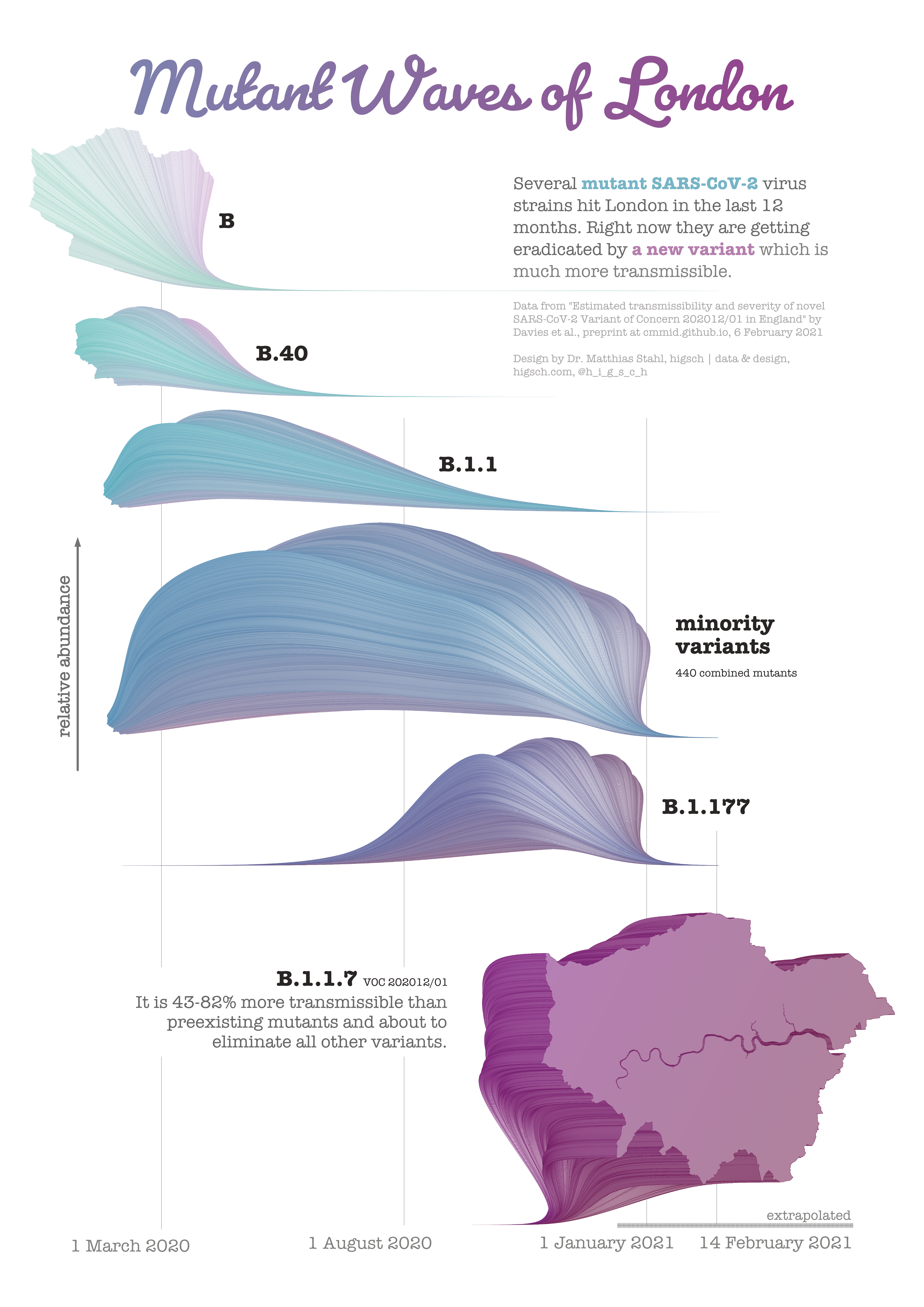
 View projectCorona virus mutants are regularly popping up, but the common media reports did not give me a feeling for how dynamic the variant evolution really is. Only when I discovered a scientific preprint...
 -
 View projectThis visualization presents a nationwide rising tide of anti-Asian bias during the height of the pandemic. The data are based on a national report published by Stop AAPI Hate, an alliance that has...
 -
 View projectThis is a data art collection of 4 + 1, both hiding and revealing data about some of the most important elements that we humans (now) need to live; Earth, Water, Air, Sun + Digital. They all stem...
 -
 View projectThe world's best infographics and data visualizations showcased, from the makers on Infogr.am. @TSSVeloso
 -
 View projectSuperconductor is a web framework for creating data visualizations that scale to real-time interactions with up to 1,000,000 data points. It compiles to WebCL, WebGL, and web workers to unleash...
 -
 View projectThe history of oil prices and consumption, explained. To understand the modern era, you need to understand our weird relationship with oil - from the crises of the 1970s, to the oil glut of the 80s...
 -
 View projectThe article explores how artificial intelligence (AI) systems, like Stable Diffusion, are trained using massive datasets, focusing on LAION-5B, a public dataset containing 5.85 billion image-text...
 -
 View projectWhy hasn’t wealth inequality improved over the past 50 years? And why, in particular, has the racial wealth gap not closed? These nine charts illustrate how income inequality, earnings gaps,...
 -
 View project"New Blood Joins This Earth" charts the diversity of genre, musical style, generation, and geography represented on Metallica's 2021 cover compilation "The Metallica Blacklist," showcasing the...
 -
 View projectAn interactive data narrative spotlighting on the the devastating effect of Bottom-Trawlers, resulting in overfishing and loss in the marine ecosystem in India. Bottom trawling gear method is one...
 -
 View projectThis research facilitates the understanding of each node’s features through Heatmap visualization in creating network visualization, and suggests a clustering of nodes by connecting the sentiment...
 -
 View projectkepler.gl is a data-agnostic, high-performance web-based application for visual exploration of large-scale geolocation data sets. Built on top of deck.gl, kepler.gl can render millions of points...
 -
 View projectHITSTORY — (Hit+Story+History) An interdisciplinary project highlighting relations between social phenomena & music history. ANTHEMS — The project (DataViz & Sonification) aims to...
 -
 View projectA few weeks ago I set on trying out new WebGL 2.0 features with deck.gl. WebGL 2.0 brings plenty of new goodies to be used for game development, creative coding and data visualization like...
 -
 View projectBy the end of 2020, about 100 million additional people are projected to find themselves in extreme poverty, living on less than $1.90 a day. Millions more are slipping into less extreme poverty...
 -
 View projectPhysics can be defined simply as the study of matter and energy. But that simple definition covers an enormous range of topics. There’s the classical physics you learned about in high school: It...
 -
 View projectDoctor-patient relationship is a special medical relationship between medical staff and patients in the medical process, and it is the key of medical interpersonal relationship. Siglis, a famous...
 -
 View projectThis work follows my father's death in 2019 and reflects on our relationship, especially on the loss of my favourite photograph I had with him. I thought the best way to reconstruct our lost...
 -
 View projectIn many Western countries, there is a significant divide between rural and urban attitudes. Does the same hold true for Germany? To find out, we took a closer look where people live and what...
 -
 View projectThe artwork shows the 40 most selling videogames in history. In the central part of the graph it is reported the five videogame companies with the greatest turnover. The games are arranged radially...
 -
 View projectThe work analyzes tourism in Piedmont, an Italian region, considering the attraction factors of the region and the evolution of tourist flows and accommodations. On the left part of the poster, the...
 -
 View projectGoogle Trends data allows us to see what people are searching for at a very local level. This visualization tracks the top searches for common health issues in the United States, from Cancer to...
 -
 View project“Satellites Charts” examines current and past artificial satellites orbiting around Earth, pointing out how our terrestrial life became so dependent on what we sent out in space. With topics...
 -
 View projectThe circular visualizations show the average daily temperatures from 2011 to 2020 for selected major cities around the world. The cities were purposefully selected to represent different seasonal...
 -
 View projectThis visualization shows the changes in energy consumption for 60 countries over a 50 year period. Each chart shows not only how total energy consumption has changed over that time, but also how...
 -
 View projectHow do we read pie charts? Do they differ from the even more reviled donut charts? What about common pie chart designs like exploded pies? In two papers to be presented at EuroVis next week,...