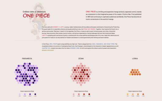
Explore One Piece: Devil Fruit Catalogue, a fun interactive tool that brings the fantastical devil fruits of One Piece to life. Reigniting my love of the series through the Netflix adaptation and...
-
 View projectI recently moved to a new, rural area, widely different from the expat-heaven Amsterdam. Thus, I decided to combine my interest in the neighborhood with my hobby. The visualization is the result,...
 -
 View projectThis work is an information visualization design in traditional Chinese colors, our IDEA is based on the traditional Chinese design concept - “藏礼于器” ("materialization of materialization of...
 -
 View projectAn interactive essay that walks a reader through the process of building a histogram, from an unordered clump of values to the finished chart. The essay highlights how parameter choices throughout...
 -
 View projectDonald Trump’s rise from joke candidate to Commander in Chief was extraordinary. As Delayed Gratification is a Slow Journalism magazine, which reports on events at least three months after they’ve...
 -
 View projectIn celebration of the start of the Rio 2016 Olympic Games this month, Visa looks back look back at major historical and cultural milestones in the Olympic and Paralympic Games since 1986.
 -
 View projectIn collaboration with Johns Hopkins University’s Bridging Research, Lung Health, and the Environment (BREATHE) Center, GovEx created a website that uses engaging interactive data visualizations to...
 -
 View projectPipa is a traditional Chinese musical instrument. This work shows the structure, development history, production materials, technological process, performance methods and other contents of the pipa.
 -
 View projectAn explorable 3D landscape built using data from an analysis of Grimm's folktales. I identified words in the stories that stood out against common English and used this to generate a landscape on...
 -
 View projectThe intention of this project is to choose a relevant and interesting story and narrate it using maps, through a combination of storytelling, cartography and visual design. This project explores...
 -
 View projectThese are four interactive data visualizations that are based on the collection of the Petőfi Literary Museum, Budapest, Hungary. The application provides additional information on the authors of...
 -
 View projectSexual assault in America has existed for centuries, yet not at any one time has the concentration of them publicly surfaced as much as in the last quarter of 2017. Spawning #MeToo, #TimesUp and...
 -
 View projectContrapedal was the first project of the "Datalab" of X-DATA, a Mexican data analytics and visualization company. Miguel Zúñiga, information designer and creator of Contrapedal, mixed his two...
 -
 View projectThis interactive data visualization explores the composition of national teams at EURO 2024, focusing on the club affiliations of players. The charts provide insights into where players are based,...
 -
 View projectThis infographic shows the first 100 historical figures in order of influence according to Pantheon, a Macro connections group of the MIT Media Lab of Boston project which took into account...
 -
 View projectThe wolf in our living rooms. How much wolf is left in man's best friend? This poster visualises the genetic relationships and diversification of dogs since their domestication from wolves. Data...
 -
 View projectThis is one of four posters in a series, representing Moscow Urban Forum on World Cities Summit 2014 in Singapore. Despite geographical and cultural differences, big cities all over the world...
 -
 View projectVisualisation about two books written by Jules Verne. The Journey to the centre of the Earth and the Around the World in 80 days. The colour divides the visualisation in 2 parts, where the darker...
 -
 View projectRadical Accounting: Alvin Ailey American Dance Theater’s Data as a Framework for Historical Imagination consists of three time-based interventions that were presented in the gallery as part of the...
 -
 View projectAlmost half of Americans believe that immigrants make crime worse. But the data tells a different story. This visual piece examines the relationship between immigration and crime in American cities...
 -
 View projectThis visualization focuses on recurring characters in the first three phases of the Marvel Cinematic Universe. The colored circles represent unique characters among different groups and are sized...
 -
 View projectA landmark new study shows that bursts of brilliance happen for almost everyone. This discovery holds promise for creatives and other kinds of professionals. We've created an interactive graphic...
 -
 View projectInfographics showing the events taking place in North Africa in the spring of 2011, which became the starting point of the protests in the region.
 -
 View projectIn July 2016, the BBC asked 177 film critics from 36 countries around the world to list their 10 favourite films of the century so far. Here are the top 100* films by critical consensus, analysed...
 -
 View project‘Meat the Future’ is an infographic design based on the OECD’s (Organisation for Economic Co-operation and Development) data of ‘World Meat Consumption and Production’. The design is intended to...
 -
 View projectLayers of Bangladesh is a three dimensional artefact enabling an interactive exploration of data relating to climate change in Bangladesh. It takes as a reference point web-based data...
 -
 View projectBio: I am an information designer and data sonification artist. I'm passionate about creating short, impactful data stories as well as nuanced, complex data-rich long reads. Throughout the design...
 -
 View projectOur goal for the Data Culture Team Visualization was to showcase the team in a way that we felt represented the unique personalities and overall culture of the team. Since all of us were included...
 -
 View projectIn this visualisaton I explored the use of explicit language in hip hop music from 1985 to 2018. I delved into the detail to understand the most common swear words used, which artists swear the...
 -
 View projectCooktus is a unique way to visualize recipes, making cooking simple, fast, and intuitive for visual thinkers, parents, and anyone who values efficiency in the kitchen—served as a set of...