
Combining analysis of historical rainfall data with deeply reported explanatory graphics, this project provides a visual overview of shifting rainfall patterns, their causes and their consequences...
-
 View projectHong Kong has been rated as the least affordable city for housing prices for nine consecutive years. That's what many people may know and only know about the Hong Kong housing market. We believe...
 -
 View projectWhen China’s Place Museum announced plans for a branch in Hong Kong the SCMP visited Beijing and Taipei to study the Forbidden City’s architecture, history and how the art collection was split...
 -
 View projectNowadays tourists are more aware of the rental available in their selected destinations. All in all, Airbnb has seen a phenomenal rise in Latam and this DataViz highlights a few trends to give an...
 -
 View projectThe famous athletes are as radiant as blooming roses, people could see their remarkable game performance and their eye-catching achievements. However, we have no idea how much pressure they have to...
 -
 View projectStrategyBlocks is the leading SaaS-based solution for strategic planning, management & execution. The platform merges quantitative & qualitative data via a system of cascading ‘blocks’ for...
 -
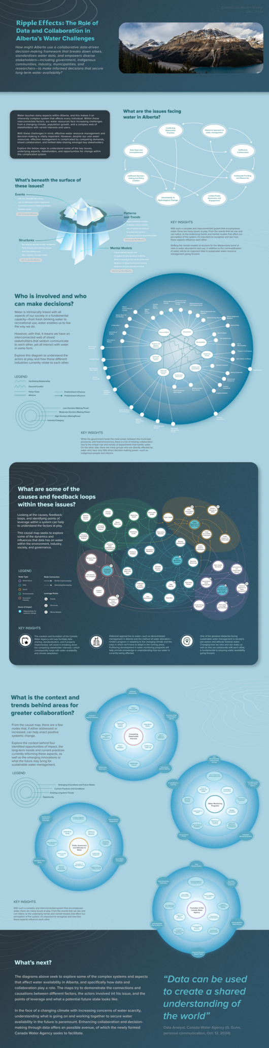 View projectWater is a fundamental resource that shapes ecosystems, industries, and individuals. However, managing this currently plentiful resource in Alberta is increasingly complex due to the impacts of...
 -
 View projectThis diagram portrays China's social media platforms in 4 categories, based on stage of maturity and functional dependency.
 -
 View projectWhen a story is well-written, you can become so immersed while reading that it becomes your world. All your surroundings disappear and all that remains are the words on the page guiding you through...
 -
 View projectThis data art project is dedicated to the participants of the Halloween party that I attended in the fall of 2024. It was a costume party — if desired, participants could choose any look that fits...
 -
 View projectA glance at the '1983 Cricket World Cup' following each match score, fall of wickets, wins & losses and Man of the match.
 -
 View projectThe growth of greenhouse gas emissions worldwide is alarming. This is a handmade visualization of Canada’s greenhouse gas emissions for 1990, 2010 and projected for 2030. Three wearable creatures...
 -
 View projectThe traditional graphic design standard books are mostly based on long text content. Boring and inconvenient, they are often hard to read. Therefore, Our Diagram of Graphic Design Specifications...
 -
 View projectStudio NAND worked with researchers from one of the largest university hospitals in Europe, Charité, and the Max PIanck Institute to tackle misinformation and misunderstanding of COVID-19...
 -
 View projectThe profit curve tells us with measured approximation how many customers we should target with our retention offer in order to maximize our profit. The profit curve automatically models and takes...
 -
 View projectA visualization of the primary roads of the Roman Empire, circa 150 AD, in the style of a subway diagram. Connections between cities are emphasized at the expense of topographical accuracy. The...
 -
 View projectKing Bhumibol Adulyadej, who died in October 2016 at the age of 88, was Thailand’s monarch for seven decades. Preparations for a lavish, five-day funeral with a budget of $90 million took nearly a...
 -
 View projectThis piece aims to show in detail the comparison of war forces between China and India, puting the territory and its geography as a context. It opens with an enumeration of the war capabilities of...
 -
 View projectIn addition to the many superlatives that have been used to describe the Qatar 2022 FIFA World Cup, it also produced more data than any football tournament ever before. Every touch, pass, cross,...
 -
 View projectIn view of the public's weak awareness of protecting ethnic ancient books and lack of sufficient understanding of the important value and role of ethnic ancient books, the team tries to focus on...
 -
 View projectTwenty-four solar terms is according to the sun in the ecliptic (the earth's orbit around the sun) on the position of the change and develop. Twenty-four solar terms can reflect the change of...
 -
 View projectExplore all of Lewis Hamilton's Formula 1 wins with this circuit view. Is he one of the greatest drivers to ever race?
 -
 View projectSometimes we have to challenge readers' sensibility so we can build a better world. This cut-out infographic includes a mid-upper-arm circumference (or MUAC) bracelet, which is used to help assess...
 -
 View project敦煌是历史上东西方文化交汇的重要枢纽,不同文化在这里汇聚和交融,塑造了独具魅力的敦煌文化。壁画是敦煌递向世界的名片,当飞天飞翔于空中,撒花奏乐时,反弹琵琶起舞时,伴随她们的衣袂飘飘,姿态神情,人们仿佛能听到古老的悠扬乐声跨越千年而来,乐器亦是其中不可或缺的部分,可以带领我们“看见”千年前敦煌的声音。 图表呈现了敦煌乐器的种类分支和不同时代不同种类的出现频率,也包含了千年前《敦煌乐谱》的不完...
 -
 View projectThe goal of this project was to use machine learning in order to get the emotional landscape of 19th century novels. The data from that analysis was then used to create data visualizations, which...
 -
 View projectMe on Scan is a personal exploration of my daily habits and thoughts, captured through a creative process of observation and visual representation. The project focuses on three interconnected...
 -
View projectA Visual and Educational Guide of India's Energy Prospects. This project aims to visualize and educate people on India's energy prospects, especially nuclear energy, and its impact on the...
-
 View projectLanguage has two aspects - sound and meaning, and yet we don't tend to care about sound as much as we care about its meaning when using language. This project attempts to draw attention to sound...


