
Created for a Cannes Lions panel—where Adam Bly, Spotify's VP Data, interviewed burlesque performer Dita Von Teese—this visualization shows how your music streaming habits offer a window into who...
-
 View projectThe Website Scrolly was done as a part of a 2-week long Data narrative module at the National Institute of Design, Bengaluru. It is a Comparative Data Essay that gives the reader an overview of...
 -
 View projectA web application that visually reconstructs the thoughts and feelings which occurred during a classical musical performance. Keynote and documentation at...
 -
 View projectIn this project, I conducted a detailed analysis of the lexicon used by Italian rapper Ghali across his albums released between 2017 and 2020. The goal was to explore the linguistic patterns,...
 -
 View projectIN COLLABORATION WITH CJR, a team of Columbia Journalism School students transformed our Pulitzer demographics database into an interactive graphic. This project, part of a graduate course on media...
 -
 View projectThis is a data story. After ogling The Pudding’s data story on ‘Gastronomic Borders in the US’, I wondered what the food preferences of Indians look like. The following data story is an effort...
 -
 View projectAnalysis of 36 trilogies for IMDB rating and domestic box office gross figures in the US. This visualisation looks at the progression of these numbers throughout the series, and identifies patterns.
 -
 View projectIt started with The Sex Pistols. Specifically, with The Sex Pistols’ June 4, 1976 show at the Lesser Free Trade Hall in Manchester, England. The concert now ranks as one of the most influential...
 -
View projectFor this visualization, I took the scripts of the TV show Parks and Recreation and created an infographic based on the information I gathered through the script data. I did the project in Excel...
-
 View projectBy list and analysis data of my life in chronological order, I got a life trajectory distribution. I divide my life into four main parts, education, family’s activities, friend’s activities and...
 -
 View projectThe Star Wars movie universe is one of the most successful franchises of all time and a multigenerational classic. These films are loved by millions of dedicated fans and have been an iconic symbol...
 -
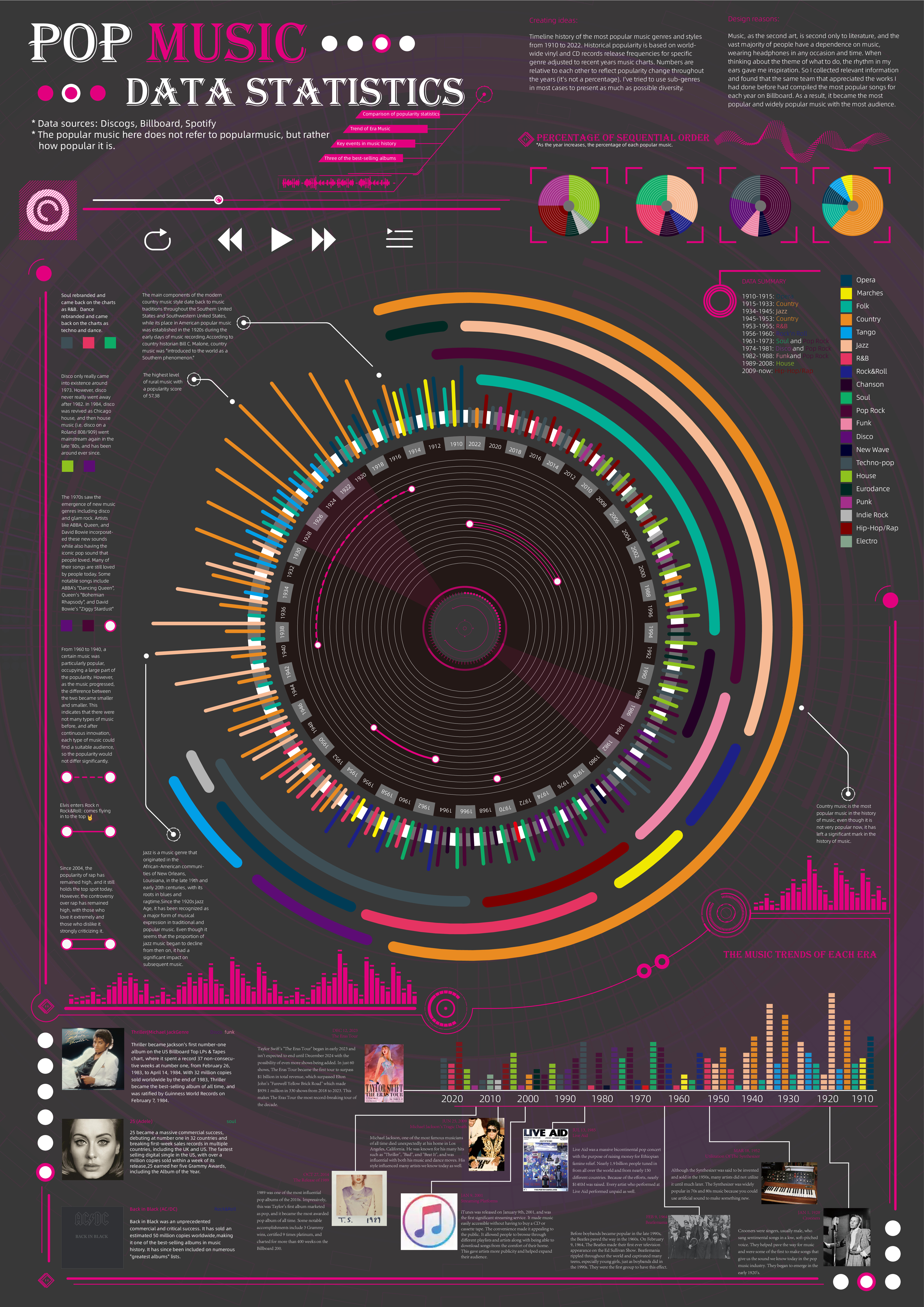
 View projectTimeline history of the most popular music genres and stylesfrom 1910 to 2022.Historical popularityis based on world-wide vinyl and CD records release frequencies for specificgenre adjusted to...
 -
 View projectStar Wars Colors is a data visualization about the physical traits and basic information of the Star Wars characters, which were represented as a card game of Lightsabers. This dataviz has a data...
 -
 View projectImagine turning the screen-time dynamics of the show "The Office" into a visual journey through Dunder Mifflin! This data visualization project dives deep into the shared screen time among...
 -
 View projectWhat did I do with my all free time once Game Of Thrones ended? Made a Data viz of all the free time I spent watching GOT of course. This data viz illustrates my not-well-though-out decision of...
 -
 View projectMy entry to the 23 IIB Awards is a data visualization highlighting the top 15 museums in the world by their floor space. As a museum enthusiast, I appreciate the opportunity to enjoy artwork at...
 -
 View projectAcross the Back to the Future trilogy, the DeLorean time machine made 13 trips through time. This visualization explores the jumps back into the past and forward into the future. Hover over the...
 -
 View projectThe Galactic Civil War — recently retold in the military history called Star Wars1 — pitted the Imperial Navy, one of the most sophisticated fighting forces in history, against the ragtag Rebel...
 -
 View projectThe Sumerian King List is an ancient document written more than 3,000 years ago. As its fragments were discovered in the 20th century, this important document about the early history of Mesopotamia...
 -
 View projectThe 24 solar terms represent climate change and are closely related to the health of tea drinking. In the "tea drinking guide", the spring, summer, autumn and winter respectively correspond to four...
 -
 View projectReleased by Telos Publications late last year, 'Infogothic: An Unauthorised Graphic Guide to Hammer Horror' is my first book, analysing the horror films from Britain's Hammer Films. Rather than...
 -
 View projectIn the HBO megahit Game of Thrones, characters, houses, and allegiances continue to change as new kings and queens gain power, opposing sides do battle, and characters meet one another across the...
 -
 View projectTo mark China’s 40th anniversary of economic reforms we look at the impact they had on ordinary people by comparing the average family’s living space in 1978 to 2018. We also look at how peoples’...
 -
 View projectThe Triple J Hottest 100 countdown is the world’s largest music poll. Each year more than 2 million Australians pick their favourite songs and the tracks with the most votes are revealed one-by-one...
 -
 View projectThe theme of our information design is "military parade to commemorate the 70th anniversary of the victory of the Chinese people's war of resistance against Japanese aggression". The whole work is...
 -
 View projectFor decades, everybody in the music business knew one thing: if you wanted to break a new artist, you had to get their songs played on the radio. But with the advent of streaming services, times...
 -
 View projectThis project visualizes IMDb ratings of Power Rangers episodes across different seasons using a horizon plot, a compact method for displaying fluctuations in ratings over time. The chart uses the...
 -
 View projectChanging the Narrative informs and educates young adults about the history of true crime podcasts and how they have brought awareness to and solved cases and given power to people.
 -
 View projectThe entrant has supplied multiple files for this work [1] [2] [3] Chart atmosphere surrounding the clay sculpture workshop, Chinese old Beijing Lord rabbit body performance process of the...
