"The Impatient List" is a storytelling piece that calls the general public 's attention to patients of the kidney transplant in the United States. Organ transplantation is a highly collaborative...
-
 View project“Hello From The Data Vandals (or free as air and water, or whatsoever things are true)” is the first exhibition by the Data Vandals (artist Jen Ray and dataviz designer Jason Forrest) at The Cooper...
 -
 View projectSpotlight is a series of occasional think pieces harnessing the power of the Firefly Millward Brown global network. One of the strengths of Firefly is the ability to quickly call on the expertise...
 -
 View projectSince 2000, China has provided upwards of $160 billion in development finance to the energy sector for foreign governments across the globe. To understand the scope and breadth of these...
 -
View projectThe Center for Investigative Journalism of Serbia (CINS) monitors the development of coronavirus in Serbia and its impact on the lives of people since the beginning of the pandemic. Since there is...
-
 View projectLast month, the Obama administration announced an eye-popping $38 billion security assistance deal with the Israelis, to be disbursed over ten years starting in 2019. That caught us off-guard. It...
 -
 View projectDesigning a "Data Selfie" is to provide a visual representation of one's own information, Capturing various aspects of life and activities through data visualization techniques. The Information...
 -
 View projectThis is a summary of the history of (Western) philosophy showing the positive/negative connections between some of the key ideas/arguments of the philosophers. This first version is based mostly on...
 -
 View project11:11 is a mobile app and emotion-based social network that prompts cancer survivors daily to reflect upon, express, and track their emotional variance among a private, peer-to-peer community of...
 -
 View projectIn the final sentence of his study of nineteenth‐century canals, Ronald E. Shaw points to the limitations of most canal maps: “The long lines of canals now drawn on our maps ... are but the...
 -
 View project"Leaves" is a course assignment of information chart design in the junior year. I collected and summarized the information, and elaborated it in seven aspects, including definition, composition,...
 -
 View project32 teams featured in the 2022 Football World Cup. Host nation Qatar were in the competition for the first time, while other countries have a much more decorated past. This visualisation, with a...
 -
 View projectWater is essential for life, yet many communities in the Western United States face challenges in accessing sufficient, clean water. Water insecurity arises when people do not have reliable access...
 -
 View projectFor the Dutch version of the Deloitte Global Mobile Consumer Survey, Deloitte asked 2000 residents of the Netherlands about their mobile phone behaviour. The respondents gave information about...
 -
 View projectBy the end of 2019, the new coronavirus pneumonia began to spread rapidly. As of March 9,2020, a total of 576 confirmed cases had been reported in Chongqing. In order to present the situation of...
 -
 View projectWe set out to produce an artwork that would map human connections online, to reunite us with the physical reality at the heart of our digital story. The story that will be told in the history books...
 -
 View projectFor our wedding, we created a network graph of the connections between all of our guests and designed individualized data-driven badges that highlighted each guests’ unique relationship to us, the...
 -
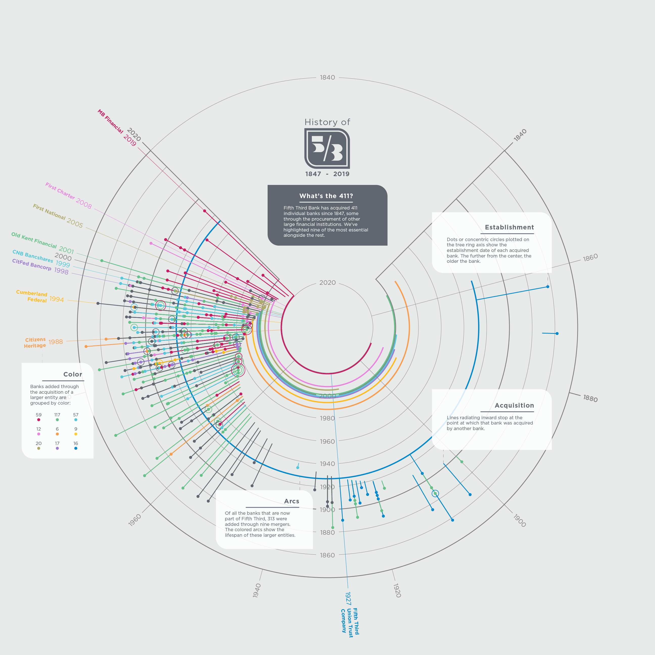
 View projectFifth Third Bank recently opened a museum to honor its 161-year history. A recent review of its history found that 411 distinct banks make up the Fifth Third Bank of today. This visual depicts...
 -
 View projectThis is the first part of a three-part series investigating the flow of money from the gambling industry into Australia’s political system. It combined sophisticated data mining techniques with...
 -
 View projectAlthough the pandemic of novel coronavirus caught humanity unawares, scientists worldwide rapidly started vaccine development. That led to a significant breakthrough in immunology: many developed...
 -
 View project农民工是中国改革开放历程中的一个重要群体,在中国经济社会占有重要地位。然而,农民工的薪酬被拖欠已经成为一个历时已久的社会问题。我们从《农民工监测报告》、人民网政务留言板、北大法宝中获取了与农民工讨薪问题相关的数据,并广泛搜集社会新闻、司法案例,运用可视化技术制作图表呈现数据,结合文字叙述,分别揭示了:(1)农民工庞大的群体和生存的困境。(2)农民工的声音谁来听?农民工的需求向谁反映?(3)我...
 -
 View projectDatadog is an observability and analytics platform for applications, infrastructure, and security. It can be used to determine performance metrics as well as event monitoring for infrastructure and...
 -
 View projectThis infographic is one of the cutest and most romantic projects I've ever worked on. For his girlfriend's birthday, Robin asked me to design a visualization based on a dataset coming from their...
 -
 View projectIn a society riddled with little to no minority representation in media and academics, this infographic brings to life the recognition of underrepresented racial groups. As civil rights movements...
 -
 View projectDataglitches is a collection of examples, drafts and mistakes created while designing data visualisations. It started as a tribute to the unexpected beauty coming out of data and information...
 -
 View projectIn the age of image socialisation, images are one of the main ways we perceive our surroundings and communicate with people. Digital filters have emerged and changed, allowing people to present...
 -
 View projectWill most meetings be remote in the future? This was the question that sparked my curiosity and inspired my exploration of every one of my work meetings from the last 3 years (Aug. 2016 - Aug....
 -
 View projectThe visualisation depicts the full 136 year of the Six Nations championship in Rugby Union. The central element of the visual focuses on the main trophies available to win in bands and which teams...
 -
 View projectData from the National UFO Reporting Center, compared against US Census Data and visualised - sightings per capita, sighting time, even trending shapes of UFOs. @John_M_Nelson
 -
 View projectThis stunning piece of digital journalism is the result of a successful collaboration between the ABC's Tokyo bureau and the Story Lab team here in Australia. Super Kamiokande is a giant science...