
Graphicacy helped Temple University’s Center for Public Health Law Research revamp their scientific legal mapping tool for global usage. Since 2016, the LawAtlas, maintained by the Center for...
-
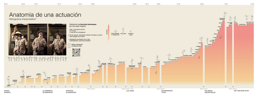 View project'Anatomía de una actuación' is an interpretative histogram, a simple infographic exercise based on admiration for the work and creativity of the actress Ana López Segovia and her Carnaval de Cádiz...
 -
 View project《全球恐袭五十年——恐怖主义数据交互可视化》是一部旨在通过数据可视化展示近五十年来全球各国恐怖主义活动的作品。近五十年来,恐怖主义已成为全球面临的重要挑战之一,给人们的生命和财产安全带来了巨大威胁。本作品通过收集和分析全球范围内的恐怖主义活动数据,利用d3.js实现交互式可视化方式,向观众揭示恐怖主义在全球的发展趋势和带来的严重后果。 在这部可视化作品中,我们将恐怖袭击次数、受害者人数和恐...
 -
 View projectThe UK’s electricity generating sites and sub-sea interconnectors. Only currently operating sites of 1 megawatt (MW) capacity or larger are included. The size of the circles is proportional to site...
 -
 View projectOver the years, we’d done numerous stories on the rising cost of rent and the increasing difficulties many Canadians face when looking for a new home. But just how bad had things become? To...
 -
 View projectI learned last summer that the rescue dog who accompanied one of my favourite YouTube musicians had died. To pay tribute to her (and him), I made a slightly whimsical series of charts showcasing...
 -
 View projectHaze, that is, smog caused by pollution, has become an inevitable part of life in many Chinese cities. Urban pollution has quietly increased, and it affects the health and lives of many city...
 -
 View projectThis visual analysis presents a comparative study of the energy transition trajectories of China and Germany from 2000 to 2023. Focusing on their heavy industries, which encompass high-emission...
 -
 View projectThis piece dives into the progress made on a global level towards achieving the UN's Sustainable Development Goals (SDGs) through data on world poverty, hunger and health. Armed with the rosy...
 -
 View projectAccording to the World Health Organization, three key factors influence the health of the people in any given country: the social and economic environment, the physical environment, and individual...
 -
 View projectThis is a portrait of the Earth in time and space – designed to commemorate the 40th Anniversary of the Voyager missions which departed Earth in 1977 bearing a record of our existence etched into...
 -
 View projectVisualizing student's academic performances across four subjects based on National Achievement Survey (2014).
 -
 View project**The demo video and pictorial of this project can be found in https://osf.io/3kt8d/. Social media platforms generate a constant flow of digital expressions, opinions, and emotions, forming a...
 -
 View projectThis poster illustrate some anonymized data provided by the New Caledonia South Province Domestic Violence Treatment Service, Le Relais. They focus on women under the age of 30 who have experienced...
 -
 View project26 March marked the 18th anniversary of the death of Stanislaw Lem, Poland's most famous (science fiction) writer. Come with me on a journey into the solar system of his works.
 -
 View projectEvery second of your life you are under attack. Bacteria, viruses, spores and more living stuff wants to enter your body and use its resources for itself. The immune system is a powerful army...
 -
 View projectThe Belgian outdid team GB’s Jessica Ennis-Hill, the defending Olympic champion. Breaking personal best after personal best, she gave the performance of a lifetime to steal the crown from the...
 -
 View projectThis visual report examines Russia’s growing use of private military companies (PMCs) to increase its influence through irregular means. In recent years, Moscow has expanded its overseas use of...
 -
 View projectIt has become common to say "I'm depressed" when we mean "I'm sad" and therefore underestimate just how severe depression is and how harmful it can be. This viz takes a look at depression: the...
 -
 View projectAn in-depth analysis and exploratory visualization of NOAA's weather data for Richmond, VA. The entrant has supplied multiple files for this project: [1] [2] [3] [4]
 -
 View projectWhy did human development proceed at such different rates on various continents? I used the data and the theory presented by Jared Diamond to make this project to let people easily know his...
 -
 View projectAcross the Back to the Future trilogy, the DeLorean time machine made 13 trips through time. This visualization explores the jumps back into the past and forward into the future. Hover over the...
 -
 View projectWilliam Shakespeare coined these 300 words and phrases over 400 years ago. How often do we still use them?
 -
 View projectImagine if trees gave off Wi-Fi signals. The map is an experiment in visual representation with a poetic, rhetorical dimension. How would the city landscape change if there was a tree planted for...
 -
 View projectBeing an outspoken woman on Twitter is hard. To find out how hard, we gathered a day’s worth of tweets sent to four prominent Indian women — Barkha Dutt, Rana Ayyub, Tavleen Singh, and Madhu...
 -
 View projectIn spring of 2021, SAS held their annual conference SAS Global Forum. The conference draws thousands of global attendees to one place for a week of connecting. Participants have a range of...
 -
 View projectWe've created a detailed interactive map and analyzed recent election results in over 80,000 regions of Europe. We found many patterns – from the radical left to the extremist right.
 -
 View projectThis visualization tracks the entire history of every team in the NFL. The bar charts above the line show winning seasons and below show losing seasons; gold bars indicate Super Bowl wins. The...

