Gratitude by SAS
In spring of 2021, SAS held their annual conference SAS Global Forum. The conference draws thousands of global attendees to one place for a week of connecting. Participants have a range of professional backgrounds, skills, and interests to share and explore at the conference. Due to Covid-19 it was held virtually.
The overarching theme in all my data visualization art is to help people from all walks of life connect to the stories behind data. Doing it through art is the ultimate form of democratizing analytics: a personalized aesthetic dialog.
Art is approachable, and it evokes curiosity and emotion. When you inform the art with data, it lets people approach hard topics in delightful and non-threatening ways. Anybody can appreciate it. You don’t have to know data science or statistics to benefit from what’s going on.
With “Gratitude”, the goal was to create a data visualization art piece that would capture and express the excitement and buzz that one would typically feel during an in-person conference and share it with them where they were, locked down in their homes.
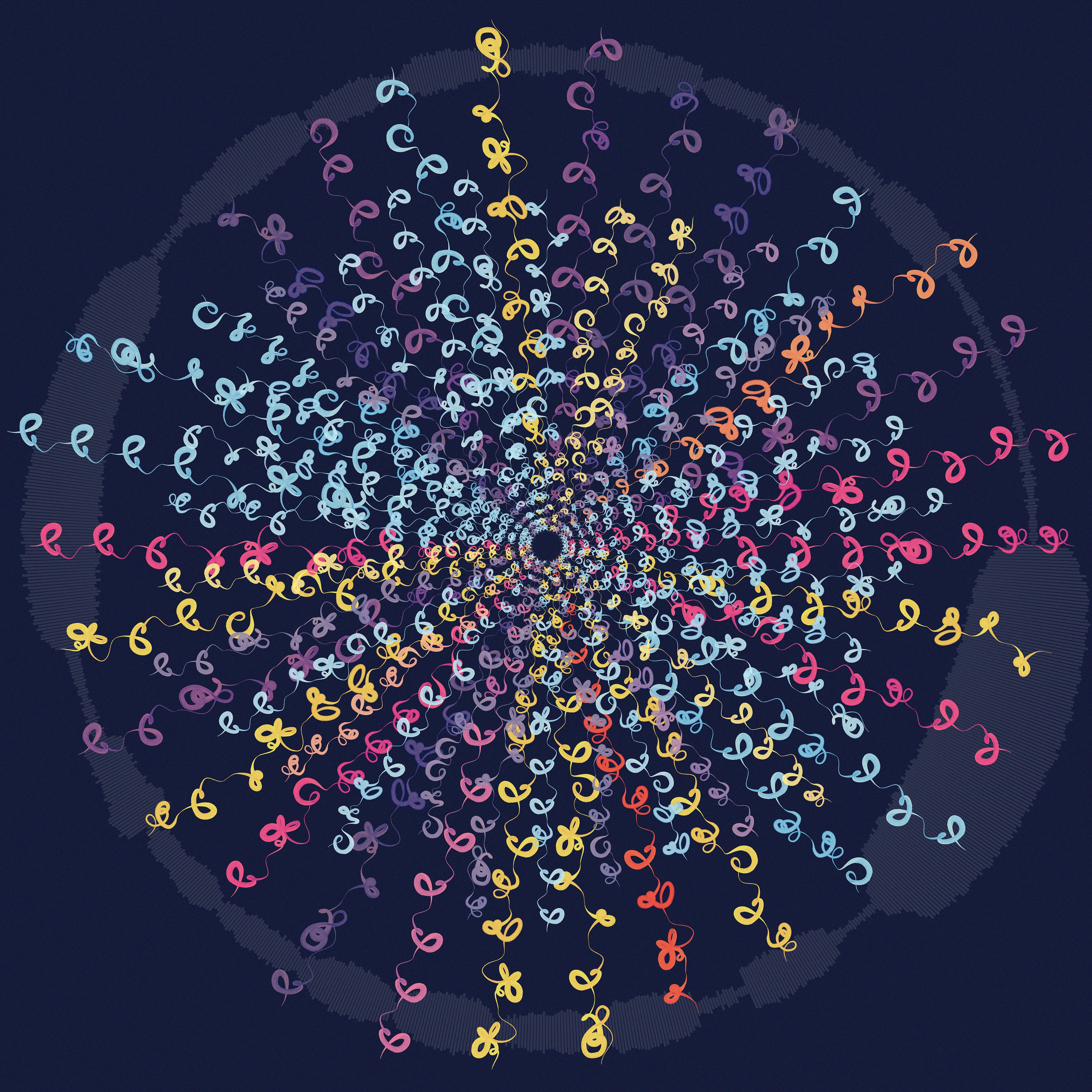
Identifying the factors to be tracked from the conference attendees' data was the initial step: session content type, attendees' key focus area, conference engagement score, conference site traffic, and geographic location.
Once the factors were identified, the artistic representation could be created.
I turned to the abstract art of Hilma af Klint for inspiration. Hilma af Klint is considered the pioneer of abstract art. Her work represents an effort to find visual expression for a reality beyond the observable world. She produced symbols drawn from nature, religion, language, or science, arriving at a vocabulary of abstract forms and representational elements that had not been seen before.
Beginning concept sketches depicted movement as abstract line gestures. By imagining the abstract path a person might make traversing through the conference, several glyphs took shape.
Choosing a medium that lends itself to fluid movement, hand painted watercolor strokes were digitized and applied to the glyph shapes in the final art piece.
As conference participants spend time at SAS Global Forum, they choose their own conference path that creates a unique signature. A signature is a collection of glyphs. Each glyph represents one of nine content types.
Sixteen focus areas inform the glyph color. For example: Sky blue for artificial intelligence, magenta for health and life sciences, and purple for manufacturing.
The final data visualization is a collection of high engagement participant signatures encircled by an ellipse. The ellipse represents conference traffic as a sound wave. There are four distinct final art visualizations -- one representing the total conference and three focusing on conference regions. Each region is denoted by its own unique color scheme.
The data visualization art piece was named "Gratitude" to express the gratitude for time spent and connections formed together in a single place, free from pandemic stressors. Each attendee received a truly unique way to represent their SAS Global Forum virtual experience.
-
CreditsJessica Peter, Data Artist & Designer; Jennifer Sabourin, Senior Software Developer & Data Scientist
-
Award
-
Categories
-
See more


