
I created the Sidewalk Story to bring data journalism to public streets and to spark public dialogue about arts access. The charts for the Sidewalk Story can be re-created on a public sidewalk by...
-
 View projectRomancing the American West is designed to survey the Western film and television genre, and to test a hypothesis set forth by Robert McKee is his book, Story. Robert McKee describes a...
 -
 View projectI wanted to explore the discussions in The Hobbit by J.R.R. Tolkien. Only those words the characters say aloud are visualised. The visualisation shows the amount of discussion in each chapter as...
 -
 View projectThe photographic darkroom process is the main line and the development of photographic materials is the subordinate line. By using collage, solve the mysteries of photography.
 -
 View projectThe digital realm and the physical world are not entirely separate; they communicate, reflect, and engage in debate with each other. Considering this relationship, the following question arises:...
 -
 View projectWhile Wikipedia is a most modern creation, its content reflects a historical accumulation of facts and attention. This map of London shows the density of articles in Wikipedia associated with...
 -
 View projectInfographics are commonly mistaken as a modern invention, but they’ve actually been used to captivate and educate minds throughout history. This motion video reviews the past and present status of...
 -
 View projectThe electoral map is many shades of Republican and Democrat—and always shifting. Which states have moved to the middle, and which are slipping out of reach for the opposition party?
 -
 View projectNumber Crunch is a monthly infographic published by Private Equity International. The piece takes two forms: a print version, which is published in every issue of Private Equity International...
 -
 View projectThe US electricity system is often described as the world’s largest machine. It is also incredibly diverse, reflecting the policy preferences, needs and available natural resources of each state....
 -
 View projectWhat is the shape of networks? How do we experience network sculptures? Our goal with this project is to bring networks to life as physical objects, a testimony to their physical reality in spite...
 -
 View projectAn interactive visualisation of weather data, on a multitouch display whith haptic control elements. In this project a visualisation was created that emphasises on the cyclic nature of weather...
 -
 View projectAugust marked the happening of Pride in Amsterdam! During this event, the worldwide LGBTQ+ community, as well as all their supporters, came together in Amsterdam for 9 days to celebrate diversity,...
 -
 View projectMeet America's busiest bikes! We sifted bike share data from four cities throughout the USA - Chicago, New York, Washington and Philadelphia. Our goal was to find the busiest bike and map its...
 -
 View projectA major nationwide investigation that revealed how in seven states victims of crime who apply for victim’s compensation to help with funeral expenses, lost wages and hospital bills are rejected if...
 -
 View projectCollection of every job that was performed on the USS Enterprise in The Original Series listed by individual episodes. Main characters and the regular extra are shown with unique icons. All others...
 -
 View projectMost movies make the majority of their profits in the first few weeks after release. A nomination for the Oscars could change this dynamic dramatically, but only for some. The nomination puts...
 -
 View project"Digital design done right." Putting your users at the heart of design, to build better websites and products online.
 -
 View projectWhat is the relationship between art + tech + death + life? Data Meditations: An Abstract Koi Pond explores these questions. Created by Kristin Henry and produced in collaboration with Reimagine...
 -
 View projectIn May 2024, I stood in Yosemite Valley, surrounded by towering granite walls. The views were stunning, but something felt incomplete—standing within the embrace of the mountains, I couldn't see it...
 -
 View projectSnowlastalgia is an informational website that outlines the projected effects of climate change on downhill skiing. ”Snowlastalgia” is inspired by the term “solastalgia”, which combines the...
 -
 View projectCan sound and visuals be used in tandem to accurately convey what chronic migraines feel like to someone who has never had the experience? What can a migraine look like? Sound like? Is there a...
 -
 View projectA compelling narrative created for Civic Influencers, an NGO, to showcase the potential impact of American youths’ interest in and access to votership, highlighting to both donors and students the...
 -
 View projectDuring my first semester at Parsons, I took a course called “Major Studio 1” taught by Daniel Sauter. This course explored the fundamentals of data visualization programming tools, “historic and...
 -
 View projectDeciding where to live in one of the most diverse states in the nation is no easy task. “The best town in N.J. … for you!” helps readers find their new hometowns through a variety of factors. The...
 -
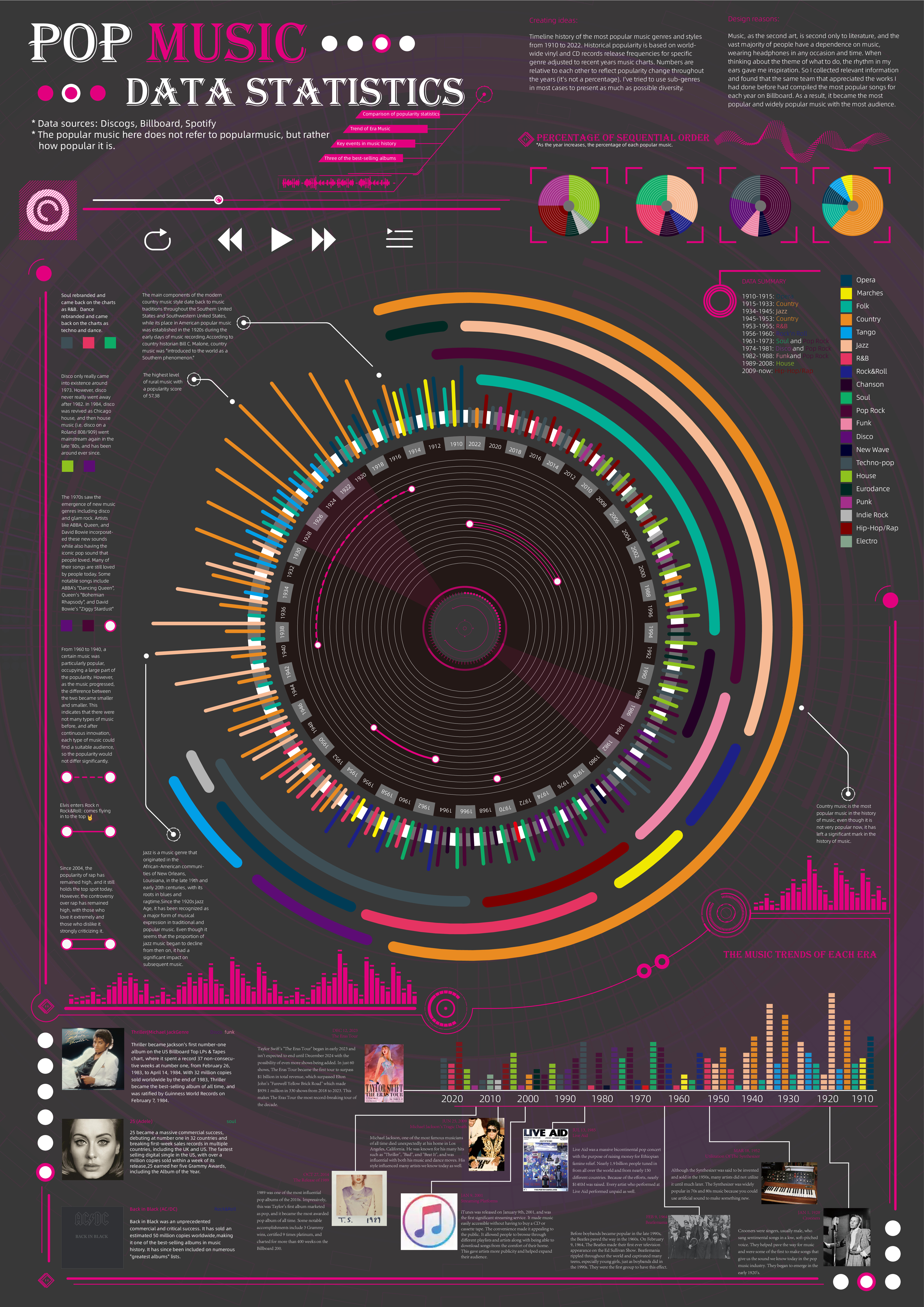
 View projectTimeline history of the most popular music genres and stylesfrom 1910 to 2022.Historical popularityis based on world-wide vinyl and CD records release frequencies for specificgenre adjusted to...
 -
View projectThis is a visualization of the Forbes world billionaires list for 2022. I also brought in historical data to show the growth of the wealthiest billionaires. This was all completed within Excel...
-
 View projectWe analyzed daily top 50 Mandarin music charts from Taiwan’s largest streaming platform, KKBOX, spanning from 2005 to the present, to showcase two decades of shifts in Taiwanese pop music. From the...
 -
 View project"Who is My Neta?" is a dashboard for India's 2024 general elections that helps voters access comprehensive information about their representatives. By combining parliamentary performance data with...
