Language has two aspects - sound and meaning, and yet we don't tend to care about sound as much as we care about its meaning when using language. This project attempts to draw attention to sound...
-
 View projectA look at the 537 Academy Awards nominated for best picture since the award show began.
 -
 View projectAnna Karenina has one of the greatest opening lines in all of literature: "Happy families are all alike; every unhappy family is unhappy in its own way." This project investigates the connection...
 -
 View projectThis visualization attempts to tell the story of film. An epic journey of innovation across 14 decades, 137 countries, and 4,070,420 films.
 -
 View projectVisualising Jane Austen's people, places and plots: Jane Austen died 200 years ago, but her novels have never been more popular. But what goes into a Jane Austen novel? And what gets left out?
 -
 View projectIn this period of overseas planning, the members of "The Infinite Challenge" received applications from all over the world , and some of them are selected for distribution. This process diagram is...
 -
 View projectThis visualization on charity songs was created on invitation by Datasketch.es (Shirley Wu and Nadieh Bremer). While the subject was "community", I chose to visualize the (top contributing) charity...
 -
 View projectThis pop culture visualization explores all spells used in the 7 Harry Potter books. Hovering over a spell reveals the spell's context and other details.
 -
 View projectThe communications department of the High Line New York assigned me to design a datavisualization for their High Line Fall Members Magazine 2016. They provided me with a data-set of the artists...
 -
 View projectThangka is the unique fabric-painting art of Tibet, and few modern people know the origins and production processes of Thangka. I used the form of the temple city to explain the production process...
 -
 View projectThere are many aspects to the Harry Potter franchise: books, movies, a new play, studio tours and theme parks. But when it comes to gauging fan reaction, there’s probably no better place than...
 -
 View projectThe 'Map of Every City' is a study of history, the urban fabric, personal experience and gentrification applied to the medium of a traditional city street map. Through its universality, it...
 -
 View projectWhen a story is well-written, you can become so immersed while reading that it becomes your world. All your surroundings disappear and all that remains are the words on the page guiding you through...
 -
 View projectHow does America watch movies? Do coastal audiences prefer action films? Do movie-goers in the south opt for films that mirror their experiences? We’ve mapped US movie tastes for this year’s Oscars...
 -
 View projectThe Frankfurter Allgemeine Zeitung (FAZ) asked me to create visualizations for a multiple-paged special on the Bayreuther Festspiele, an opera festival founded by Wagner. The graphs show some...
 -
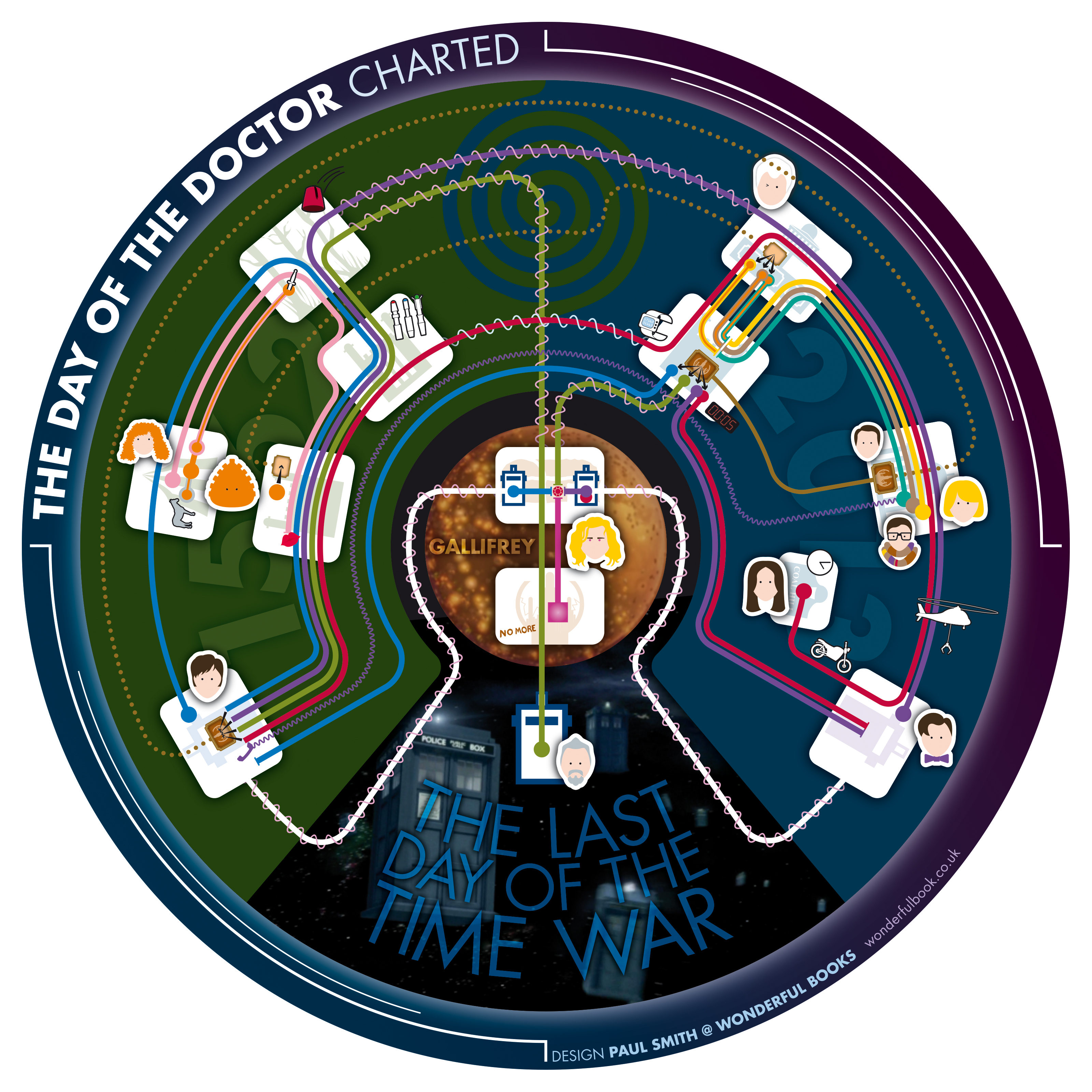
 View projectInterviewed in Doctor Who Magazine in 2016, series showrunner Steven Moffat talked about the difficulties of writing the 50th anniversary special 'The Day of the Doctor' in 2013. He was not only...
 -
 View projectThe Infinite Drum Machine can create beats using sounds from the everyday world. Thanks to the Philharmonica Orchestra, London, for contributing some sounds to this project.
 -
 View projectOnly self-supporting statues are profiled in this graphic. Statues carved on rocks and mountains or those under construction are not included. You may want to try resizing the browser window
 -
 View projectBased on the manga by Akira Toriyama, the first episode of Dragon Ball Z aired in Japan on April 26, 1989. Even after more than 25 years, the anime is still extremely popular, with a filler-free...
 -
 View projectWhat three years and 75,000 shows in New York tell us about the chance your favorite band will succeed.
 -
 View projectSeparately, we looked at marrying age, divorce rates, and those who never married. Now let’s look at marital status all together, with the addition of the widowed status. As you switch between...
 -
 View projectHead on a spike? Check. Shot on the privy? Check. Baked into a pie? Check. Over the past 6 seasons of Game of Thrones, more than 100 characters have been killed off the show — but only one has...
 -
 View projectWhile experiencing the beloved "Fast and the Furious" films, one might ask: How fast? How furious? A scrappy team of Bloomberg designers and reporters meticulously analyzed the first seven movies...
 -
 View projectWhat would David Bowie’s music look like through the lens of data visualization? This is what designer Valentina D'Efilippo and researcher Miriam Quick set out to explore in OddityViz – a visual...
 -
 View projectA nonlinear narrative is a storytelling device that portrays events of a story out of chronological order. Story curves visualize the nonlinear narrative of a movie by showing the order in which...
 -
 View projectThe past few years have seen a steady increase in the number of multiplex screens in India. Apart from the mainstream big-budget movies, Bollywood has been evolving and producing experimental films...