
Regional Weather Myths explores several questions:
Are our summers getting warmer and drier? Do real summers and winters even exist anymore? Are floods on the agenda in the region?
It all started...
-
 View projectA visual enquiry into the rape epidemic in India and the systematic dysfunction of the Indian justice system.
 -
 View projectGCP SL, the first UK REIT to focus on student accommodation, celebrated their fifth birthday in 2018. We created a chronological timeline graphic to showcase the company’s achievements since...
 -
 View projectThis incredible project will immerse you in the wild world of the Chornobyl Zone. You can see and even hear the voices of animals and birds—from Przewalski's horses to the Ukrainian brook lamprey....
 -
 View projectColor research in movies. We held a survey concerning colors presented in several films by means of calculating the amount of one or another color shade appearing during the whole movie. That's how...
 -
 View projectA map that visualizes at the percentage of population with acess to broadband internet alongside the number of primary care physicians per capita for each county in 50 states and the District of...
 -
 View projectNBA's leading scorer: LeBron James has surpassed 38,387 points, the record set by Kareem Abdul-Jabbar over 30 years ago. Graphics team members Mitchell Thorson and Ramon Padilla partnered with Jeff...
 -
 View projectAs Ukraine’s counteroffensive finally got underway, the pace of the early news came thick and fast. Between stalled Ukrainian attacks and what they revealed about the depth of Russia’s defensive...
 -
 View project‘Renewable Rhythms’ is a dynamic data-painting installation created by the generative artist collective The “What If” Project, led by Daniele Giannini, an IT professional at Terna, the Italian...
 -
 View projectThis animated web graphic is part of a 5 part information graphic series for Siemens Healthcare, mentioning 5 major trends in global healthcare, one per piece. The artwork ‘Facing the paradigm...
 -
 View projectThis information visualization aims to make the ordering process fun and faster at the "Tuck Shop" (the university canteen), for all those who wish to order (but primarily for students!). The...
 -
 View projectUsing the 2012 Agricultural Census data, we sought to answer three related questions about U.S. Farm Size: 1. Do small farms really have greater crop diversity? 2. Do government payments...
 -
 View projectCan sound and visuals be used in tandem to accurately convey what chronic migraines feel like to someone who has never had the experience? What can a migraine look like? Sound like? Is there a...
 -
 View projectThe interactive scientific poster "Explore The Ocean" of the GEOMAR Helmholtz Centre for Marine Research explains complex marine science with a multi-touch display right on board the Hapag-Lloyd...
 -
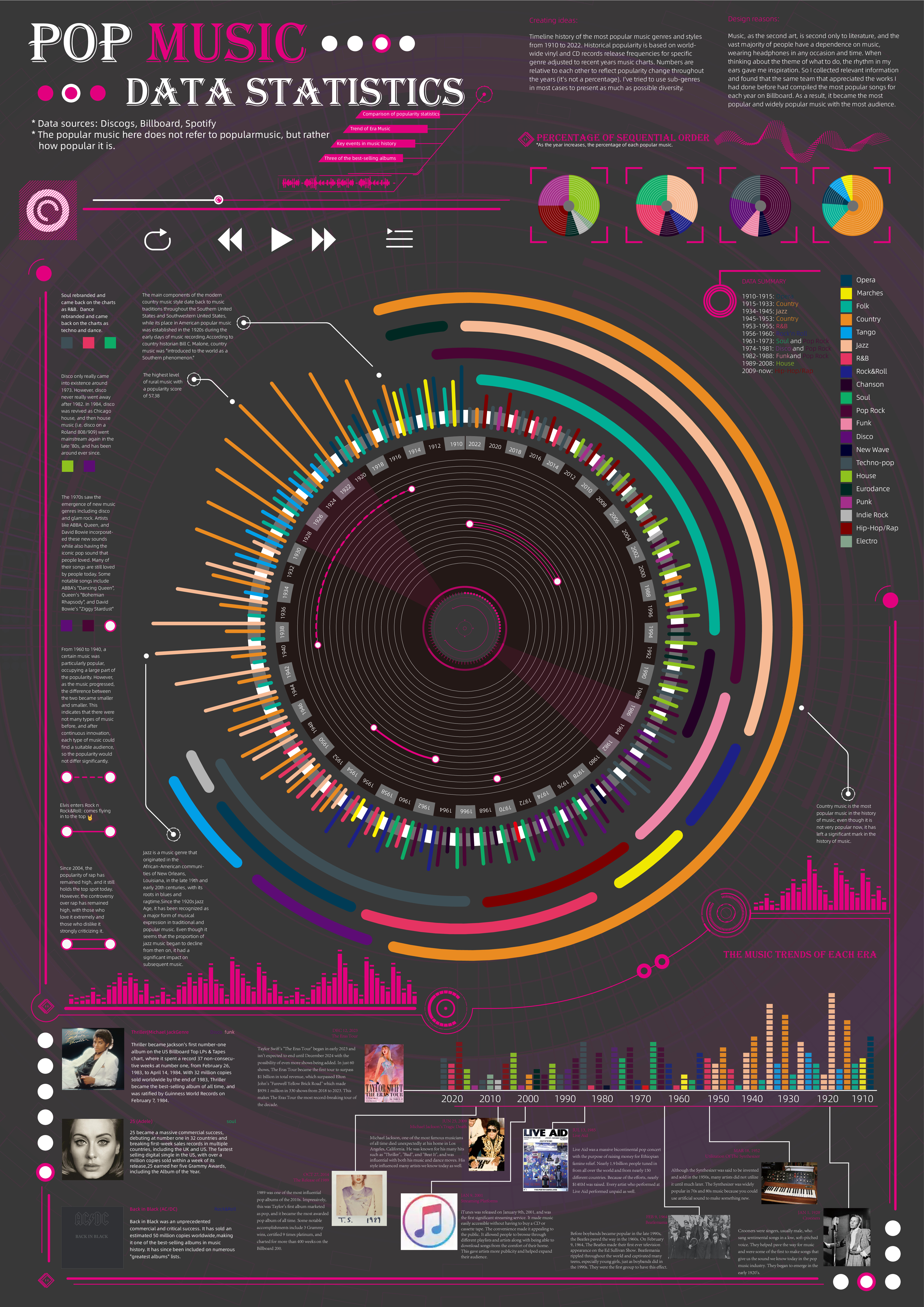
 View projectTimeline history of the most popular music genres and stylesfrom 1910 to 2022.Historical popularityis based on world-wide vinyl and CD records release frequencies for specificgenre adjusted to...
 -
 View projectA visual story going over on some common dishes frequently consumed during Lunar New Year in Taiwan and related symbolisms. One of the many hallmarks of this 16-day celebration is the feasting...
 -
 View projectForma Fluens (Latin: Flowing Form) reveals an overlapping collection of drawings generated by over 100,000 authors in "Quick, Draw!" game. Each image is slightly different. ”Every eye sees...
 -
 View projectLiaoning province has six world cultural heritage sites, of which the Manchus occupy four: Qingfu Mausoleum, Shenyang Imperial Palace, Qingzhao Mausoleum and Qingyong Mausoleum. Due to the lack of...
 -
 View project"But what about protein?" is perhaps one of the most frequently asked questions to vegetarians. The doubt arises from the simple view - surrounded by problems - that meat and eggs are the main...
 -
 View projectItalians often complain about their politicians being too old and detached. But are they really? The project allows users to explore and find out the ages of Italian Parliament members, viewing...
 -
 View projectUsing a continual progression of movement, we slide from scene to scene and transition between contrasting colors to explain an app that uses geolocation. Helping a business tell their customers...
 -
 View projectWE ARE ALONE ARE WE? is a set of four visualizations on the questions behind the search for extraterrestrial life: Is there any? How could we reach them? What would they look like? And how would we...
 -
 View projectSPOILER ALERT! Everybody dies in the end (as they did in Hamlet, as they did in the Titanic.... get over it). This interactive visualization explores the flurry of tweets that occurred after the...
 -
 View projectThe size of protesting crowds is a contentious issue in Hong Kong. In many large protests, the headcounts estimated by police and protest organisers have been dramatically different. Accurately...
 -
 View projectMultidimensional Scaling is a technique to visualise similarities in datasets. It works by projecting a high-dimensional dataset into a two-dimensional space. While the resulting visualisations...
 -
 View projectThe entrant has supplied multiple files for this work [1] [2] The infographics design of Beijing traditional technological process of medicinal incense(Yao Xiang) is mainly based on the...
 -
 View projectCovid-19 vaccinations administrated in the different Regions of Italy from 30.12.2020 to 20.12.2021. The day by day administration of primary, secondary and booster dose is visualized clockwise...


