
Affording old age.
-
 View projectA poster-sized color analysis of the 2,466 story panels in the groundbreaking 12-part graphic novel Watchmen. Built with Python and Tableau, the viz is eighty-odd variable-width bar charts, colored...
 -
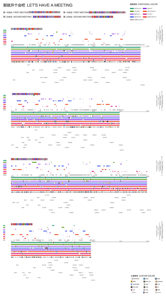 View projectAs an important online communication tool, Tencent Meeting has rapidly gained popularity and has become an indispensable part of our daily life and work. Sometimes students are nervous when giving...
 -
 View projectStorytelling with Data teaches the fundamentals of data visualization and how to communicate effectively with data. @storywithdata
 -
 View projectIn basketball, each player performs their role. Some focus more on offense, others on defense, while some support the entire team through their actions. In the "NBA Gems" visualization, the Ternary...
 -
 View projectHong Kong is a city well known for its housing and space scarcity crisis affecting all its residents. But for the migrant domestic helpers living there, their socioeconomic and citizenship status...
 -
 View projectThis special project is dedicated to the 30th anniversary of the first and only flight of the spaceship "Buran". The analysis of the flight goes into detail about the most difficult stages of the...
 -
 View projectEach square in the blanket represents data from episode of Face Jam, a podcast where hosts Michael and Jordan each rate limited edition fast food items on a scale of 1-100. Each host's rating is...
 -
 View projectCommissioned by Someone for Cancer Research UK, a data visualisation created for the cover of CRUK's 2016 Research Annual, showing the the far-reaching collaboration between scientists all across...
 -
 View projectDebris is an embroidered data visualisation of the plastic waste that washed up along beaches in different countries. Each stitch of kantha embroidery represents one piece of plastic waste that...
 -
 View projectOriginally held at Olympia in Greece between the 8th century BC and the 4th century AD, the Olympic Games returned in 1896 after a 1500 year hiatus. A few sports have been featured on every...
 -
 View projectMany drugs have been evaluated for treating patients with covid-19 at different disease severities. The resulting research has been published in enormous quantities at unprecedented speeds. To make...
 -
 View projectFashion is an industry obsessed with now and next, even the way we make and consume information. What happened in the past, and over time, might be a good indicator of what's happening now and...
 -
 View projectI created this project during a studio course for my minor study in Information Design, which also enriched my understanding of Finland and its politics. From the parliamentary election in April...
 -
 View projectCreated by Matthias Dörfelt, ‘Block Bills’ is a series of 64 banknotes generated from the Bitcoin Blockchain. Each banknote represents one block in the chain and the whole series consist of 64...
 -
 View projectThe visualization is created using Tableau software, and some design elements are created with MS PowerPoint. The Last Airbender show has always been close to my heart since childhood. ♥ This viz...
 -
 View projectThis infographic presents the complex world of animal communication in all the forms in which it is known. The visualisation put emphasis on the structural characteristics that each code has, in...
 -
 View projectNorth Korea has made steady progress in expanding its missile programme, developing weapons that can strike across the globe - or hit critical targets closer to home. New records were set for its...
 -
 View projectOnly one year of school can not only change the life of an individual, but have significant impact on the whole world, making it a better place.
 -
 View projectThe first map shows the degree of social backwardness in each state of Mexico with three indicators: illiteracy, the population over 15 years of age with incomplete basic education, and the...
 -
 View projectHarvard’s Engineering School is one of the most collaborative, interdisciplinary institutions in the country. But how do you visually communicate that idea? Harvard Engineering and The DataFace...
 -
 View projectThe final chapter in his series on the birth of globalisation by Deputy Head of Infographics for the South China Morning Post, Adolfo Arranz is the story of ‘how silver changed the world’. Using...
 -
 View projectThis visualization presents a captivating perspective on the leading 300 YouTube channels with the highest number of subscribers as of February 2023. The network diagram effectively illustrates...
 -
 View projectIn the middle of Germany is Suhl. From there, the road to Freising is not long - just three hours by car. However, considering the average age of its inhabitants, the distance could not be...
 -
 View projectThis data visualization represents the admitted patient care activity in English NHS hospitals and English NHS-commissioned activity in the independent sector during 2019-2020. This dashboard...


