Vanuatu is the riskiest country to live in, with natural disasters on average affecting more than a third of the population each year, according to the World Risk Report 2015.
Countries are...
-
 View projectBetween 2011 and 2021, Zambia's national expenditure increased by a staggering 482%. This DataViz explores this growth by sector. This viz was featured in the Tableau Conference Viz Gallery in...
 -
 View projectThe Global Peace Index interactive map visualises the Global Peace Index (GPI), a composite index that measures peace in 162 countries according to 22 indicators. The objective is to engage a...
 -
 View projectFaced with the health crisis of 2020, most countries have chosen to confine themselves, putting a sudden halt to most of their economic activities. What was the impact on the climate? Through the...
 -
 View projectIntroducing "Carbon Emission of the World," a captivating Tableau dashboard designed to shed light on the pressing issue of carbon emissions. This visually compelling and informative report offers...
 -
 View projectA visualization of the next 30 days of near Earth asteriod approaches. The bigger the circle, the bigger the asteroid. The darker the circle, the closer it will get to the Earth. You can hover...
 -
 View projectAt a time when New South Wales Police were already under immense public scrutiny, this story used the police force’s own statistics to question the efficacy and legality of its “proactive policing”...
 -
 View projectThis video imagines a future where Earth has been ravaged by wars, cyclones, food shortages, destructive weather and turned into areas of uninhabitable zones. And yet cities would still make bids...
 -
 View projectForecast is a nostalgic window that uses light and mist to experientially recreate past weather conditions for a future civilisation forced underground by climate change. Inspired by the rising...
 -
 View project'Tokyo Love Story' explores the hidden electromagnetic pulse of Tokyo's urban landscape. Through a series of audio recordings and data visualisation techniques, this exhibition transforms Tokyo's...
 -
 View projectTHE loony music video “Gangnam Style” surpassed two billion views on YouTube this week, making it the most watched clip of all time. At 4:12 minutes, that equates to more than 140m hours, or more...
 -
 View projectI love trail running. And I love data and infographics. And running the UTMB ,considered to be the holy grail among ultra runners, is on my bucketlist. So I combined all these passions in a...
 -
 View projectThis visualization was created as part of the Viz4ClimateAction initiative hosted by Tableau and TheSDGVizProject. It features 4 different visuals that walk users through the story of climate...
 -
 View projectThis interactive infographic captures the beauty and of population both at the country level and for each continent. Hovering over a country will highlight the country in the map key at the top....
 -
 View projectThe interactive dashboard helps identify the best and worst performing clients in the current period and overall. The dot-dash-plot together with the highlight table at the bottom provide an...
 -
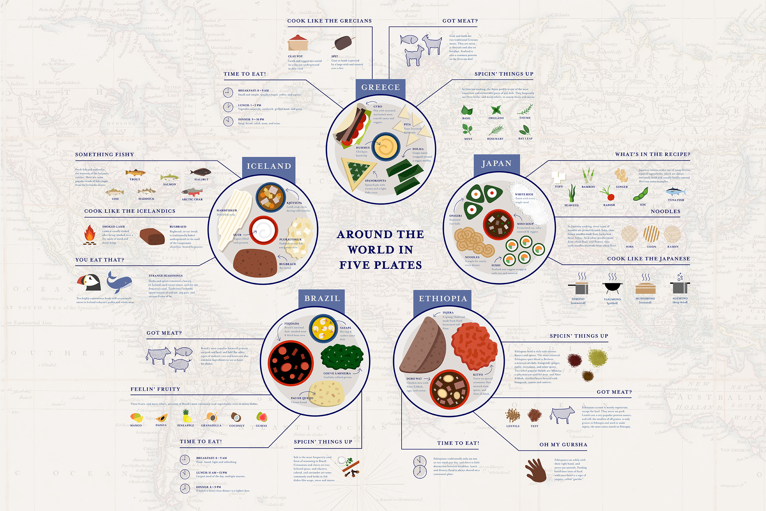
 View projectThis infographic is meant to visually portray the cuisines of 5 very different countries from around the world. Illustrations of each country's signature foods are housed on dinner plates, with...
 -
 View projectOn the 50th anniversary of Apollo 11’s moon landing, the National Aeronautic and Space Administration (NASA) is setting its sights on returning to the moon, and going far beyond. This interactive...
 -
 View projectThe first map represents the distribution of femicides in the city halls of Mexico City and municipalities of the State of Mexico registered from 2015 to 2022.The second map shows the location of...
 -
 View projectI did a survey and observed cycles in and around my college campus based on their condition if they are geared or non-geared, where they are located, whether they are locked or not and much more....
 -
 View projectA look at the 120-year history of Australian Rules Football (1897-2016). The visualization explores ladder placement for each club after the home and away season as well as premiership success.
 -
 View project
Dataviz in Perspective: teaching and professional practice of data visualization in Brazilian Design
"Dataviz in Perspective: teaching and professional practice of data visualization in Brazilian Design" is the first-ever original publication entirely dedicated to data visualization, from the... -
 View projectTo capture the toll of terror, the Los Angeles Times tracked every fatal act of terrorism around the world in April. By the end of the month, terror had struck 180 times and killed 858. The project...
 -
 View projectIdentity Theft in the US dashboard shows the number of thefts that has occured in the US from 2001 to 2017. It also shows the demographics and the states which are mostly affected. Finally it also...
 -
 View projectThe visualization, titled CO2 Emission per Capita, examines the carbon emissions per capita of the top 30 emitting countries from 1998 to 2020. Each country is represented by a bell-shaped...
 -
 View projectImmigration remains a hot-button issue in American politics—and it needs clarity. Enter the Economic Innovation Group (EIG), a bipartisan public policy organization. EIG is committed to creating a...
 -
 View projectHow long does a citizen have to work in order to afford common medicines? This data analyses the price to income ratio in each country.
 -
 View projectI am a self-taught developer learning data visualisation and the energy company I am using provide an API to get my energy usage and tariff data. However, the website of the energy company doesn't...
 -
 View projectNowadays, more and more females pay more attentions to their own body. They try different kinds of ways to lose weight, go to the gyms, try various healthy diets, even get liposuction. In response...
 -
 View projectThis visual and interactive report shows how the combination of several different types of data can be leveraged to provide a more systematic understanding of the efforts made to save lives in the...
 -
 View projectThe map centres on the North Pole with the black circle representing Earth's northern hemisphere. The dark blue represents the minimum extent of sea ice in the Arctic in 1980. The mid blue...