
How did 3000 romantic relationships fare over time? We often hear stories of how romantic relationships progress and fare from an individual standpoint, but rarely consider the behavior of these...
-
 View projectThis infographic is a chapter of a fully illustrated non-fiction book about the European Red Wood Ant. Each book chapter is a large two-sided leporello and covers a certain aspect about Wood Ants....
 -
 View project"Ailing Brussels" is an interactive story that uses open data to understand inequalities in Brussels (precarity, health & pollution). It tries to answer the question: How badly does the city...
 -
 View projectThe world needs deep and rapid cuts in CO2 emissions to keep us on track for 1.5 degrees. The G7 nations represent 40 percent of the global economic activity and a quarter of the total global...
 -
 View projectThe annual European Backpacker Index, compiled by priceoftravel.com, is designed to help money-savvy travellers find the cheapest European cities and plan an accurate budget for when they...
 -
 View projectTime appears to flow persistently forward with regularity and order and yet can also seem to expand, contract and warp. In this booklet and poster series I explore how time can be structured and...
 -
 View projectAfter Novak Djoković , the best-known portrait of the Western Balkans unfortunately remains mass unemployment. Especially among young people.
 -
 View projectConfusion matrix - in a way that is friendly to a non-technical audience (interactive, without VBA) Confusion matrix is a decision-making tool, that helps us to solve classification problems in...
 -
 View projectRecords fell on the final day of the Premier League season as newly-crowned champions Manchester City became the first team to reach 100 points. City have also set a number of other new benchmarks...
 -
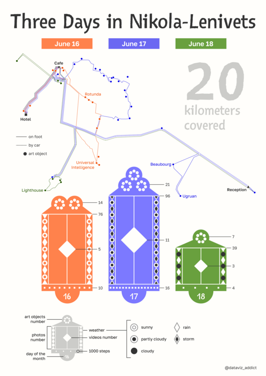 View projectThe poster is dedicated to a personal trip to an art park with landscape installations. Art objects are located in the open air, harmoniously coexisting with nature. I went to Nikola-Lenivets in...
 -
 View projectAn interactive timelapse visualises the 227,000 protesters who marched through the streets of Hong Kong on July 1. The entrant has supplied multiple files for this project: [1] [2] [3]
 -
 View projectResearch has shown that our personality can affect our income and the jobs we are suitable for. Enter your personality type to see how your personality is affecting your finances.
 -
 View projectThis print infographic captures the movement patterns of various animal species, showcasing their behaviors and migrations over time. It distills complex tracking data into an accessible format,...
 -
 View projectKochi, a bustling coastal city in the Southern part of India, grapples with a growing waste crises threatening its charm, heritage and sustainability. This project dives deep into the city’s waste...
 -
 View projectThe Bloomberg Industry Leaderboard is the data visualization component of Bloomberg's new franchise The Year Ahead. This tool compares 55 global industries and the 600 market leaders within them...
 -
 View projectTomTom is the only independent mapmaker in the world today, and has been making maps for the world’s largest technology companies, car manufacturers, fleet management organizations, city...
 -
 View projectThis map is an American snapshot; it provides an accessible visualization of geographic distribution, population density, and racial diversity of the American people in every neighborhood in...
 -
 View projectIn January 2022, Insider published a database and analysis of more than a thousand people who work for the Queen’s royal firm. There has never been a full public accounting of the employees and...
 -
 View projectWhen it comes to the new vehicles people buy in America, the story is all about light-trucks—the broad category that includes pickups, SUVs, crossovers, and minivans. As the economy gains strength...
 -
 View projectThis project represents a data art system that I made for Sony Music Entertainment to create data-driven re-imaginations of the ‘Gold record’, the record certifications plaques that celebrate...
 -
 View projectThis data visualization depicts Roger Federer's (aka "The Maestro") journey as a tennis legend. It shows his journey, statistics on various courts and levels, win percentages on serves and returns,...
 -
 View projectItalians often complain about their politicians being too old and detached. But are they really? The project allows users to explore and find out the ages of Italian Parliament members, viewing...
 -
 View projectA 2 minute video that represents some statistics from mountains around the World from Everest to Kilimanjaro.
 -
 View projectTitle: 2024 World Economic Forum Travel & Tourism Development Index: Regional Performance Trends Description: This interactive dashboard highlights the rankings and performance shifts of...
 -
 View projectThis flow visualisation allows you to follow the castaways from Australian Survivor, Season 2 through their alliances and eliminations of until there is only one 'sole survivor'. The twists and...
 -
 View projectData from a civil rights group shows that reports of hate incidents involving American mosques jumped sharply in 2015 and has remained at the same rate since — about once every three days. More...
 -
 View projectFrom the false emergency of the migrants of the climate, from the countries that host more refugees to the reasons they escape: the coordinates to orient themselves in one of the most complex...
 -
 View projectLess than half the world lives in a democracy. Democracy is on retreat globally as it suffered more reversals in 2021 based on EIU'S Democracy Index 2021 report. The percentage of the world's...
 -
 View projectThe pandemic has affected so many aspects of our lives, amplifying disparities and challenges that already existed. For far too many households simply having access to enough food to eat is a daily...
 -
 View projectHear The Blind Spot is a data sonification experience that champions greater digital inclusion for visually impaired people in Ethiopia. It tells the story of a visually-impaired young woman called...