The electoral map is many shades of Republican and Democrat—and always shifting. Which states have moved to the middle, and which are slipping out of reach for the opposition party?
-
 View projectNumber Crunch is a monthly infographic published by Private Equity International. The piece takes two forms: a print version, which is published in every issue of Private Equity International...
 -
 View projectThe US electricity system is often described as the world’s largest machine. It is also incredibly diverse, reflecting the policy preferences, needs and available natural resources of each state....
 -
 View projectWhat is the shape of networks? How do we experience network sculptures? Our goal with this project is to bring networks to life as physical objects, a testimony to their physical reality in spite...
 -
 View projectAn interactive visualisation of weather data, on a multitouch display whith haptic control elements. In this project a visualisation was created that emphasises on the cyclic nature of weather...
 -
 View projectAugust marked the happening of Pride in Amsterdam! During this event, the worldwide LGBTQ+ community, as well as all their supporters, came together in Amsterdam for 9 days to celebrate diversity,...
 -
 View projectMeet America's busiest bikes! We sifted bike share data from four cities throughout the USA - Chicago, New York, Washington and Philadelphia. Our goal was to find the busiest bike and map its...
 -
 View projectA major nationwide investigation that revealed how in seven states victims of crime who apply for victim’s compensation to help with funeral expenses, lost wages and hospital bills are rejected if...
 -
 View projectCollection of every job that was performed on the USS Enterprise in The Original Series listed by individual episodes. Main characters and the regular extra are shown with unique icons. All others...
 -
 View projectMost movies make the majority of their profits in the first few weeks after release. A nomination for the Oscars could change this dynamic dramatically, but only for some. The nomination puts...
 -
 View project"Digital design done right." Putting your users at the heart of design, to build better websites and products online.
 -
 View projectSnowlastalgia is an informational website that outlines the projected effects of climate change on downhill skiing. ”Snowlastalgia” is inspired by the term “solastalgia”, which combines the...
 -
 View projectCan sound and visuals be used in tandem to accurately convey what chronic migraines feel like to someone who has never had the experience? What can a migraine look like? Sound like? Is there a...
 -
 View projectA compelling narrative created for Civic Influencers, an NGO, to showcase the potential impact of American youths’ interest in and access to votership, highlighting to both donors and students the...
 -
 View projectDuring my first semester at Parsons, I took a course called “Major Studio 1” taught by Daniel Sauter. This course explored the fundamentals of data visualization programming tools, “historic and...
 -
 View projectDeciding where to live in one of the most diverse states in the nation is no easy task. “The best town in N.J. … for you!” helps readers find their new hometowns through a variety of factors. The...
 -
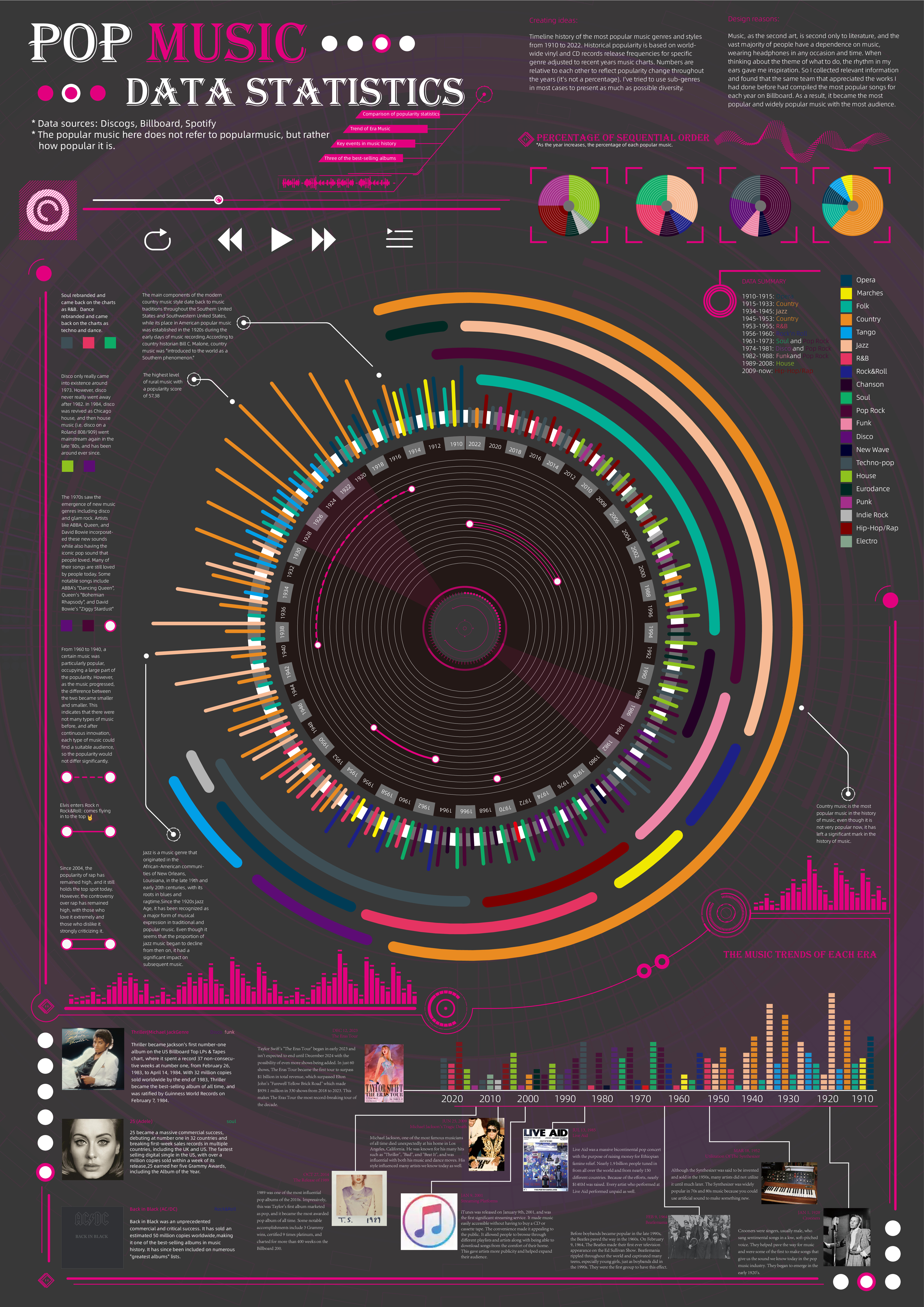
 View projectTimeline history of the most popular music genres and stylesfrom 1910 to 2022.Historical popularityis based on world-wide vinyl and CD records release frequencies for specificgenre adjusted to...
 -
View projectThis is a visualization of the Forbes world billionaires list for 2022. I also brought in historical data to show the growth of the wealthiest billionaires. This was all completed within Excel...
-
 View projectWe analyzed daily top 50 Mandarin music charts from Taiwan’s largest streaming platform, KKBOX, spanning from 2005 to the present, to showcase two decades of shifts in Taiwanese pop music. From the...
 -
 View project"Who is My Neta?" is a dashboard for India's 2024 general elections that helps voters access comprehensive information about their representatives. By combining parliamentary performance data with...
 -
 View projectThe male workforce generally represents the mainstream, while the female workforce is often overlooked and invisible, but it is also a very important force in society that cannot be...
 -
 View projectThe digits of Pi are assigned mass and placed uniformly around a circle. The simulation calculates the gravitational forces between all mass pairs and moves the masses accordingly. When masses...
 -
 View projectThe purpose of this project is to represent and explain data quickly and effectively in a visual and interactive way that represents and tells a story about one particular aspect of Johannesburg....
 -
 View projectThis story investigated and explained sanctions during the beginning of the 2022 Russian invasion of Ukraine, especially why certain individuals/entities were not sanctioned over their critical...
 -
 View projectMangrove forests are one of the most productive marine ecosystems in tropical and subtropical coastal areas. They have the characteristics of both terrestrial and marine ecosystems and are also...
 -
 View projectThink of all the things you observe during the day. How much time do you take to actually stop and notice them? There is so much data in our environments, sometimes it just takes a moment of pause...
 -
 View projectDisplayed on touchscreens and mobiles at HP Discover Las Vegas, HP What Matters uses data visualization to showcase the results of a survey of 3 500 IT executives.
 -
 View projectDear Judges: Former special counsel Robert Mueller made it clear after releasing his report on Russian interference in the 2016 election that he wouldn't have more to say on the topic beyond the...
 -
 View projectWith increasingly sophisticated data available, major league hitters are focusing on getting the ball in the air.