AtF Spark is a font that allows for the combination of text and visual data to show an idea and evidence in one headline. Sparklines are currently available as plugins or javascript elements. By...
-
 View projectInteractive visualization of Winter Olympic medals by Country, year, gender, sport and medal. Slice and dice data in multiple ways to discover insights, and find details on particular countries.
 -
 View projectHow's the Italian football? What are the numbers of the system? An in depth look at the football economy through the rigorous study of Niccolò Donna, Gianfranco Teotino and Michele Uva. All served...
 -
 View projectInsider asked thousands of "Game of Thrones" fans to vote for the best characters and performances on HBO's hit series using two simple matchup generators and asking readers on social media to...
 -
 View projectAn exploration of the impact of COVID-19 on the stock market a few months into the pandemic. The visualization looks at various industries which were impacted, both negatively and positively,...
 -
 View project‘How cities are governed’ is an interactive visualisation which presents the results of the global Urban Governance Survey undertaken by LSE Cities in partnership with UN Habitat and UCLG...
 -
 View projectAt a time where the internet continues to distort our perception of truth, our trust in the content we consume online is diminishing. Data Obscura is our response to this current and pressing quest...
 -
 View projectThis project maps war dead recoded by the Commonwealth War Graves Commission during the First World War. It's an attempt to quantify the price of the conflict and equate the scale to a contemporary...
 -
 View projectOutrage|Us is a visualization tool that uses machine learning to identify, measure, track and contextualize anger and hate speech on Twitter.
 -
 View projectThis was a data-driven story created in collaboration with Birdlife International and the Spoon-billed Sandpiper Task Force. It portrays how the conservation of migratory birds, which travel...
 -
 View projectThe best solutions to climate change also come from the most ordinary places. In collaboration with Voilà:, the Canadian Climate Institute has developed a new report on the impact of today’s...
 -
 View projectI created this collection in honor of Albert Einstein who was born on pi day in 1879. That is why I chose to visualize the first 1879 digits of pi through circles and squares. This is my first...
 -
 View projectThe Rafa Nadal museum asked us to adapt an infographic that we made about Rafa Nadal's career in the Mundo Deportivo newspaper. The size of the infographic is 3 meters high by 18 meters wide, you...
 -
 View projectDelhi, the capital of India, is a vibrant and diverse metropolis that has a rich cultural heritage. Its culture is a beautiful blend of historic traditions, modern influences, and a melting pot of...
 -
 View projectThis microsite is an accessible introduction to a historically inaccessible topic: city budgets. The tool allows visitors to learn about the Houston budget, build their own, and then share their...
 -
 View projectThis interactive dashboard shows the differences between Afrobeat and Afrobeats (The music styles from West Africa) , most people often think both are referring to the same type of music and they...
 -
 View projectThis project visualizes each play of the 2024 College Football National Championship game, showing how Michigan's victory over Washington developed and highlighting scoring plays. This project uses...
 -
 View projectSlow Down visualizes locations of traffic crash fatalities of pedestrians, bike riders, and drivers that occurred in New York City from 2010 to 2017. It takes a unique physical form with powerful...
 -
 View projectVanuatu is the riskiest country to live in, with natural disasters on average affecting more than a third of the population each year, according to the World Risk Report 2015. Countries are...
 -
 View projectThe Global Peace Index interactive map visualises the Global Peace Index (GPI), a composite index that measures peace in 162 countries according to 22 indicators. The objective is to engage a...
 -
 View projectAt a time when New South Wales Police were already under immense public scrutiny, this story used the police force’s own statistics to question the efficacy and legality of its “proactive policing”...
 -
 View projectThis video imagines a future where Earth has been ravaged by wars, cyclones, food shortages, destructive weather and turned into areas of uninhabitable zones. And yet cities would still make bids...
 -
 View projectForecast is a nostalgic window that uses light and mist to experientially recreate past weather conditions for a future civilisation forced underground by climate change. Inspired by the rising...
 -
 View project'Tokyo Love Story' explores the hidden electromagnetic pulse of Tokyo's urban landscape. Through a series of audio recordings and data visualisation techniques, this exhibition transforms Tokyo's...
 -
 View projectTHE loony music video “Gangnam Style” surpassed two billion views on YouTube this week, making it the most watched clip of all time. At 4:12 minutes, that equates to more than 140m hours, or more...
 -
 View projectI love trail running. And I love data and infographics. And running the UTMB ,considered to be the holy grail among ultra runners, is on my bucketlist. So I combined all these passions in a...
 -
 View projectThis visualization was created as part of the Viz4ClimateAction initiative hosted by Tableau and TheSDGVizProject. It features 4 different visuals that walk users through the story of climate...
 -
 View projectThe interactive dashboard helps identify the best and worst performing clients in the current period and overall. The dot-dash-plot together with the highlight table at the bottom provide an...
 -
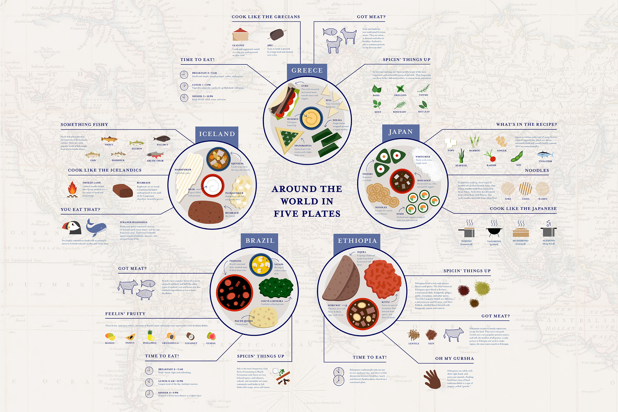
 View projectThis infographic is meant to visually portray the cuisines of 5 very different countries from around the world. Illustrations of each country's signature foods are housed on dinner plates, with...
 -
 View projectOn the 50th anniversary of Apollo 11’s moon landing, the National Aeronautic and Space Administration (NASA) is setting its sights on returning to the moon, and going far beyond. This interactive...