
Dear Judges:
More than six million people visited the Grand Canyon National Park in 2018. In 2019 people kept coming, undeterred by the three deaths in the first three months of the year. Since...
-
 View projectThis study explores the relationship between human communities and natural ecosystems, focusing on what happens when they intersect. We aim to understand how conflicts and losses are seen and...
 -
 View projectIn the 21st century, people are creating more than 2.5 terabytes of data every day. Complex and large amounts of data are difficult to understand and develop a sense of distance. As data...
 -
 View projectWelcome to the whimsical world of Taylor Swift, where melodies weave tales of love, heartache, and self-discovery. Take a journey through the eras using Spotify's song attributes, and discover...
 -
 View projectInspired by the polygon aesthetic of Pasquale D’Silvia's Trianimals & Bryan James’ Species in Pieces, this visualization creates animal images programmatically (in pure code), without...
 -
 View projectThis infographic is deeply personal, reflecting my Indigenous cultural background, my profound empathy for marginalized communities, and my commitment to healing through design. Inspired by my...
 -
 View projectLast month, the Obama administration announced an eye-popping $38 billion security assistance deal with the Israelis, to be disbursed over ten years starting in 2019. That caught us off-guard. It...
 -
 View projectAn artistic point by point depiction of the 2023 Men's Wimbledon Final. Each set forms a row of games that are made to look like tennis balls by the white line running through the middle. The line...
 -
 View projectEveryday is a World Day of something. These special days pass through a wide variety of subjects : scourges, diseases, society trends, consumption habits... Sometimes serious or harsh and sometimes...
 -
 View project此次作品的主题是“诺贝尔历年得主”,通过在诺贝尔官方网站上的信息资料的搜集,整理出了化学、物理、医学或生理的历年来获奖者,进行可视化处理,使这些信息有效地呈现上这幅作品里。在作品中,得以看到获奖者性别、寿命、项目的研究时长等信息,对于我们了解诺贝尔奖,走进诺贝尔得主,是一次有意味地探寻。
 -
 View projectInfographics made on the basis of a study conducted by Siemens. A coefficient of urban ecology is composed from a combination of eight parameters.
 -
 View projectThrough this visualization, we present a distinct perspective on the evolving landscape of space launches across different eras. The visualizations illustrate countries' advancements in launching...
 -
 View projectThe need for community is fundamental to being human. But in the recent past, alongside the rise of the internet, the nature of many communities has changed as community as a service has emerged as...
 -
 View projectAcross the relationship that exists between the brain and human emotions, there is a spectrum that goes beyond the tangible; To explore it, we present this project with the aim of breaking down the...
 -
 View projectThis visualisation shows the linguistic diversity of the Arctic, focusing on the main language families, using data from the Arctic Indigenous Peoples Languages and Revitalization project. I chose...
 -
 View projectThe Hostages: A Visual Representation of Time, Status, and Connections. This interactive visualization presents the hostages through silhouettes that reflect their gender and age. The background...
 -
 View projectThe project is an attempt to remember the massacre of Rabaa, Cairo, Egypt. August 2013. This data visualisation is made to be created by users using fusible plastic beads as a way to make users...
 -
 View projectTableau can help anyone see and understand their data. Connect to almost any database, drag and drop to create visualizations, and share with a click. @tableau
 -
 View projectHere’s a look at every single song that has reached the Hot 100, stretching back to 1958. Each tiny rectangle denotes a different song. The larger the rectangle, the longer the song stayed on the...
 -
 View projectPagodas were introduced to China with Buddhism in the late Eastern Han Dynasty. They have changed significantly in form, structure, material, layout, and function over a long...
 -
 View projectWhat will really increase your average life expectancy and lifespan? Why do women live longer than men? What’s the best method of life extension? Diet and exercise? Or polygamy and pets? Let the...
 -
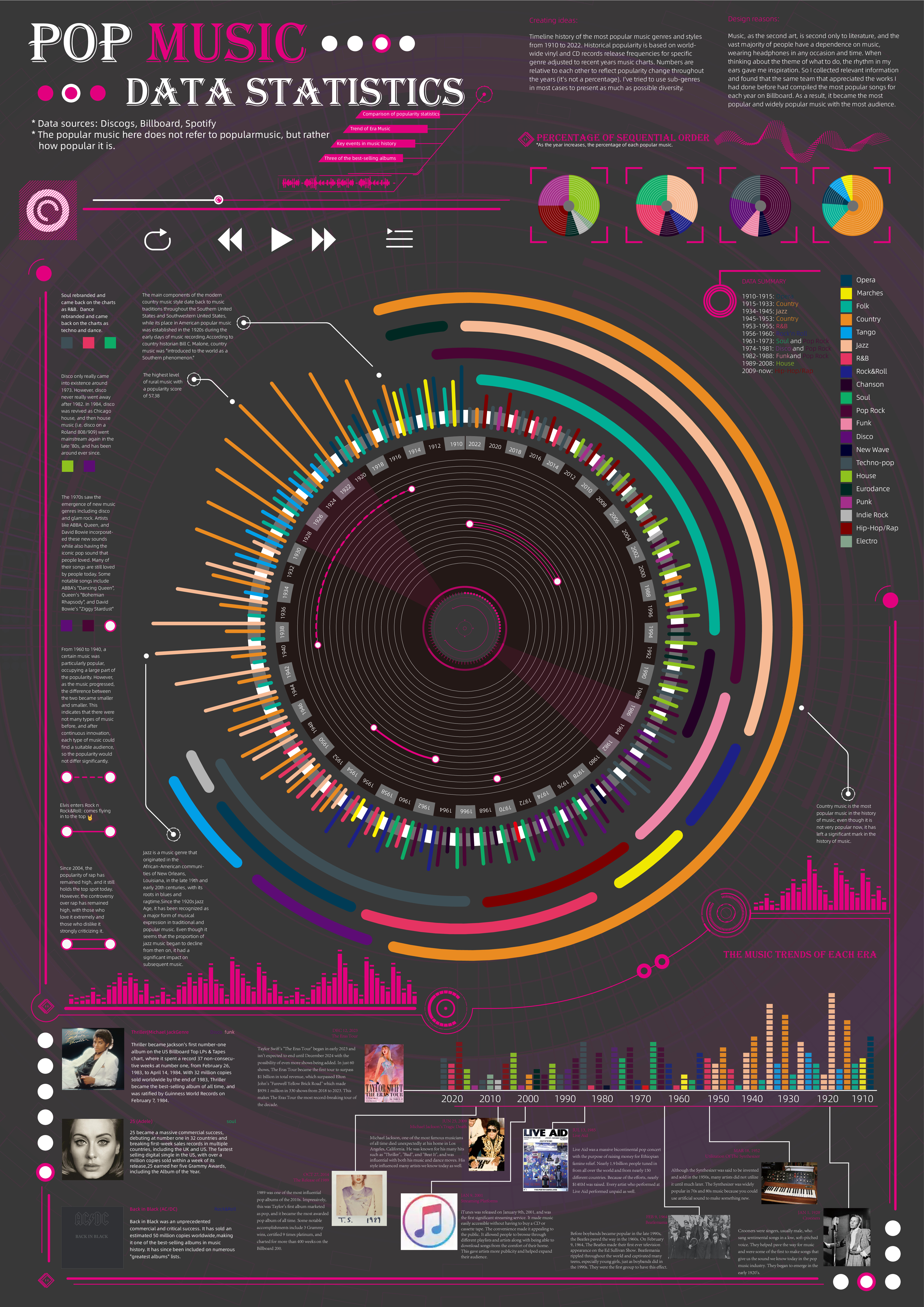
 View projectTimeline history of the most popular music genres and stylesfrom 1910 to 2022.Historical popularityis based on world-wide vinyl and CD records release frequencies for specificgenre adjusted to...
 -
 View projectThe visualization is created using Tableau software, and some design elements are created with MS PowerPoint and Photoshop. The viz conveys a detailed analysis of the chemical composition of...
 -
 View projectThis visualization explores global internet usage trends, categorizing countries by income groups and regions. Drawing on data from 2003 to 2022, it highlights the percentage of the population...
 -
 View projectNBA Jam was an arcade game developed by Midway in 1993. It was a 2 on 2 basketball game using real teams and player likenesses from the NBA. The game featured players that could jump ten feet high...
 -
 View projectLandmarks on Venus are named after famous women or goddesses. I made a topographic map introducing the woman behind each name. You can find the full-size map here.
 -
 View projectThe visualization is created using Tableau software and some of the design elements are created with MS PowerPoint. The viz represents the recent trends of refugees migrating to the U.S from around...


