A map that visualizes at the percentage of population with acess to broadband internet alongside the number of primary care physicians per capita for each county in 50 states and the District of...
-
 View projectOur World in Data publish yearly stats on energy usage by country and energy source type (https://github.com/owid/energy-data), and this makes for an intimidating dataset on an increasingly urgent...
 -
 View projectFor at least 9,000 years agaves have been an integral part of Mesoamerican culture, identity, and tradition, supporting rural communities and healthy ecosystems. In Mexico today, intensive farming...
 -
 View projectLinear algebra and matrix computations are often presented in math class as an array of inane formulas and calculations to drill and memorize. This explorable explainer attempts to present a deeper...
 -
 View projectThe Global Burden of Disease (GBD) study offers a comprehensive overview of pressing societal issues of mortality and disability on a global scale, encompassing 204 different countries. It...
 -
 View projectWhen Tutankhamun died, objects specially crafted for the burial and heirlooms from his predecessors went with him to the grave. All were believed to accompany the pharaoh to a comfortable...
 -
 View projectReuters documented and analysed more than 10,000 aftershocks that struck southern Turkey and northwest Syria in the weeks after the two massive earthquakes in February. The team were able to...
 -
 View projectHow will »prompting« change the way we experience the world? Artificial Worldviews inquired GPT-3.5 about its knowledge of the world in 1.764 prompts and mapped out the results. The advent of...
 -
 View projectThe dashboard serves to illustrate the trends and attributes of blood donor activity in Malaysia. The availability of an ample supply of blood is of importance for the efficient functioning of the...
 -
 View projectI'm very interested in the memory of the Web. I'm fascinated by the fact that millions of sites and pages created in the 2000s simply don't exist today. They've been erased from the Web's surface....
 -
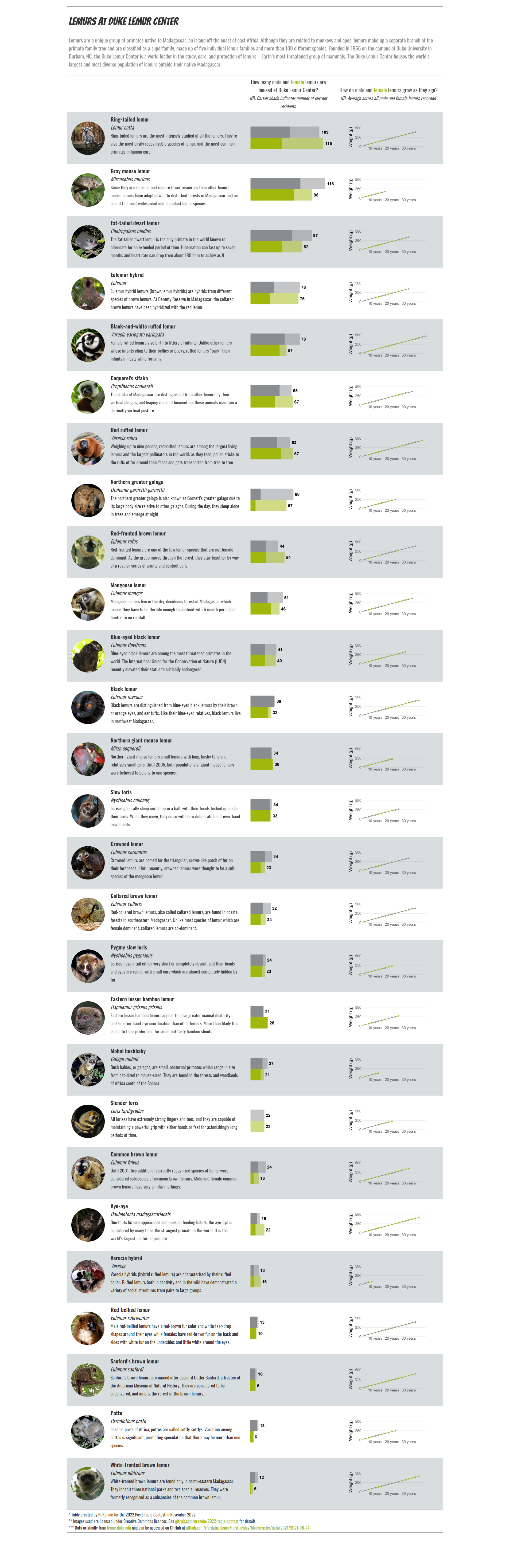
 View projectDuke Lemur Center houses several hundred lemurs, many of them endangered species. This table explores of 27 of the species of lemur that have been housed there, showing the number of males and...
 -
 View projectOn April 14th, 2003, the Human Genome Project announced the successful sequencing of approximately 20,000 human genes. Since then, genomics has profoundly impacted public health. Despite the...
 -
 View projectOne of the societal challenges in high-income countries (HICs) is fertility decline below replacement level, driven by increasing childlessness (Zeman et al. 2018). For example, in Southern Europe...
 -
 View projectNowadays, the term artificial intelligence is not new to anybody. “Intelligent“ devices and algorithms are everywhere – as digital assistants or chatbots, for example. The notion, that an algorithm...
 -
 View projectI developed this data visualization to highlight the 20-year gap in life expectancy across regions - a phenomenon the United States hasn't experienced in nearly 50 years. I wanted to show the...
 -
 View projectThe Gender Diamond and Gender Flower are two interactive visualizations of the gender spectrum that suggest a mathematical datafication of nonconforming gender identities and sexualities. With...
 -
 View projectAll the main streets in (maybe) your city! Video: https://youtu.be/mSxhXsTijqE #QGIS #Threejs #WebGL #shaders #maps #harta #OpenSource #OSM #romania #3D #rute #routes #streets #strazi #city...
 -
View projectThe work "space rocket - way to the moon" deals with the research question of how technically abstract and complex content can be made accessible with the help of targeted group-specific design...
-
 View projectAtlas is a data visualization catalog inspired by the groundbreaking work of William Playfair and his "The Commercial and Political Atlas," published in 1786. While chart catalogs aren't new, what...
 -
 View project
UFOs in the USA: Mapping Decades of sightings with Location, Trends, Shapes, and Witness Testimonies
Unidentified Flying Objects (UFOs) have been a topic of fascination and controversy for decades. With the advancements in technology, more and more sightings are being reported and documented... -
 View projectOpenFlights Airports Database contains over 10,000 airports, train stations and ferry terminals spanning the globe. Feel free to query all airports on this map. Video:...
 -
 View projectLiquid Gold was built for this year’s World Breastfeeding Week. World Breastfeeding Week runs annually in August and is designed to bring awareness to breastfeeding and its benefits and the...
 -
 View projectConfusion matrix - in a way that is friendly to a non-technical audience (interactive, without VBA) Confusion matrix is a decision-making tool, that helps us to solve classification problems in...
 -
 View projectThis visual, created by a cross-functional team across EVERSANA, is a dashboard constructed in tableau that comprises dozens of sheets that have been assembled to provide an audience a complete...
 -
 View projectBROMACKER project combines paleo research and science communication at the excavation site in the UNESCO Geopark Thuringia Inselsberg - Drei Gleichen, at the Museum für Naturkunde Berlin, at the...
 -
 View projectAlong with innovative scientific discoveries, the way in which these are depicted also requires a development in line with the times. Overgrown Tree - Evolution of Evolutionary Thinking is an...
 -
 View projectHappiness is a deeply personal experience, yet everyone pursues happiness. Growing up in Beijing and living across the globe sparked my curiosity about the ways different cultures perceive and live...
 -
 View projectSome animals live for spans once thought impossible, others die off fast, and a handful appear to age hardly at all. The bowhead whale, for example, can survive more than 200 years despite the risk...
 -
 View projectAs a key figure in the IPCC Synthesis Report, Figure SPM1, panel c, captured global media attention and inspired many related visualizations. Figure SPM1c breaks new ground for IPCC as it ties...
 -
 View project"But what about protein?" is perhaps one of the most frequently asked questions to vegetarians. The doubt arises from the simple view - surrounded by problems - that meat and eggs are the main...