
Independent scientists from academia and government considered the research on red meat for six months before meeting for a week in Lyon, France, to render a decision. The panel included...
-
 View projectThe US holds only 5% of the world’s population but 25% of the world’s prisoners. Was it the war on drugs? Mandatory minimums? How we got here – the global leader in incarceration – is one of the...
 -
 View projectThe information graphic for the Burckhardt+Partner agenda shows 116 projects in the first quarter 2015. Size and colours give an insight into project volumes and the varied compositions of the...
 -
 View projectWith this Data Visualization, created exclusively for the competition, I wanted to offer a way to understand terrorist phenomena around Europe, in order to have a clearer vision about policies of...
 -
 View projectImagine having to explore, compare, and organize hundreds to thousands of small regions in one or more large images or visualizations. For example, how would you assess the typical look and...
 -
 View projectA visual story going over on some common dishes frequently consumed during Lunar New Year in Taiwan and related symbolisms. One of the many hallmarks of this 16-day celebration is the feasting...
 -
 View projectThe Standing Rock Sioux are inspiring the world with their resistance against the pipeline. But it’s not just Big Oil and Gas that they’re opposing.
 -
 View projectThis visualization tracks all of the off-season movements of NFL Players. The interior section shows players that moved from one team to another. The exterior section, shows players that were...
 -
 View projectWe are all familiar with the layout of the long-standing Periodic table, as well as the distribution of its constituent elements, but who discovered them, and when? 2019 was named the...
 -
 View projectArchivo Khoka visualizes information about the coca plant and offers spatial, temporal, and semantic experiences that explore the knowledge emerging from this plant, which has a rich history and...
 -
 View projectDiese Datenplastik liefert eine Fülle von EIGENSCHAFTEN - sie ist impactful durch ihre Körperlichkeit und Nachhaltigkeit - sie ist klar im Sinne leichter Interpretierbarkeit ( aufgedruckte...
 -
 View projectData visualization project for Al Majalla magazine, published in September 2024. This visualization consists of five data sets, each presented in a dynamic and organic way. The design aimed to...
 -
 View projectSocialMap is an interactive platform that aggregates public data on education, health, and security in Brazil in one accessible place. Designed for both policymakers and the general public, it...
 -
 View projectThe Big Mac Index was invented by The Economist in 1986 as a lighthearted guide to whether currencies are at their "correct" level, based on the idea of purchasing-power parity. Since then,...
 -
 View projectThe Dalai Lama asked Paul Ekman and Stamen Design to design him an Atlas of Emotions. This online interactive project visualizes what science knows about emotions, emotional states, triggers,...
 -
 View projectAfter Hawaii’s worst wildfire killed scores of people in August 2023, local and federal agencies were reckoning with the toxic chemicals created when a built environment burns. Reuters visually...
 -
 View projectA blockchain is a database that is shared across a network of computers. Once a record has been added to the chain it is very difficult to change. To ensure all the copies of the database are...
 -
 View projectThis project visualizes the HSBC World Rugby SVNS 2024/2025 Men’s Standings after the Dubai and Cape Town events, using R (ggplot2) and Figma. The radial bar chart represents accumulated points for...
 -
 View projectTo celebrate the 50th anniversary of the most giant leap for mankind, we visualise all the missions to the Moon.
 -
 View projectThere were some graphics going around that showed the total amount of time spent during an average person’s lifetime doing things. The numbers were pretty rough though. For example, to calculate...
 -
 View projectCyberattacks are increasingly threatening industries and sectors in the wake of the Covid-19 pandemic. The consequences of cyberattacks can be severe and lasting, causing disruptions to the supply...
 -
 View projectKobe Bryant's 30,699th and final field goal came from 19 feet with 31 seconds left against the Utah Jazz. During his 20 years with the Lakers, he fired up more than 30,000 shots, including the...
 -
 View projectThe Star Wars movie universe is one of the most successful franchises of all time and a multigenerational classic. These films are loved by millions of dedicated fans and have been an iconic symbol...
 -
 View projectData Dance Movement is a response to Asian hate incidents and bystander intervention mainly related to Covid-19. In this design research project, I collected qualitative information through...
 -
 View projectThe 2012 Xylem Value of Water Index is a nationwide poll of American voters detailing what they think should be done about the country's water crisis and who should pay for it. The key findings of...
 -
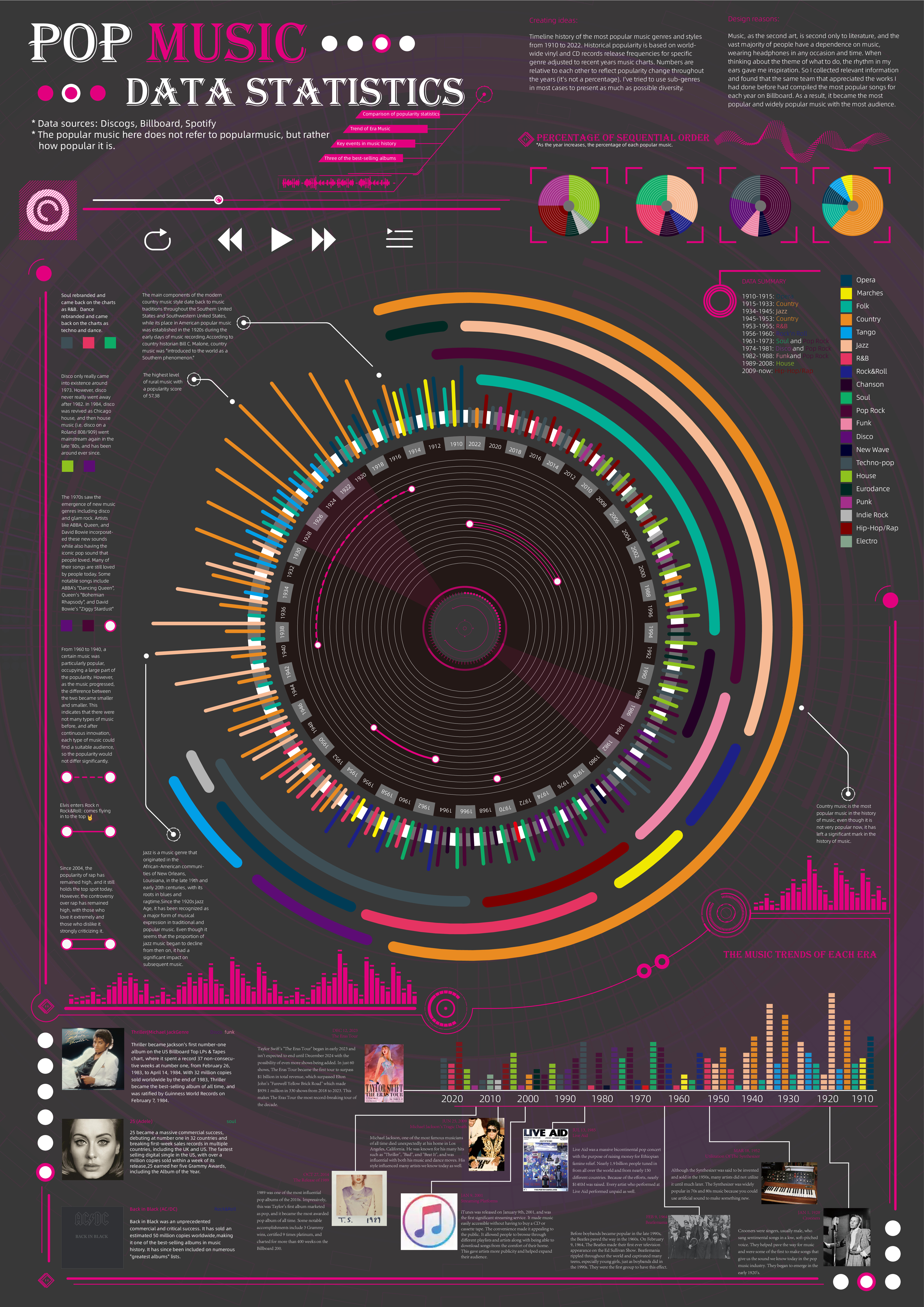
 View projectTimeline history of the most popular music genres and stylesfrom 1910 to 2022.Historical popularityis based on world-wide vinyl and CD records release frequencies for specificgenre adjusted to...
 -
 View projectWhen it comes to sand mining, the Singapore government is often closed to scrutiny. As a result, it is often cast as a villain, guzzling sand from its neighbours while it grows bigger through...
 -
 View projectThis infographic provides a clear overview of the 2024 EU elections across all 27 member states. It highlights key details such as election dates, the number of MEPs to be elected, voting rules for...
 -
 View projectStar Wars Colors is a data visualization about the physical traits and basic information of the Star Wars characters, which were represented as a card game of Lightsabers. This dataviz has a data...
