
This visualization was designed to look like a desk at the Dunder Mifflin Paper Company, the main location of the hit tv show "The Office". The visualization is presented from the perspective of...
-
 View projectSir Donald Bradman was an Australian international cricketer, widely acknowledged as the greatest batsman of all time. In terms of numbers, Bradman's achievements are so staggering that many of...
 -
 View projectA year-long project featuring a friendly monthly competition between two data professionals. This project involves community participation and an opportunity to learn and experiment.
 -
 View projectThis datavisualisation traces the use of different colours in lego sets, from the first set to today. It is built using R, with an aesthetic that a lego brick sculpture. The emergence of different...
 -
 View projectThe artwork shows the satellites launched from 2003 to 2015. It represents the type of institutions that were focused on projects and the nation that financed them. On the left it is shown the...
 -
 View projectThe map of America’s gun violence epidemic can seem overwhelming. There were more than 13,000 gun homicides in the US in 2015, across nearly 3,500 cities and towns. But the toll of this gun...
 -
 View projectThe grooming culture in the Arab world goes back centuries. Harem existed for women to gather away from the sight of men and exchange information, stories, jokes, and experiences. Some rituals...
 -
 View projectThis visualization tracks all of the off-season movements of NFL Players. The interior section shows players that moved from one team to another. The exterior section, shows players that were...
 -
 View projectAs a result of the increase of online population and connected technologies in daily life, an unprecedented amount of personal data is being generated and collected. The visualization explains the...
 -
 View projectVisualising the National Football Soccer League of Costa Rica for the Summer Tournament 2015. The 12 First Division clubs had varied objectives: win the title, make decent progress or simply avoid...
 -
 View projectClimate Central's flagship sea level project, two years in the making, allows users to search or navigate interactive maps to see areas below different amounts of sea level rise and flooding — down...
 -
 View projectTemperature scarves are great, of course, but what about a fan scarf that displays the results of all official matches of a football club for a season? To bring my idea to life, as a PFC CSKA...
 -
 View projectPeople spend on average a third of their lives sleeping. During this time, a multitude of processes take place inside the body, which people are often not even aware of. One of the most complex...
 -
 View projectIn 2014, I researched the musical origin of the word “shorty.” Turns out that Too $hort was the first to rap it and Lil Jon coined the southern-drawled “shawty.” Shorty wasn’t pervasive,...
 -
 View projectThis minimal business dashboard, designed in a dark mode aesthetic, showcases the analysis of month-to-date and year-to-date cost expenditures within a company across various spending categories...
 -
 View projectWhat are satellites used for, who owns them and where do they orbit the Earth? Satellite Explorer is a web application that answers these questions by providing a visualization of the active...
 -
 View projectThe Dates in a Life Waking Project 2020 is a year-long painting project documenting the number of steps I walk each day. I prefer to walk for exercise, as time permits, outside in addition to...
 -
 View projectThis piece makes a case for why Brett Kavanaugh's nomination is important and might be the most lasting effect of Donald Trump's presidency. It starts with an explanation of the Supreme Court...
 -
 View projectExplore 7 years of my music listening data, which visualizes different aspects of my listening habits and music qualities over time. Click through the visualization to discover how my taste has...
 -
 View projectKowloon Walled City, located not far from the former Kai Tak Airport in Hong Kong, was a remarkable high-rise squatter camp that by the 1980s had 50,000 residents. A historical accident of colonial...
 -
 View projectData visualization project for Al Majalla magazine, May 2024. This project highlights key insights about the social network X, featuring a central Bubble Chart as the main visual focus....
 -
 View projectCollaborating with Ludovic Tavernier, Klaus Schulte shares this data-driven story of how he — and the rest of Germany — was introduced to tennis great Boris Becker. The project visualizes Becker's...
 -
 View projectAccess to adequate health care is crucial to social and economic development, as healthy human capital fosters productivity and economic growth. This scrollytelling interactive tracks global...
 -
 View projectChai is the heartbeat of India. But how did this drink become a national obsession? This map-based story narrates its journey through cartography.
 -
 View projectAn exploration of search patterns during election years. More information: https://truth-and-beauty.net/projects/waves-of-interest
 -
 View projectObjectives Covid and Monkeypox have made it clear, CDC must tell the data story as it unfolds with interactive visualizations that are mobile-friendly, high-traffic ready, user-tested, and...
 -
 View projectImmagine Sonora is a flexible visual system that maps temporal patterns in Spotify music streaming behaviours. It reveals when, throughout the year, people listen to music using real streaming...
 -
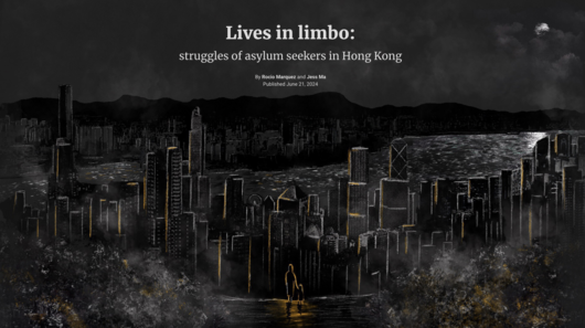 View projectThe article on the asylum situation in Hong Kong was crafted with the intent of shedding light on the struggles faced by asylum seekers in the city. By sharing personal accounts, it seeks to evoke...
 -
 View projectEvery day, millions of people check in on Foursquare. We took a year's worth of check-ins in London, Chicago and Istanbul and plotted them on a map. Each dot represents a single check-in, while the...
 -
 View projectThe project is a visual representation of the world, seen through the eyes of a pilot. The map has been inspired by Vanhoenacker's book "Skyfaring". On the map are indicated the airports and the...