人的情绪波动与脑电波有一定联系,该作品尝试通过对实验者的行为进行数据捉取,将行为数据与脑电波图形匹配,最终让实验者推动被程序设定的漏斗,所形成的图形即是情绪化脑电波的数据可视化呈现。实验过程中发现不同的人,相似情绪的脑电波图形是相近的,作品力求通过陌生人的相似图形建立起不同人的交流桥梁,近而探索陌生人情感表达通过可视化手段拉近彼此距离的可能性。
The emotion...
-
 View projectThe infosphere* relies on an intricate network of signals, wired and wireless, that support it. We are completely surrounded by an invisible system of data cables and radio signals from access...
 -
 View projectRefugee Flow gathers data from multiple reliable sources to construct a compelling account on how persons become refugees. This project examines one of the direct fundamental causes of the global...
 -
 View projectAn interactive analysis revealing how the Star Wars trailers frequently repeat scenes while parsing out bits of new material to generate attention.
 -
 View projectTop Models DNA is an anthropological comparison of 96 famous famale fashion models considering their body features and origins.
 -
 View projectThe next five years of Chinese leadership lie in the hands of the 20th Party Congress of the Chinese Communist Party (CCP). This nuanced political system is built on a dizzying array of connections...
 -
 View projectIn the midst of the digital age, we have more information than ever before, information that is generated at an unprecedented speed. Globally, every second 6,000 tweets, 740,000 WhatsApp messages...
 -
 View projectHillary Clinton surpassed Donald Trump by more than 2 million votes, but lost the electoral college 306 to 232. In raw votes, it was the largest popular-vote lead in history for a candidate who...
 -
 View projectThe Data Futures Exchange (DFx) is a global resource to empower decision-makers with state-of-the-art data and insights for a transformative impact. An open-source data innovation, the DFx connects...
 -
 View projectThis sculptural data visualization generated from the forces of wind is an exploration in new media art centered around the concept of creating tangible artifacts from intangible forces.
 -
 View projectGerrymandering is having a moment. A number of cases concerning the fairness of district maps have been heard in both state and federal court over the past year. But although district boundaries...
 -
 View projectLeicester have won the Premier League. But how did they do it and how does their success differ from other winners across the continent?
 -
 View projectParticles and fragments of light slip by in a stream of time and space to portray the compelling experience of driving. »Porsche BlackBox« reimagines this connection by visualizing racing data as...
 -
 View projectOne passionate entomologist poetically describes and ranks over 70 species' painful stings.
 -
 View project"Dumped" is a data-driven art exhibition concept that delves into the stark reality of Europe's plastic waste and its global impact, unraveling the dynamics of 'waste colonialism' and the...
 -
 View projectArticle 19’s Expression Agenda metric reveals the state of freedom of expression internationally. The metric examines 350 aspects of democracy in 172 countries to provide an analysis that captures...
 -
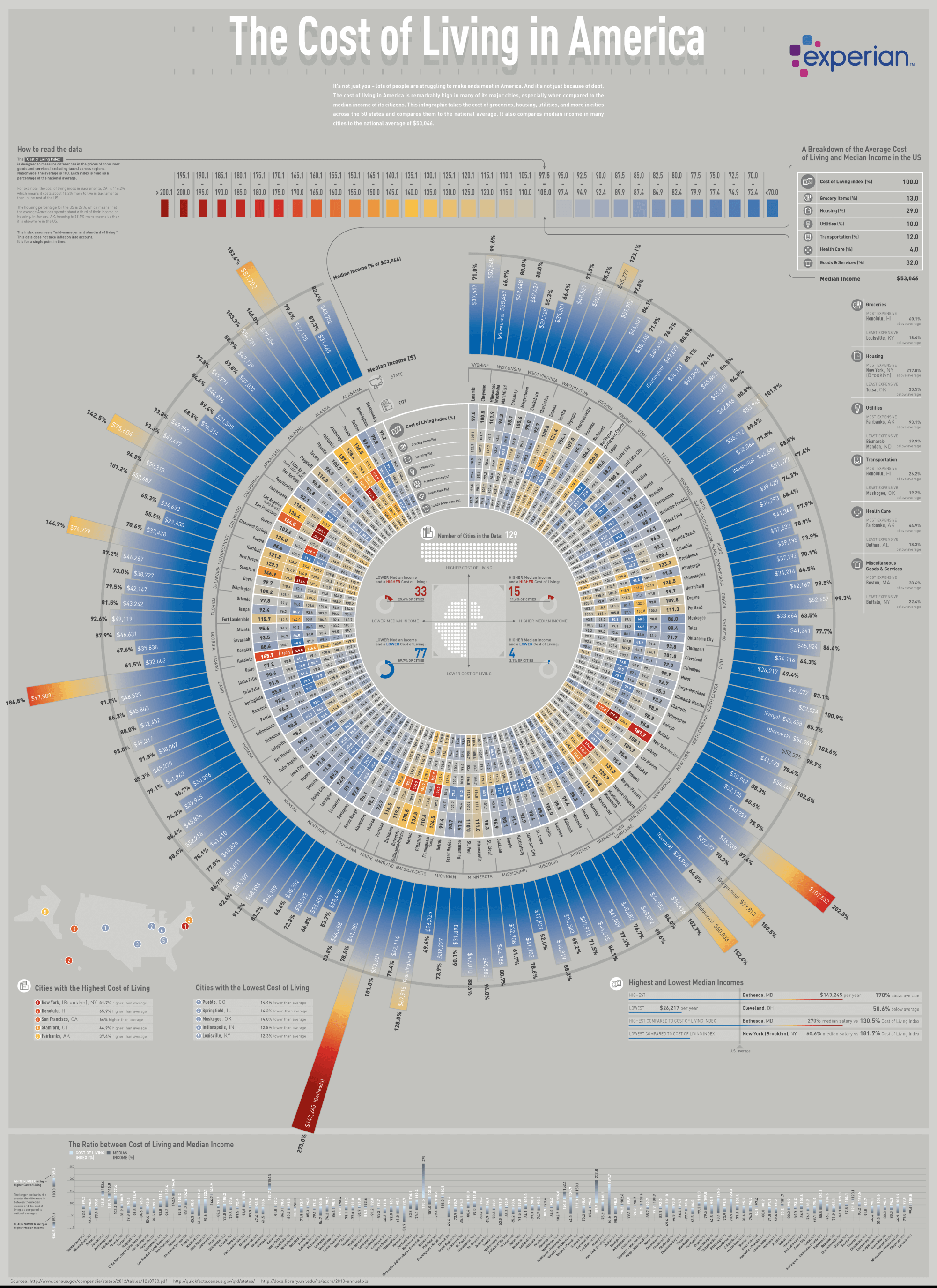
 View projectMany people are struggling to make ends meet in America. And it's not just because of debt. The cost of living in America is remarkably high in many of its major cities, especially when...
 -
 View projectThe Unspoken Project is comprised of two main deliverables—a publication piece, and an abridged data visualization—which address how the historical evolution of hidden symbols and signalling among...
 -
 View projectSportivity Index is a survey made by Clas-PTS Group and published by Il Sole 24 Ore. For the 2018 edition for the first time we made a strong effort on the web side (the survey has been published...
 -
 View projectFor the December 2016 print issue, Scientific American asked Accurat Studio to develop a data visualization centered on the research paper “A Cosmic Hunt in the Berber sky: a Phylogenetic...
 -
 View projectThe infographic displays popular tweets for the 2012 Year in Music among Billboard #1 songs, festivals, award shows, and popular hashtags.
 -
 View project360Giving has launched a visualization challenge to answer questions to help funders to maximize their impact on the charitable causes they support. Such questions intend to give a better...
 -
 View projectInspired by the approach of our design studio we created an interactive annual review for 2017 based on the hours we worked. Through a navigable timeline, you can see projects that we've worked on...
 -
 View projectA forensic analysis of newly obtained CCTV footage shows the movements of a suspected suicide bomber in the Sri Lanka attacks. The project explains how the man, with a large backpack, casually...
 -
 View projectC-SPAN sponsors an annual survey of historians, professors, and other “professional observers of the presidency” in order to rate and rank the presidents. “Rating the Presidents” visualizes that...
 -
 View projectThis project visualizes city street network orientation, configuration, and entropy using OpenStreetMap data and the Python-based OSMnx package. Each of these cities is represented by a polar...
 -
 View projectFor this data art project, I looked at the last 10 years of recorded racially-motivated crimes in London. Each of the circular shapes corresponds to 100 hate crime incidents reported to the...
 -
 View projectArt Off the Rails is an interactive look at public art scattered across MTA NYC Transit stations. This map shows how art is entwined into the everyday commutes of New Yorkers. Each station appears...
 -
 View projectData-driven poster based on the results of the Giving Tuesday charity campaign in Russia in 2022 held by blago.ru.