This artefact represents the impact that humanity has had in space around Earth. Each piece of tinfoil represents 10 debris pieces generated by man in the Earth’s Low Orbit, for a total of 13...
-
 View projectThe International Space Station (ISS) is one of the greatest endeavours ever undertaken by the human race, representing the peak of scientific ingenuity and global cooperation. This data...
 -
 View projectI thought it would be cool to tell the story of Great Britain's Paralympic history through data. Using statistics that I sourced from the official Paralympic website I charted GB's Paralympic...
 -
 View projectAfter one hundred years, how far have we pushed forward the limitation of human body? Are human races getting faster, higher and stronger? To answer this question, the project collect historical...
 -
 View projectData visualization project for Al Majalla magazine, December 2023. Elon Musk and X. The layout draws inspiration from the new ‘X’ brand identity, incorporating four distinct data sets, each...
 -
 View projectThis viz showcases 12 trailblazing directors and their filmographies. They are game changing, impact making directors. Hover over the directors' name to learn more about them. Click on an icon...
 -
 View projectHIV is a global problem, but it is getting rampant in Russia. One of the key reasons is the lack of awareness and the taboo nature of the topic. According to the UN, Russia has one of the...
 -
 View projectAt Avodato we have been collecting data about how the Internet is interconnected during the last months to do some basic data exploration and create some basic visualizations about how the internet...
 -
 View projectCommit is a series of visualization and sonification works based on GitHub commit history. By analyzing developers' code commit data on GitHub, the work uses data-driven generation to generate...
 -
 View projectAmerica is being watched from above. Government surveillance planes routinely circle over most major cities — but usually take the weekends off.
 -
 View projectThere is no arguing that Beyoncé is a wildly accomplished singer, songwriter and performer. She's got a hoard of Grammys to prove it, and a hive-full of fans who rightfully adore her. But would you...
 -
 View projectThe traditional categories used for describing countries (Developed and Developing) do not provide an accurate description of the current status of any country. These categories were helpful in the...
 -
 View projectNew variants of SARS-CoV-2 are rapidly spreading through the U.S. These coronavirus variants are being studied because they may be more transmissible, cause more severe disease, or reduce the...
 -
 View projectThis map portrays the US states as a Dorling cartogram with each state shown as a circular symbol proportional to the total votes cast. It illustrates the winner in each state using a solid colour...
 -
 View projectThe framework for diagnosing personality disorders is in need of an overhaul. Which of the top 10 are proposed for removal?
 -
 View projectThis infographic analyzes the complex historical and cultural deposits in Chinese historical relics, and specifically explores the architectural, art, and historical background of Nanjing Ming's...
 -
 View projectMy project explores the relationship between education spending and economic development. Using data from the IMD Business School's Global Talent Ranking and other sources, I analyzed key...
 -
 View projectWhat's one of the first things you think of when you think of moving or visiting a new place? If you said climate or weather, you're right! According to the National Centre for Atmospheric Science...
 -
 View projectThis visualisation shows the river basins of Iberia along with the main rivers and their tributaries. The visualisation is created using the free and open-source R statistical computing language,...
 -
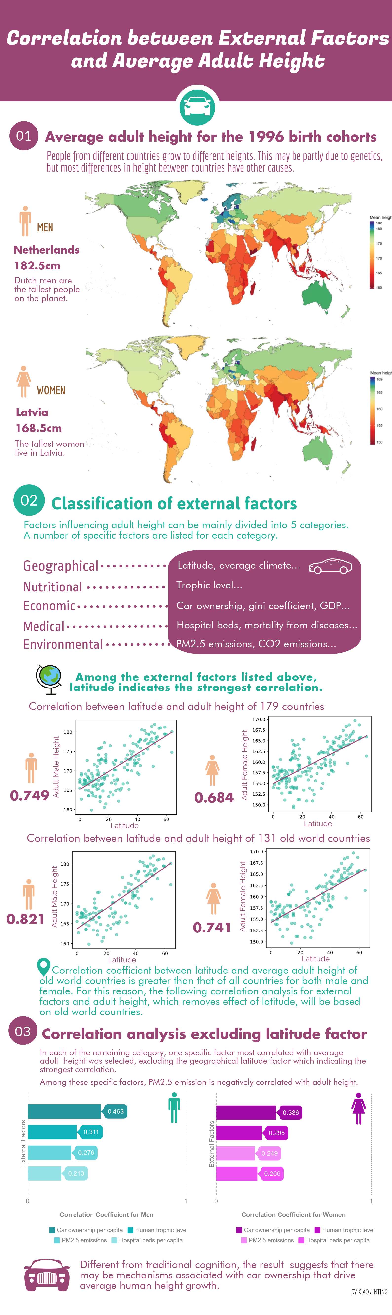
 View projectThe infographic shows that, after excluding the geographical latitude factor which indicated the strongest correlation, the most significant correlation was between per capita car ownership and...
 -
 View projectThe visualization was created using Tableau software, and some design elements were created with Figma. The stream graph represents Cannabis related exposures reported to US Poison Centers from...
 -
 View projectEverything Oscar Wilde said or wrote was designed to be quoted. But how far has he succeeded? We used search engines, books of quotations and newspaper archives to work out which of Wilde's...
 -
 View projectThe issue of segregation of immigrants has generated a lot of interest in many Western countries, not least in Sweden in the run up to the 2018 elections. In the midst of many alarmist stories...
 -
 View projectI am a cancer survivor - after surgeries and a long period of rehabilitation I can again use my left hand. I lived through this painful period without losing my sanity mostly thanks to my...
 -
 View projectExplore the performances of British athletes in their medal events at Paris 2024, through this dynamic visualisation which evokes the shape of the medals themselves. Inspired by a desire to...
 -
 View projectData USA puts US government data in your hands. It's a free and open source platform that combines data from a variety of U.S. statistical agencies and brings it to life in more than 1.8 million...
 -
 View projectThis data visualisation project attempts to quanitfy and explain different forms of wellbeing, including mental health. The study had two parts which each collected data from a UK-representative...
 -
 View projectThe United States has joined more than 90 countries in a pledge to combat climate change and species extinction by safeguarding 30 percent of Earth’s land and water by 2030. These maps show areas...
 -
 View projectCities in Europe – Facts and figures on cities and urban areas The publication ‘Cities in Europe’ contains 13 infographics that show facts and figures on recent urban developments in the context...