
The four main characters of Seinfeld are known for their short-lived relationships and flimsy reasons for breaking up with someone (such as, “she eats her peas one at a time”). The relationships of...
-
 View projectThis visualization project comissioned by the United Nations Refugee Agency (UNHCR) shows flows of refugees and other persons of concern over time using an interactive StreamGraph. Clicking on a...
 -
 View projectIt's an enhancement of Jim Unwin's creation from 2009. He actually added a completely new creature - the Mermahuataur, a mix of Human, Narwhal and Bull. A lot of people took him up on that and...
 -
 View projectTech blogs. They don't agree on much. Apple Fanboys, Android Fanboys, Playstation Fanboys, Xbox Fanboys… the web is awash with people flaming each other about their choice of technology. If there's...
 -
 View projectThe obesity epidemic plaguing much of the developed (and developing) world has long been blamed on excess fat consumption, but recently sugar has emerged as the more likely culprit. This piece...
 -
 View projectThis project looks at the effect that historic redlining has had on the city of Pittsburgh. The visualization explores the geographic redlined areas and the levels of current spending in relation...
 -
 View projectThe world’s biggest election involved around 1 million polling stations spread across the country, from remote corners of the Himalayas to crocodile-infested mangrove swamps of the Andaman...
 -
 View projectUntil the upheaval of 2015, Europe was home to the world’s most open frontiers. But within months, a messy effort to halt a mass flow of migrants fleeing wars in Syria, Iraq and Afghanistan...
 -
 View projectUnveiling the Saudi Conflict is a data-driven tale about the war between the USA and the Islamic terrorist group Al Qaeda on Saudi soil. This thematic cartography visualizes data relating to the...
 -
 View projectIn the city of Bristol, in the southwest of England, up to 260 people a year die as a result of air pollution. That’s 5 people a week. Most of these deaths are caused by particulates released by...
 -
 View projectA title drop is when a character in a movie says the title of the movie they're in. "Full of Themselves" is a large-scale analysis of 73,921 movies from the last 80 years, exploring how often,...
 -
 View projectDuring the COVID-19 pandemic, my company requires its employees to get a new wristband from the front desk each day when we go into the office. The wristband indicates that the employee has tested...
 -
 View projectGlobal spending on R&D reaches record high of almost US$1.7 trillion. See how much your country spends.
 -
 View projectThe Art of Perseverance and Relentless Pursuit of Culinary Artistry. This project delves into the prestigious James Beard Foundation Awards, examining the achievements of outstanding chefs in...
 -
 View projectWe humans have been making maps of the world since the beginnings of our culture, from the babylonian Imago Mundi to the latest big data based digital maps. Here a new world map is created from...
 -
 View projectA Mother’s Unwavering Journey: Navigating Pregnancy, Full-time Job, and Motherhood. Through sleepless nights and overwhelming fatigue, I found solace in data tracking, discovering my strength and...
 -
 View project“The Cost” is an infographic depicting the physical, mental, political, and financial costs of one of the most catastrophic disasters in U.S. history. The water of Flint, Michigan was contaminated...
 -
 View projectAs Avengers assemble with characters from all corners of the Marvel universe, this graphic will tell you who fights whom, who has a hellish sister, and more.
 -
 View projectA mini startup project built entirely in public, Hoodmaps charts different demographics and neighbourhoods in cities around the world.
 -
 View project40 Governmental organs (‘agencies’) had the task to implement the policy set by the Dutch Government in 2013. These ‘agencies’ are of great importance, but little is known about their finances and...
 -
 View projectThis data visualization has been created for the challenge the Data Visualization Society (DVS) holds every year to understand the results of the State Of The Industry (SOTI) survey. The...
 -
 View projectOur collaboration tool enables audiences at live events to brainstorm, share ideas and respond to presentations in real time. Stimulating collaborative thought, Talkviz engages audiences and...
 -
 View projectIn today’s complex and interconnected world, the pursuit of happiness remains a fundamental human goal. Yet, defining and measuring happiness is an ongoing challenge. Geography of Happiness...
 -
 View projectThis interactive dashboard displays attacks and fatalities since October 2023 in Palestine (Westbank and the Gaza Strip) with animations to show changes over time. It also displays names of...
 -
 View projectA visualization about colors in language, specifically what these words are across a group of contemporary European languages, and how they matured and came to our modern world through ages of...
 -
 View project“In Search of Place” is an exhibition poster series exploring what elements of spaces are more personally significant in facilitating placemaking processes and making meaningful spaces. The series...
 -
 View projectTo create Paradise Papers, we used interactive graphics to illustrate complex concepts relating to secret, often convoluted tax machinations of some of the world’s most powerful people and...
 -
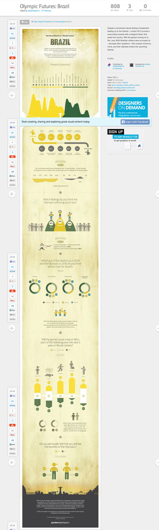 View projectThis work was an attempt to bring the somewhat perceived enthusiasm with a smatter Brazilian vibrancy and place it against the well known problems and tensions of everyday life. Setting this in the...
 -
 View projectArtificial Senses visualizes sensor data of the machines that surround us to develop an understanding how they experience the world. In current times, machine learning and artificial...
