“Red sunsets, a natural miracle?” project illustrates the relationship between the presence of air pollution and the “red” color of sunsets.
The approach to data visualisation has here the aim to...
-
 View projectFinDev Canada opened in 2018 with the goal of supporting the growth and sustainability of businesses in developing markets. After only two years of operations, they were ready to present their...
 -
 View projectIBM Immersive Insights is a data exploration tool that applies AR technology to data exploration and communication. Users are able to view their data in 3D using the AR wearable tool, and within...
 -
 View projectThis data visualization mobile emphasizes that geographical distance and physical presence or absence no longer dictate a relationship's significance, relevance, or depth in today's interconnected...
 -
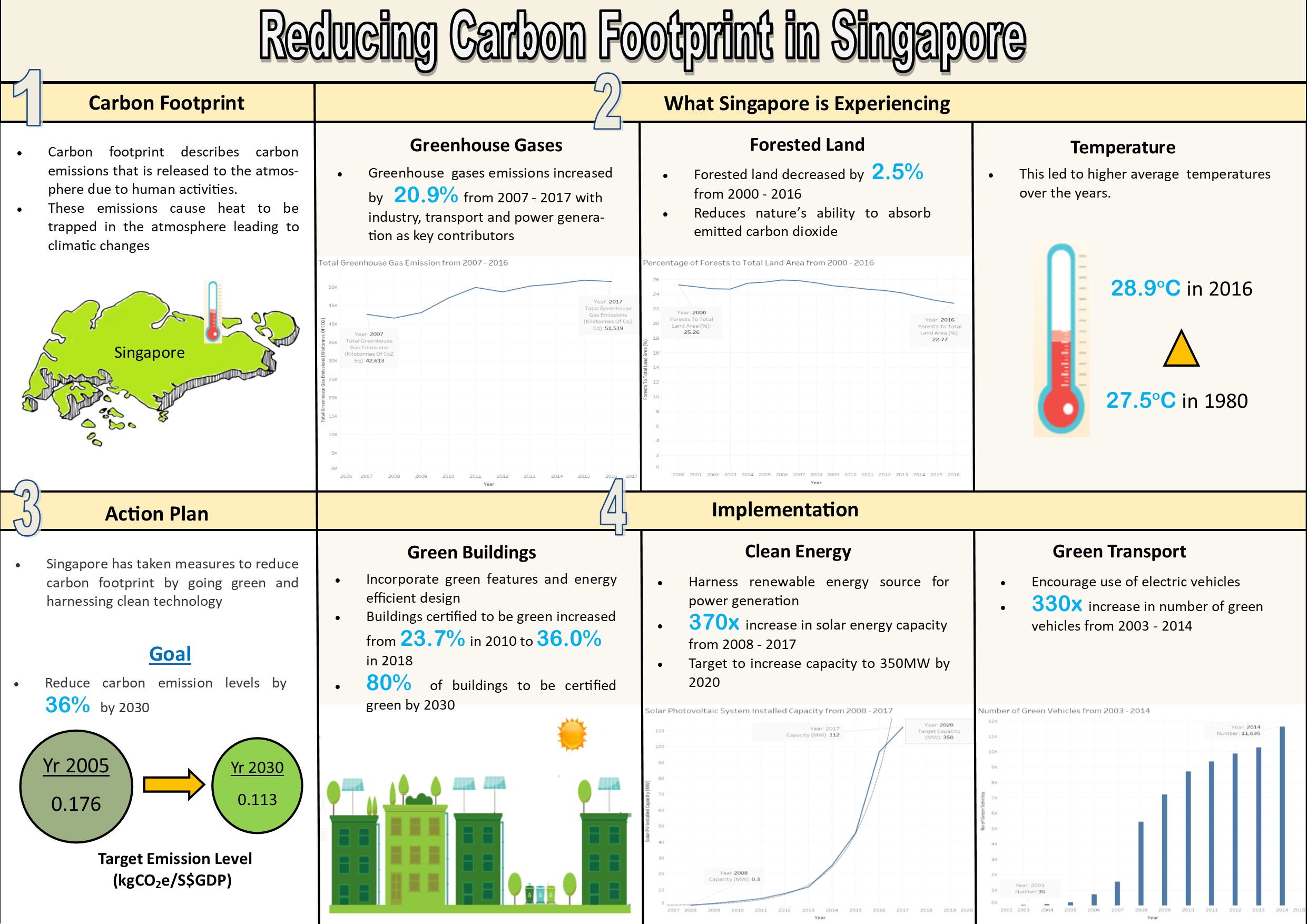
 View projectThe infographic shows the factors influencing carbon footprint in Singapore, its impact and the actions taken to reduce carbon footprint.
 -
 View projectThis piece is a timeline depicting the history of the Rugby World Cup (rugby union) and includes a visual representation of the scores of all matches at each tournament. The majority of matches are...
 -
 View projectThe Metropolitan Transportation Authority (MTA) is the entity that manages the NYC subway, one of the busiest public transportation systems in the world. An unsung, sometimes unnoticed, aspect of...
 -
 View projectOver one year in Boston, 1,064,053 people cycled 16,548,483 mins in total. They burned 56,264,845 calories and saved 1,581,331,745 g CO2 emissions compared to if their journeys were by car. This...
 -
 View projectAfter a Boston Green Line train derailed October 2024, I started wondering each time I boarded the train: How dangerous are Green Line derailments, and do they happen as often as it seems? I...
 -
 View projectThe Center for Public Integrity's “Dark Money Inc.” investigation uncovered more than $173 million in political contributions from about one-third of the 300 largest companies in the United States...
 -
 View projectIsrael’s politics have long been a kaleidoscope of parties split along ideological, ethnic and religious lines. @AdMeara
 -
 View projectSince music albums with cover art became the standard during the vinyl era, these two have become inextricably attached. Now, in the streaming era of digital distribution, a new call is open to...
 -
 View projectInfographic devoted to one of the most impressive transportation services ever done. This poster is divided into three different sections: 787 fabrication, global impact, and important facts....
 -
 View projectModern slavery effects 21 million victims on any given day. Exploited Hopes and Dreams in Modern Slavery explores the story of two victims in Switzerland and brings to light how traffickers prey on...
 -
 View projectThe Infinite Drum Machine can create beats using sounds from the everyday world. Thanks to the Philharmonica Orchestra, London, for contributing some sounds to this project.
 -
 View projectW.E.B. Du Bois, a sociologist, writer, and Pan-Africanist civil rights activist, organized "The Exhibit of American Negroes" at the 1900 Paris Exposition. This project recreates some of his...
 -
 View projectData visualization project for Al Majalla magazine, published in September 2024. This is the second part of the article How AI is Draining the World of Its Energy Sources, showcasing the fusion...
 -
 View projectHave you ever wondered if you are using an app too often? Over 50 000 Tinder users did wonder and used our data analytics and visualization tool to find out more about their own dating...
 -
 View projectThis dual language (English/Russian) digital artwork visualises the flights and fates of all the known Soviet Space Dogs. The sad story of Laika, the first animal to go into orbit, is known...
 -
 View project«Energy industry in Ukraine» - our special issue that was fully dedicated to the issues and possibilities of the energy industry. The purpose of the report is to demonstrate our expertise and...
 -
 View projectThe project was done and published during my master program study at NYU Journalism Institute. In that semester, right after COVID first broke out in NYC, our cohort decided to create a web...
 -
 View projectGreg Wyler’s first space Internet startup, O3b Networks, has positioned a ring of satellites in medium-earth orbit around the equator—high enough to cover large portions of the planet, but not...
 -
 View projectThis project is a web-based application that focuses on exploring the spread of music genres in Western Europe clubbing culture. The application is mainly exploratory. Based on all the events...
 -
 View projectThe National Statistics office of Mongolia conducts a Time Use Survey every four years. The Tungaahui Data Studio LLC worked on the latest 2023 survey data visualization and report design. Main...
 -
 View projectThe European and Regional Innovation Scoreboard 2024 is an interactive data visualization platform that compares innovation performance across EU countries, analyzing key indicators in business,...
 -
 View projectThe project 'Pantheon' visualizes information about top 1000 of the globally known people born within present day the world. The visualization is based on data of Massachussets Institute of...
 -
 View projectOne day I decided to analyze how much time I spend with my iPhone. I calculated the data for July 2020. As a result, I decided not only to reduce the time in social media, but also to turn the...
 -
 View projectExplore this interactive visualization about the world of visualization itself - see charts, books, and tools arranged by popularity and trends in this collaboration between Google News Lab and...