Equitable Value Explorer by Graphicacy
The Institute for Higher Education Policy (IHEP) hired Graphicacy to transform a trove of data into compelling visual stories that depict how postsecondary educational institutions create value and to identify where equity gaps exist.
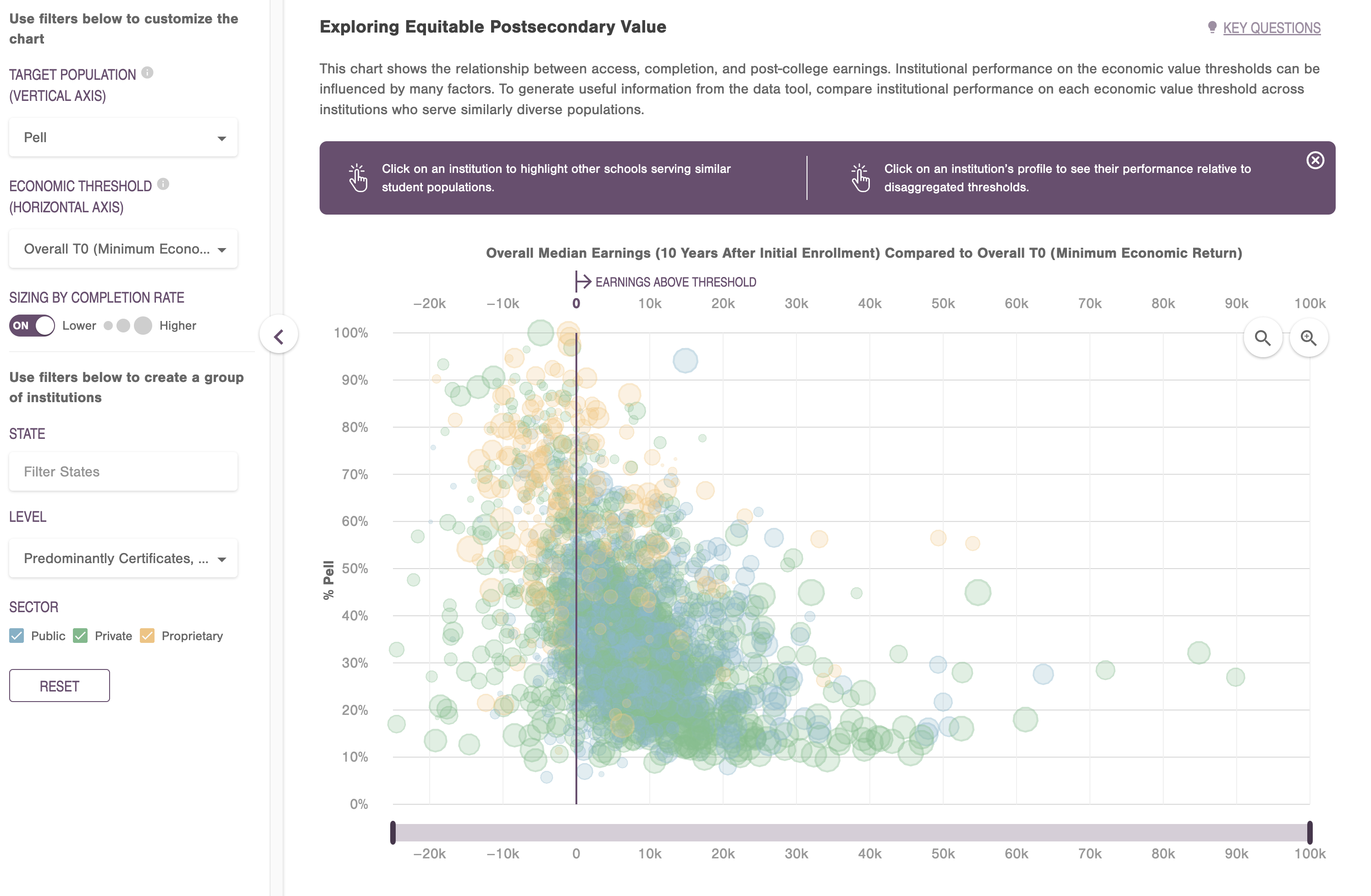
This work’s centerpiece was the Equitable Value Explorer (EVE). A robust, interactive scatter plot chart, the EVE presents data on two axes representing target population and economic threshold. Users can view data for specific institutions by hovering their cursor over a scatter plot.
Powerful filtering capabilities via a collapsible accordion menu allow users to select numerous variables for each axis, including race, gender, earning premium, and economic mobility. Users can also filter institutional data by state or create their own institution groupings based on location, degree level and sector.
The EVE contains data from a variety of publicly available sources regarding enrollment rates, completion rates, and income earned across different genders, races, and economic groups. The volume of data and the number of institutions involved — nearly 6,000 — presented a substantial engineering challenge.
Traditional data plotting methods using Scalable Vector Graphics (SVGs) would not suffice. Graphicacy engineers had to get creative to render the data points and manipulate the various filter elements without causing lags or other performance glitches.
“In my research I found a proof of concept with a scatter plot animation for manipulating such a large amount of dots,” said Eduardo Velez, Lead Data Visualization Engineer at Graphicacy. “I opted to use PixiJS, an HTML5 canvas framework.”
PixiJS combines canvas with a 2D WebGL rendering library that allowed Graphicacy to serve up the institutional data quickly and smoothly. “It’s frequently used as a gaming engine,” Eduardo added. “By using it for our data visualization, we gained the level of performance we needed. All the parts and pieces move with no delays, and that was essential for us with a chart of this magnitude.”
Expanding JavaScript functions with PixiJS opened a new toolset for Eduardo’s team. For instance, each institution has its own unique page. When users hover over a dot on the EVE chart, a box appears with a summary of the selected institution’s details per the user’s filters, along with options to go deeper into a school profile. A standard rendering tool would necessitate going through all the dots and redrawing everything to render another frame — causing significant performance delays.
“For each circle, I was able to reverse engineer the coordinates and, as if there was a transparency on top, draw an outline of the circle without having to go back into canvas for re-rendering,” said Eduardo. “This approach allows the dots to appear crisp and the motion seamless as users move their cursor and change filters.”
With the dataset abstracted into thousands of files, and the application separated into numerous different views, engineers placed a heavy emphasis on lazy-loading while developing the EVE. The primary way the app decides what to load at any given time is by looking at the URL. Rather than loading the entire application at the initial page load, Graphicacy split the code base into different modules to load on the appropriate route. This helps keep the initial JS bundle size smaller.
Graphicacy also heavily leveraged query and route parameters to determine which datasets need to load at any given time, caching them once loaded. These techniques enabled a quick and performant user experience.
“Both our team and IHEP were extremely happy with how well the EVE enables users to navigate such vital information,” said Eduardo. “The final product validates the work we put into identifying the right tools and tactics for a performant visualization.”
-
CreditsShing-Yun Chiang, Senior Data Visualization Designer & Analyst / Graphicacy Eduardo Velez, Lead Data Visualization Engineer / Graphicacy Josh Nerpel, Managing Director / Graphicacy Jeffrey Osborn, Creative Director / Graphicacy
-
Award
-
Categories
-
See more


