How the Populist Right Is Redrawing the Map of Europe by Bloomberg LP
“If 2017 looked like the year when moderate politicians took back Europe, look again.” So kicks off Bloomberg’s stunning interactive graphic mapping the rise and reach of the populist far right—which found that support for these parties is higher than any time in 30 years.
In “How the Populist Right Is Redrawing the Map of Europe,” Bloomberg compiled a massive database that combined election figures from 22 countries and ideological classifications for 88 political parties going back decades. The project represents the most comprehensive assessment of populist parties on the right, which were identified with the help of several respected international academics.
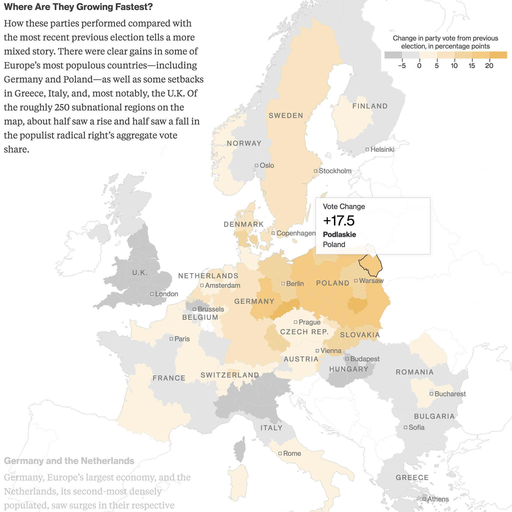
Merging these various datasets enabled Bloomberg to create an interactive map of unprecedented scope and detail, showing where 39 populist parties on the right have increased their overall influence across Europe. The visually captivating interactive also takes readers on a guided tour of several countries and regions to explore the demographic, electoral and economic issues unearthed in the data that help explain these parties' successes.
A second interactive graphic further down presents an issue-based taxonomy that compares the policy positions of the various parties analyzed, alongside individual party profiles based on reporting from Bloomberg’s extensive network of European bureaus.
These elements are supplemented by secondary graphics showing the correlation between the populist right’s vote share and rates of migration and unemployment; survey data about how open different countries are to populist right issues; and the rising influence of the populist right in European Parliament elections.
The scope and detail of the data work and reporting involved, along with the ambition of its graphic presentation, we think set this project apart as an award-worthy example of data journalism at its finest.
-
CreditsAndre Tartar, Hayley Warren, Cedric Sam, Sam Dodge, Jeremy Scott Diamond
-
Award
-
Categories
-
See more


