A snapshot of the jobs malaise by Axios
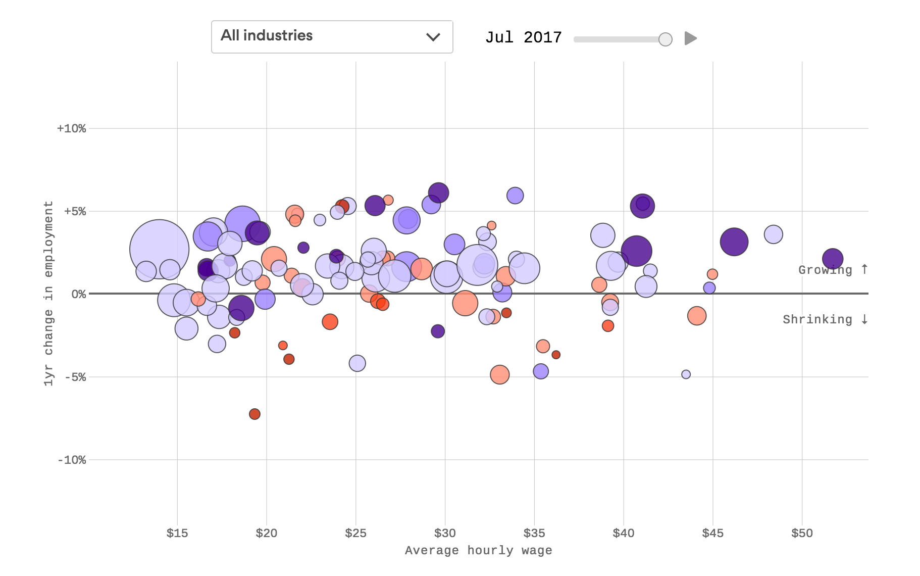
This animated chart tracks the U.S. economy sector by sector, and follows employment and wages since 2006, just before the crash. The circles indicate industries, sized by their average number of employees over time. From there, the chart is doing two things — tracking jobs and earnings from 2006 to 2017 (the up and down movement of the circles shows the change in number of jobs; left to right is the change in earnings), and projecting forward from 2014 to 2024 (signified by the intensity of the colors of the circles).
-
Credits
-
Award
-
Categories
-
See more


