
Dataviz Under the Stars: An Interview with Jordan Vincent
Jordan Vincent is a busy man. As a UX engineer and designer for Roam Analytics and co-founder of Adminica, you might think he has limited time for exploring the beauty of the US National Parks... but he makes the time. This passion for the outdoors led him to create one of the most popular works of the 2018 Information is Beautiful Awards - A Night Under the Stars.
In addition to winning the Bronze in 'Leisure, Games & Sport,' this project received substantial press attention from outlets such as Travel + Leisure, The Verge, and Infogram. Who doesn't dream of pitching their tent under a clear sky in Yosemite? We caught up with him recently to learn the story of this marvelous project.

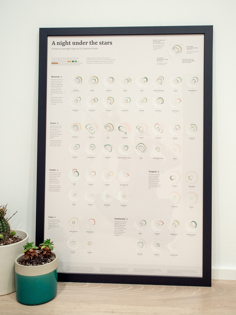
This visualization explores overnight stays at your favorite US National Parks and uncovers some surprising patterns.
What inspired you to produce this project?
A Night Under The Stars is very personal. I love the outdoors, but it's always hard to know where to go. The weather is either too cold or too hot, and when the conditions are ideal, it's usually overcrowded! I knew I could find some data out there to help me out.
Did you overcome any difficulties in collecting and visualizing the data? What tools did you use?
I was lucky to find public data by the US National Park Service. Most of the time, the data you find online is already aggregated, but this time around, I had access to very granular data. Nonetheless, I had to manually download each of the 54 national parks, for the last 5 years. It took a few hours.
Once I had the data, it started getting fun. I used D3 to explore and prototype various ideas. It's impossible to design in a vacuum, the shape of the data really influences what you can or cannot do. For instance, I wanted to use the same scale for each park, but some parks are so popular that they would have dwarfed everything else.
Even after the general concept is finalized, there is still half the work left to be done. Creating the website, writing the copy, and putting the final touches takes a while.
Did you know at the start that this project would be a poster? Why did you think it would work well in print, and what were the challenges in translating a digital project to poster form?
No, I didn't know! Only when I started putting it together and telling myself, "It's beautiful, I just want to look at it every day!" did I consider it. But I had never created a poster before and I was a little hesitant. Then, out of the blue, someone I didn't know asked for it. They wanted to offer it to their son for Christmas! I couldn't say no. I only had a few weeks left before Christmas, so I put myself to work.
Creating the poster was challenging. I didn't have a readily available Illustrator file. I tried to convert the SVG and HTML, but it didn't work because Illustrator didn't support some of the features I used. In the end, I used Puppeteer, an amazing library that allows you to take high-resolution screenshots of websites. Then, I took it into Illustrator and I updated the layout to make it work as a poster. I had to go with the largest poster size available because there was a lot of information to display.
This piece has connected really well online, and certainly with our judges. Why do you think it was received so positively? Did you have a strategy for promoting/positioning this work for public consumption?
I didn't do any promotion — and I'm unknown in the field. I think it connected deeply with people. Planning your next adventure is a real issue that this visualization helped with. Fast Company even interviewed me for one of their stories.
Someone posted my work on Hacker News, and it made it to the homepage. If you look at the comments, you can see people sharing tips with each other! I would have never expected my work to have such an impact on people's lives.
Can you share the impact of winning an Information is Beautiful Award? What advice do you have for others in submitting their work for awards?
The Information is Beautiful Award is the most prestigious competition for data visualization. I always had doubts, but I now feel part of that community. During last year's ceremony, I met wonderful people who I would have never been able to meet otherwise.
I have three pieces of advice for people submitting their work to the awards. First, start early. For example, a Night Under The Stars took me two months to create! Collecting the data and finalizing the visualization takes a lot of effort. Second, data visualization is a balance between multiple disciplines, not only does your visualization need to present accurate information in a simple manner, it needs to please the eye and keep the reader engaged! We can all take example from visualizations created by news organizations such as the New York Times; their constraints are very similar. And third, iterate, iterate, iterate! Any visualization you've seen online went through many iteration cycles. I believe it's what differentiates good from great work.
What are you working on now?
My latest visualization A Flight Against Time, was nominated for the 2019 Information is Beautiful Awards. Everyone knows flying can feel shorter or longer depending on the destination. With this visualization, I wanted to show just that. It's built as a narrative, something that I had never tried before. I'm excited to see how people react to it!

