Each civilian life lost in the war in Ukraine, caused by Russia’s full-scale invasion that began on February 24, 2022, carries a story—of someone who should still be here. This project aims to...
-
 View projectDive into a unique visualization of 1.3 million trades lighting up India during the one-hour Muhurat Trading session, a time steeped in tradition and prosperity. Inspired by the famous "Diwali...
 -
 View projectWhat is the most-watched NBA moment of all time? We identified over hundreds of thousands of NBA videos on YouTube and categorized each by game and play. Here are the top 100 videos from several...
 -
 View projectIn the era of Exponential Risk, interlocking global challenges are combining to create complex problems. Understanding the real-time complexities of risk through smart use of data and technology is...
 -
 View projectThis page lists media reports, collected by Google News, about hate crimes and bias incidents. The “keywords” column contains names and places found in the news reports in the “articles” column....
 -
 View projectThis chart aims to comprehensively display the core information of the Taklama Desert Railway, including the railway route, distribution of oases and stations along the line, and other main...
 -
 View projectThis interactive data-driven visualization aims to show the main mango varieties frequently consumed in Taiwan. Twenty three varieties are displayed in this visualization, and the user is able to...
 -
 View projectAustralia has for the first time released data reflecting the gender pay gap at nearly 5,000 companies – every private company with 100 employees or more. The data paints a stark picture, with...
 -
 View projectThe richest people in the world found success at various ages. Warren Buffett spent over 25 years as a millionaire before becoming a billionaire, while it took Mark Zuckerberg and Jeff Bezos less...
 -
 View projectFlagstories is an analysis of world flags according to layouts, colours, similarities, proportions, age, complexity, history, meaning and symbolism. Published by Ferdio
 -
 View projectThis data narrative explores the complex and often conflicting realities surrounding stray dogs in India. It begins by visualizing the stark reality of human-animal conflict, showcasing the number...
 -
 View projectEvery city has its banner. The Think Summit’s City of Technology has something more: a 12 metres long interactive flag generated and powered by the ideas and hopes of its citizens. An innovative...
 -
 View projectThis (static) visualization shows the almost 3000 satellites that were still active in space around September 1st, 2020. By turning each satellite into a separate circle, but grouping them by the...
 -
 View projectResearch on creativity has shown that people tend to produce their most important works when they are young. This is true for scientists too. But a new study finds that this is simply because...
 -
 View projectAmong the many ways COVID-19 reshaped our lives, one of its most enduring effects may be changes to the way we use and move through public spaces. At the height of the pandemic, parks, restaurants,...
 -
 View projectThis graphic illustrates the disproportionate impact of family and domestic violence on Aboriginal and Torres Strait Islander people. In 2021-22 - the latest data available - Indigenous women aged...
 -
 View projectThe Wheel of Inequality is an interactive and data-driven journalistic investigation that uncovers how systemic barriers—such as family background, education, and geography—perpetuate inequality...
 -
 View project"Summer Bound in Thrissur Round" is a Schematic map of a small town in Southern India called Thrissur. Swaraj Round or Thrissur Round is the biggest roundabout in South Asia and The map aims to...
 -
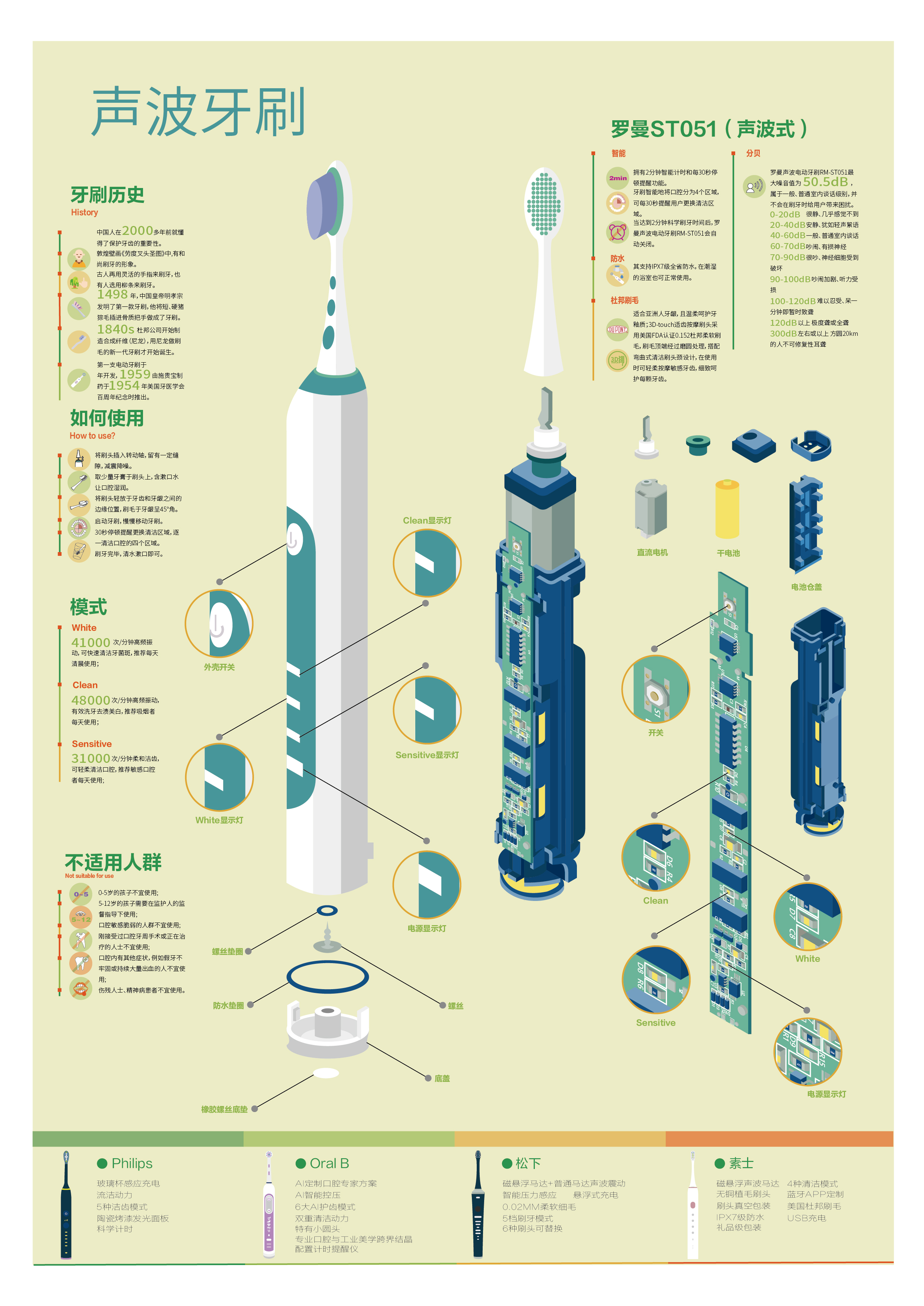
 View projectThis is an infographic introducing the Roman ST051 sonic toothbrush, which interspersed with some knowledge about electric toothbrushes.
 -
 View projectAmid the staggering loss of life and urgent humanitarian crisis in Gaza lies the catastrophic destruction of places integral to Palestinian life. This story, done in collaboration with Visualizing...
 -
 View projectShrinking glaciers, a changing economy and environmental worries are forcing the Bhutanese to question whether their dependence on hydropower is the realistic way forward. This is a story of a...
 -
 View projectRussian volunteers are searching through graveyards, archives and the internet to determine how many of the country’s soldiers have actually died in Ukraine. A database they helped build provides...
 -
 View projectNew York City's urban forest provides numerous environmental and social benefits, and street trees compose roughly one quarter of that canopy. This map shows the distribution and biodiversity of...
 -
 View projectOver the years, I’ve had countless conversations with women about their clothing shopping experiences. It’s clear that we all have stories to share about how shopping for clothes impacts our...
 -
 View projectThe Australian magpie is known for being aggressive and swooping people every spring. Do magpies mean to hurt us? I decided to answer this question using mathematics. At my school there is a bad...
 -
 View projectDuring this pandemic watching the Daily Show hosted by Trevor Noah and wearing hoodies have been two things that brought me joy. This project is a celebration of the colorful rainbow of hoodies...
 -
 View projectSuperannuation (similar to a pension fund in some countries) and compound interest are notoriously dry topics. However, there are significant gender disparities in superannuation savings, with...
 -
 View projectKekki is an experienced game analyst. In this interactive visualization, he guides us through the landscape of mobile games while traversing through a beautiful forest. The adventure is available...
 -
 View projectThe Itaewon district in South Korea’s capital is known to revelers as a place of fun, freedom and openness. But its narrow, steep streets and tight access points proved a lethal mix for Halloween...
 -
 View projectThis A2 fold-out poster was sent out to around 30,000 general practitioners (family doctors) in the UK, in the GP edition of The BMJ. It shows the UK guidance on cancer referral (produced by NICE)...