Global governance indicators by Hassen Chaieb
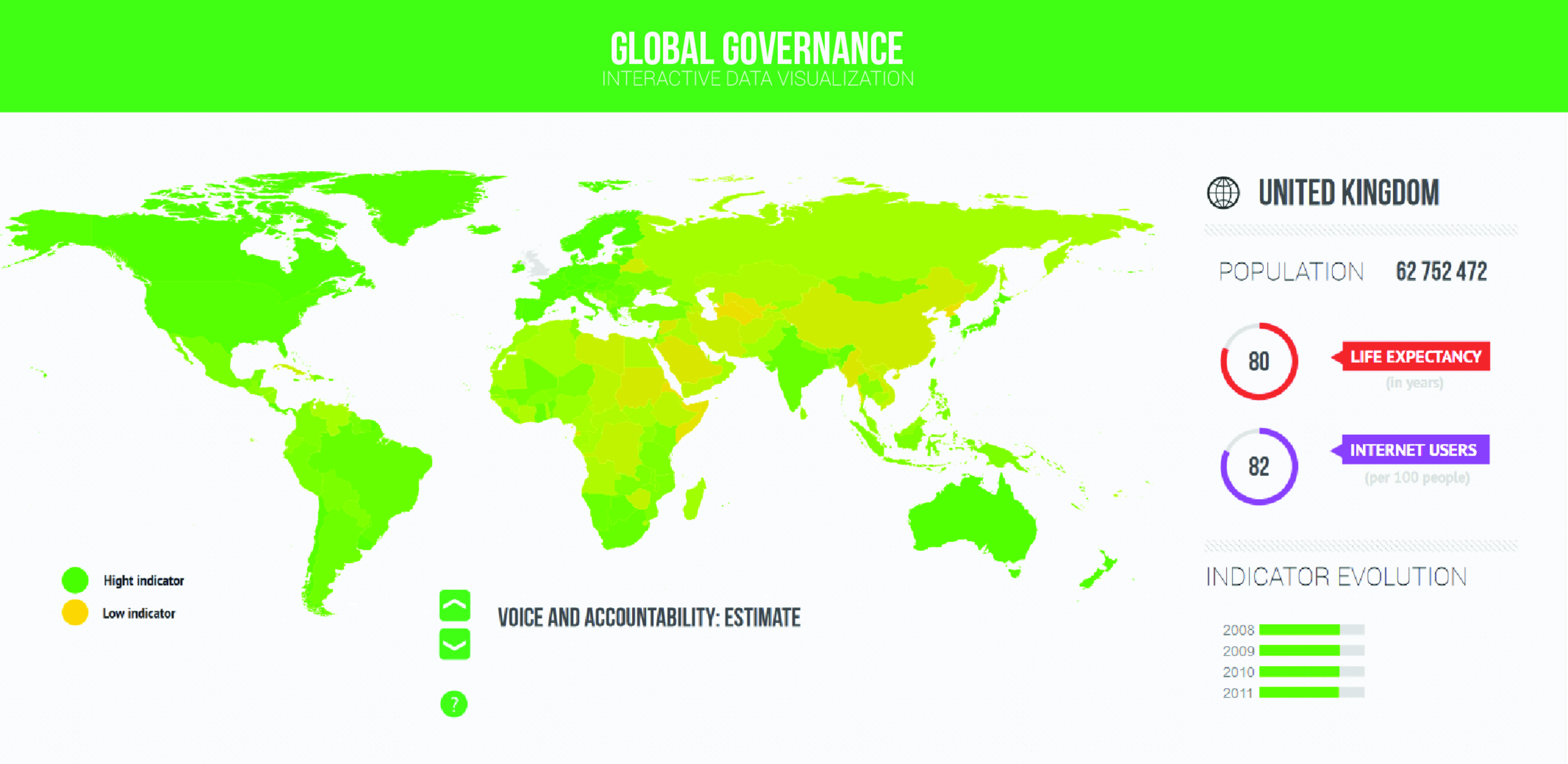
The first part of this visualization is the interactive map: With the green arrows, you can choose a governance indicator and see which countries have te highest or lowest indicator.A country which has a hight indicator will be colored in green and a low indicator will be represented in yellow.
Furthermore, you can see on the bottom right the evolution of the selected indicator over the years (2008 to 2011) and on the upper right part, we can see some indicators that could have a relation with the indicator.
The second part of the visualization is the correlation graph, in this graphic we can choose the governance indicator for the y axis and other country indicators for the x axis. This graphic shows us some surprising correlations like the perfect linear relation between voice and accountability with the number of internet users or the rise of government effectiveness with the rise of the gdp per capita. You can play with this interactive visualization to discover other correlations.
-
CreditsHassen Chaieb
-
Award
-
Categories


