History of voting since 2006 by Texty.org.ua
Before 2022 the electoral geography of Ukraine is narrowed only to the differences between several regions, mostly East and West. This simplification draws artificial boundaries. However, the real picture is much more interesting.
TEXTY looked at the details and showed the behavior of voters in different regions in dynamics, from 2006 to 2019. Parliament voting results were taken as a data. Parliament voting results were taken as data.
The task was not simple because of the disparity of identification numbers of polling stations year by year. We equated the polling stations of 2006-2007 to the unified numbers introduced in the 2012 elections, by address and area covered. Most of the work was done manually, with the help of our tireless interns. As a result, we have established equivalents for more than 90% of polling stations, which allows us to compare voting results by year (2006-2019) for almost 30,000 polling stations. This is a unique result.
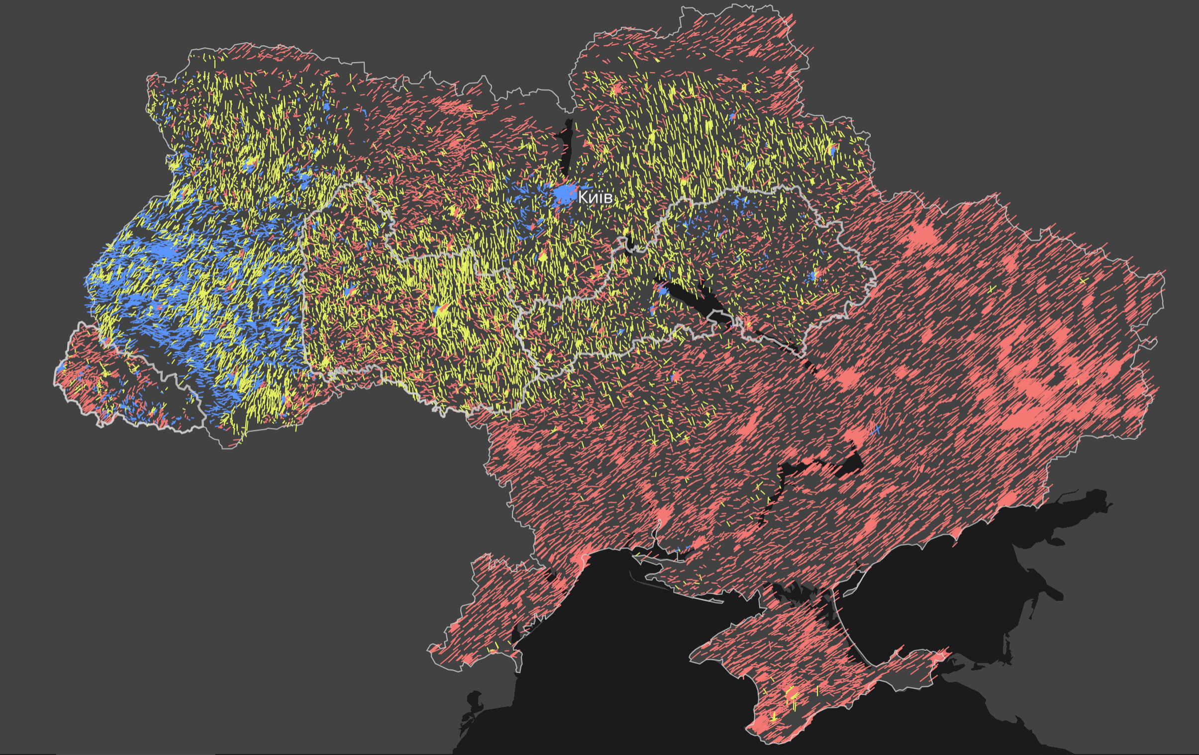
The political preferences of voters were presented in the form of a triangle, where the blue corner indicates the national democratic forces; the red corner, the pro-Russian and communist parties; the yellow, the populist. The deviations from the "center" for each polling station in the parliamentary elections are marked on the map by arrow lines
In general, both the slope and the color of the lines show the proportion of votes received by the parties in these three directions. Users can switch between years to compare election results. One line is one polling station. The interactive map allows you to identify districts, towns, and cities that vote differently compared to their regions. And the whole map is beautiful year by year though different.
-
CreditsMykola Dobysh, Anatoliy Bondarenko, Yevheniia Drozdova, Nadja Kelm, Yelyzaveta Dorontseva, Hanna Arhirova and others
-
Award
-
Categories
-
See more


