Bollettino.grafico by Giacomo Flaim
Bollettino.grafico is both information and experimentation, the name itself is a declaration of intent. It’s called “bollettino” (dispatch) because it’s a fast direct daily update on the covid-19 pandemic in Italy. It’s “grafico” because it visually shows data, displaying “the story” of the single person that is represented by a single dot.
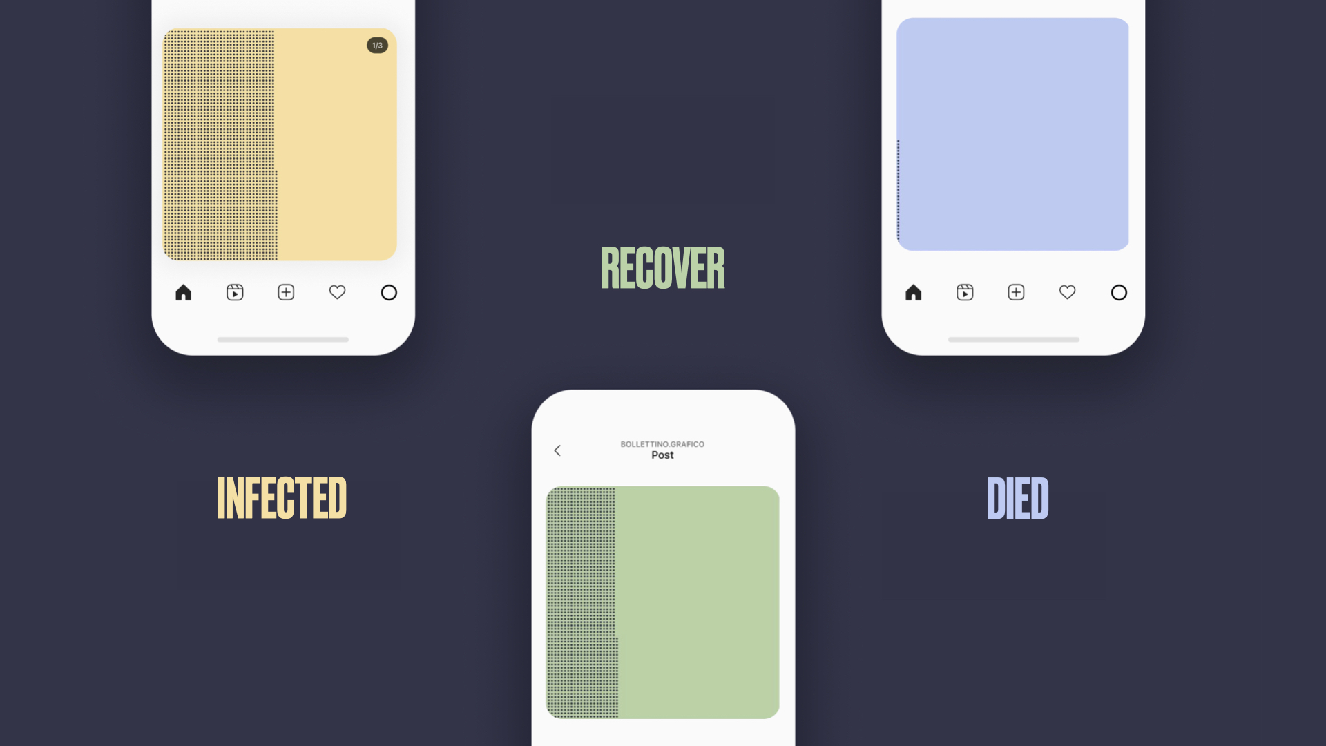
Instagram becomes a live infographic growing day by day with the story of covid-19 in Italy, showing 3 categories: infected, recovered and passed away people.
The fixed grid of the medium becomes an opportunity to create 2 different ways of reading, and tell a strong story:
- the horizontal one shows a daily report of the 3 categories.
- the vertical read becomes a barchart that shows the trends of the three different of data.
- The highlights-stories are transformed in the “how to read”, which helps the reader.
The project idea was born in march 2020, during the first wave of covid in Italy. It started from the need to bring a real contribution to the community during the as information designers creating an innovative information tool and making the official data accessible on a very popular platform like instagram. Bollettino.grafico showed daily data for 472 days.
-
CreditsBarbara Nardella, Giulia Zerbini Francesco Cosmai
-
Award
-
Categories
-
See more


