365 Days of Color and DataViz by Diogo Guerra
During 2021–2022 I engaged on a personal project hoping to deepen my knowledge and experience in data visualization. I wanted to experiment with different tools, graph types and presentations. I was inspired by illustrator Mesa Schumacher's year long project Animalia, where she illustrated one different animal species per day during 2021 and published them on her Twitter Page (@mesabree). I extracted color palettes from her illustrations and visualised these color summaries in different ways.
Process:
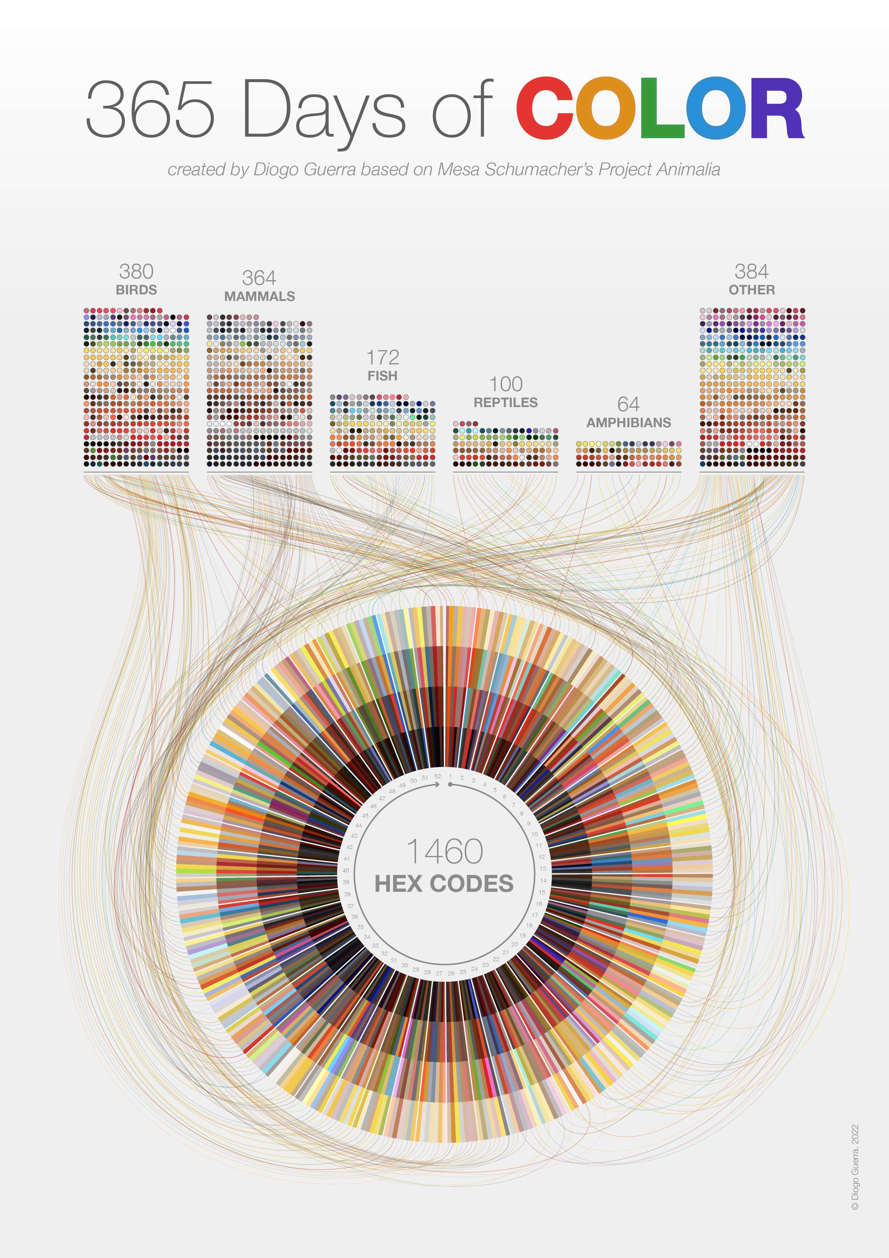
I started by using Adobe Color to extract 4-part daily color palettes based on each of the 365 animal species drawn by Mesa in 2021. For each color palette, I collected Hex codes, together with Day, Animal Taxonomic Group (mammal, reptile, bird, etc.), RGB and HSL values. This dataset of 1460 hex codes was organized in Microsoft Excel. Finally, I’ve used Rawgraphs and Flourish to create different types of plots and Adobe Illustrator for the Final Layout.
The results are varied and fun, a sort of color summary of different animal illustrations, reflecting which animal groups are more colorful, and also personal preferences from the illustrator. Final pieces were published regularly on my Twitter page. The example uploaded to the IIB Awards is the final piece I designed for this project, a summary of all 365 color palettes – a top pictogram chart breaks down the number of entries and codes for each main taxonomic group. I wanted to link this first chart with another way of organizing the data – in a sunburst plot representing the yearly, cyclic calendar with all 365 days, weeks and color palettes (organized from darker to lighter tones).
More results from this project can be found at diogoguerra.com/color-dataviz
-
Credits
-
Award
-
Categories
-
See more


