Here's who lives in your city's worst heat islands by Canadian Broadcasting Corporation
While Canada is well-known for its winters, it is also home to deadly urban heat waves. But where are the areas most affected by extreme heat? And who lives in them? Answering these simple questions took us months of meticulous work.
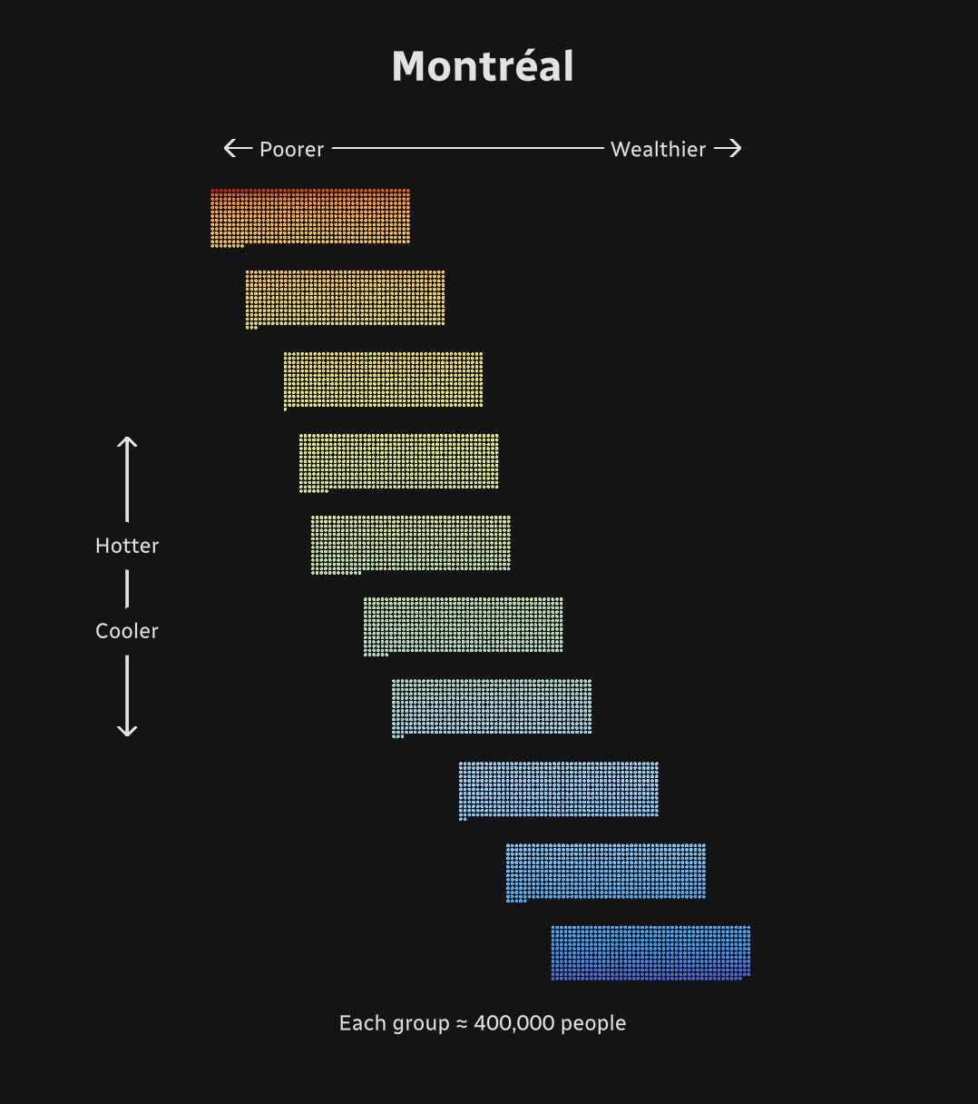
Our analysis, published in mid-July, revealed a pattern of striking inequalities in Canadian metropolitan areas: immigrants and people with low income are most likely to live in the hottest neighbourhoods. This makes them much more vulnerable to heat waves, with deadly consequences. As global warming increases the frequency and intensity of heat waves, knowing where heat islands are in cities — and who lives in them — becomes a crucial public health issue.
Early on in the project we discovered only a few cities had mapped their heat islands. The maps were quite old and the methodology wasn't uniform, making comparing cities impossible.
With the help of several experts, we established an up-to-date methodology applicable to the 17 main metropolitan areas where more than half of Canadians live. For each, we
retrieved several recent satellite pictures taken during the summers. We estimated the land surface temperature of each pixel with the satellite's raw data. Then we overlaid Canadian census data. We processed billions of pixels to find an answer to our question and created a unique dataset for this purpose.
After verifying our results, we then needed to make them easy to understand for our readers. To do this, we focused on three relevant geographical levels of information:
- their neighbourhood
- their metropolitan area
- an overview of the whole country
We created this interactive web project to allow users to customize their experience while still getting the important national figures.
Because of the number of data points, the leading data visualization is coded in WebGL, with the javascript library ThreeJS. The animations are computed on the GPU, instead of the CPU, for maximum performance and fluidity. The data points are placed inside a 3D space instead of a 2D one to give a unique visual feeling during the animations.
A detailed methodology was published along the story. In releasing it, we hope it can be helpful to other data journalists or members of the dataviz community.
Here's the link to the methodology, which can be found at the end of the project: https://ici.radio-canada.ca/info/2022/07/ilots-chaleur-villes-inegalites-injustice-changements-climatiques/metho-en
-
CreditsIsabelle Bouchard, Anis Belabbas, Charlie Debons, Melanie Julien, Isabelle St-Pierre Roy, Daniel Blanchette Pelletier, Andre Mayer, Martine Roy.
-
Award
-
Categories
-
See more


