New Workers, New Normal by Morning Consult
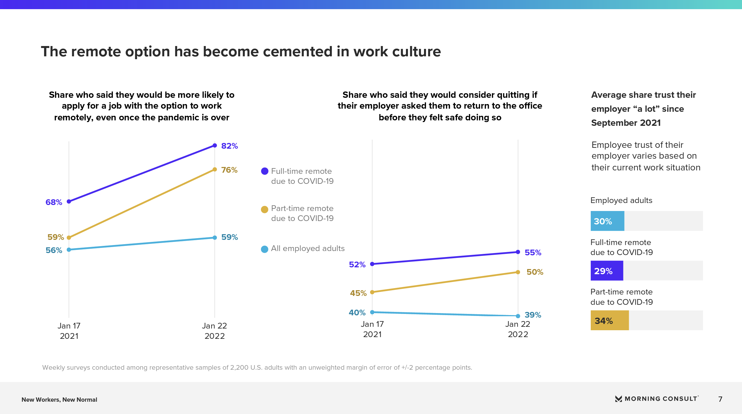
The piece is meant to be targeted to HR professionals to help understand the changing workforce. The data was meant to be clear and accessible in a straightforward way, and easily digestible. In visualizing the polling data contained in this report, we leveraged existing report branding, incorporating it into a consistent approach to data visualization that we carried throughout the report. I encouraged the use of slope charts on pages 6-7, to show year over year changes in shares over time, an comparatively underused but simple chart type in my experience. One of the main goals of the project was to present a typology of five “types” of worker, and then provide descriptives about these workers, and their beliefs and preferences about work. For each “type,” we used a different color in presenting the typology, and then carried that color through to all subsequent charts relating to that type. We did this to help readers keep track of which charts were about which type, as we presented separate but similar series of charts for each type. We then used these colors, dual encoded with unique shapes, on subsequent comparative charts with data about all the types. The consistent color associations, and dual encoding helps reduce cognitive load, and makes the visualizations more accessible for color blind and lower vision users.
-
CreditsDesign Director of Data Visualization: Amy Cesal Data Visualization Designers: Sara Holcombe, Sam Elbouez, Jes Standefer
-
Award
-
Categories
-
See more


