
Killing Time by Amelie Dinh and Boris Kourtoukov
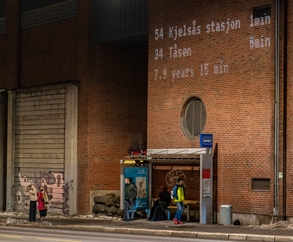
Many Oslo bus stops have a screen that shows when buses will arrive. Using this visual language, we created a live projection that pulls accurate arrival times from the service’s API, and replaces the scrolling line with a countdown to when some experts have projected we will hit the 2 degree C warming limit.
With this visual, we were looking to contrast the data that we care about and the data that we willfully ignore. As those waiting for the bus count down to the arrival of their bus, they also see that those same, eagerly passed minutes bring them closer to another, very different milestone.
Killing Time is part of an investigation into how live data can be visualized and integrated into public space.
https://datainpublic.space/
The entrant has supplied multiple files for this project:
[1] [2]
-
CreditsAmelie Dinh and Boris Kourtoukov
-
Award
-
Categories
-
See more


