50 Years Of Music Charts by D One & Hinderling Volkart
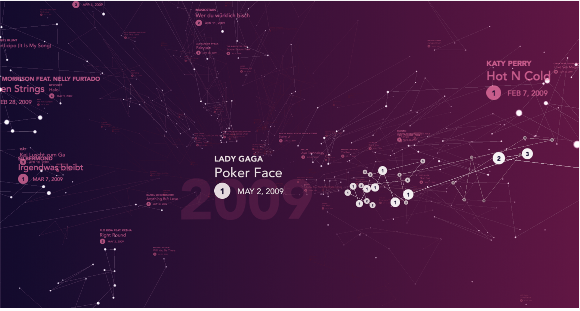
The Data Driven Experience opens the web page. You dive in and scroll back and forth along the timeline. The space you enter is divided into a left and a right sphere. On the left are the "melancholic/slower songs" and on the right the cheerful/faster songs. Depending on where you move in the space, the song will be played gently, always the one closest to you. The songs are similar to constellations: Each point is a chart placement (date) and the placement. The Experience contains all songs and places from 1-15. In total there are about 127,000 data points.
In the Experience one can let oneself drift and is surrounded by memories triggered by the music.
www.50-Jahre-Hitparade.ch/analysis
"The Map" is the data page. Here you get the structured access to all 10,939 songs that ever made it into the charts. The design takes up the data-driven approach - it is kept cooler - and corresponds to the more rational approach and discussion around the information about the songs.
Big stars mean a higher ranking, the color shows the mood (orange=happy/blue=bad), and the placement of the stars (the higher up) shows if a song is danceable.
There are filters available e.g. all 1st places, or only Swiss songs. Also all available videos and covers are shown.
Over the decades you can zoom in on an annual basis. Further insights are listed under the menu item Analyses: The most frequently used words in the song title, overview of all ranks, etc.
The Map is a website developed on d3.
-
CreditsOverall responsibility: Christian Erni, D ONE; Creative Direction: Michael Hinderling, Web Experience (hinderlingvolkart.ch); Christian Erni, Analytics & Data Story (d-one.ai); Umsetzung: Severin Klaus, Web Experience; Simon Hefti, Data Concept; Nicola Hefti, D3
-
Award
-
Categories
-
See more


