
Visualising Songs Using Colour by Muskeen Liddar
For this project, am exploring the question ‘How Can Sound be Visualised?’ I am intrigued by how I can reveal the sounds around me into a visual form, and am experimenting with the ways I can do this.
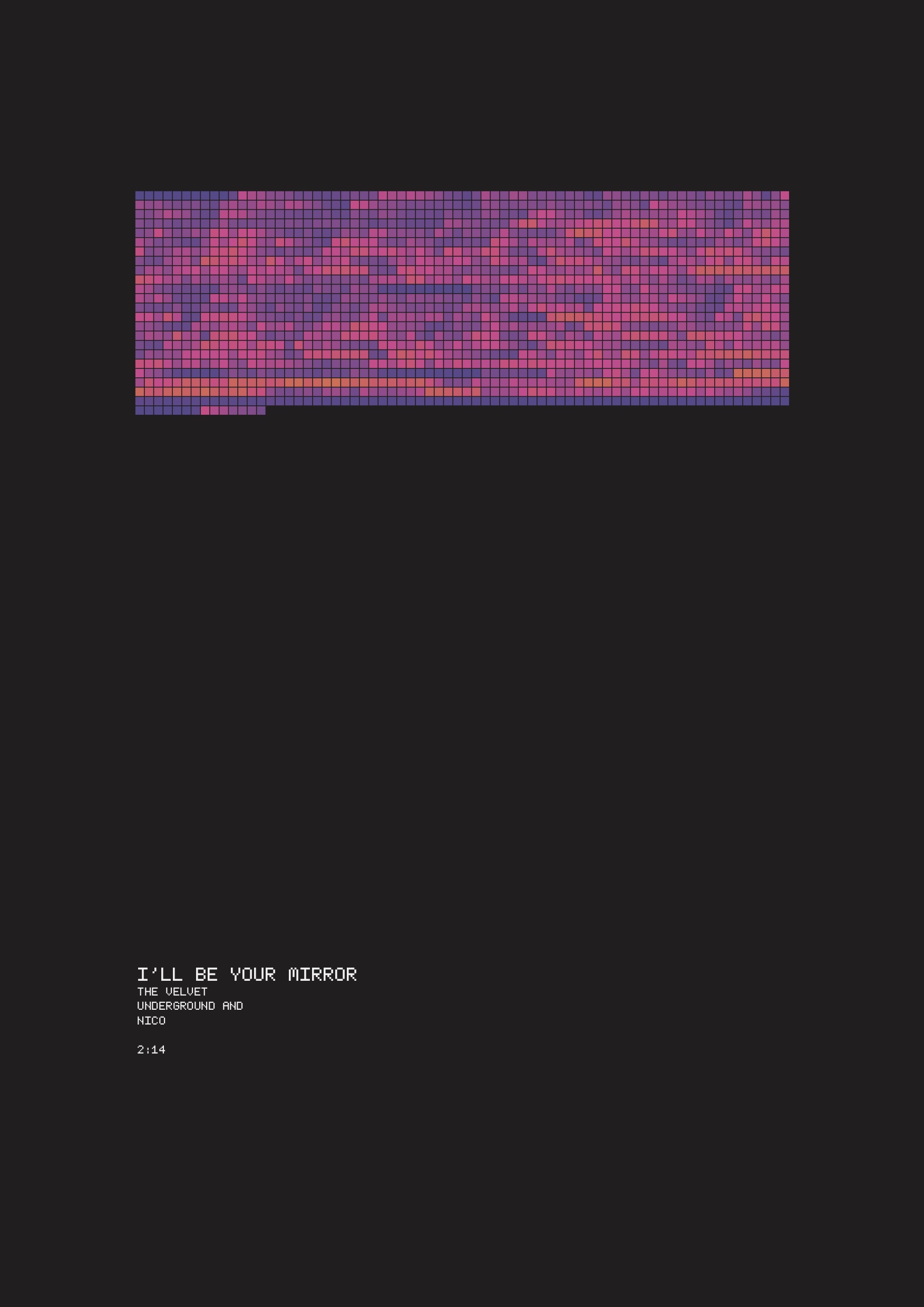
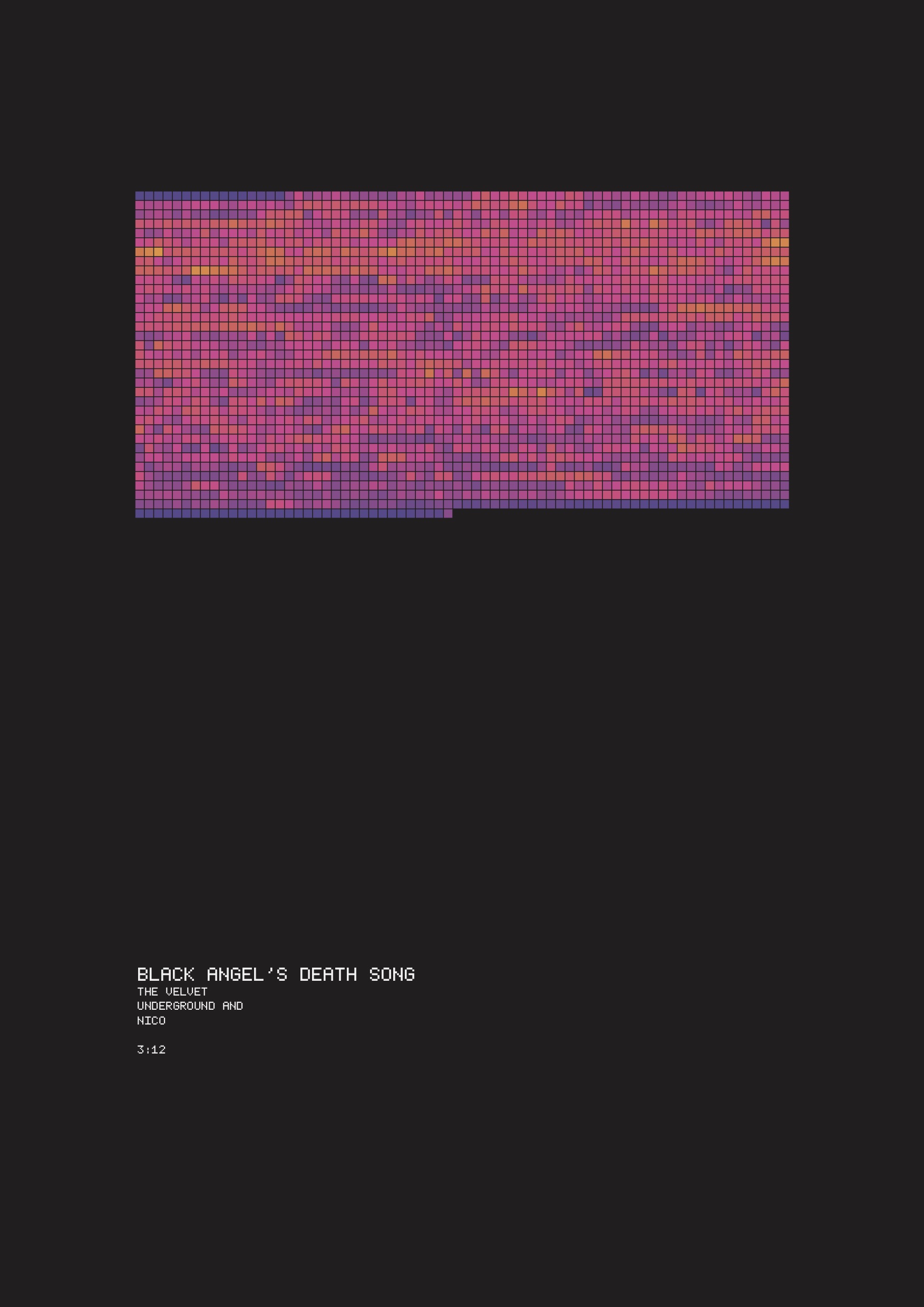
I am interested in how I could use code to generate outcomes based on sound data. I went about this by mapping the frequency data from songs onto a sequential colour scale.
I created a series on ‘The Velvet Underground and Nico’ album because I’ve always found this album inspiring and wanted to visually explore the experimental sounds and transitions in moods from each song.
I decided to visualise it using a sequential colour scale with the low frequencies on the left (purple) side of the spectrum and the high frequencies on the right (green) side of the scale.
I chose this colour scale because I feel as though the colours are dynamic and represent the emotions and ideas of the songs that I interpreted whilst I was listening to it (although I realise this is very subjective.) I also feel as though contextually, It links in with the psychedelic colours of the sixties which is when the songs were produced.
It was interesting to visualise the Velvet Underground album using the same colour palette for all songs, as it allowed me to compare how long songs were and which parts of the album were more lively and energetic.
Overall I found it really interesting to compare the patterns in the song and enjoyed exploring how my visual experience of the songs compared with listening to the song.
The entrant has supplied multiple files for this project:
[1] [2] [3] [4] [5] [6] [7] [8] [9] [10]
-
CreditsMuskeen Liddar
-
Award
-
Categories
-
See more


