
Bike Commuting by Guenter Richter
Visualization of bike sharing trips for a given time window of a business day to create a snapshot of commuting patterns. Selecting different periods of a day these patterns can be compared to leisure or other bike usages.
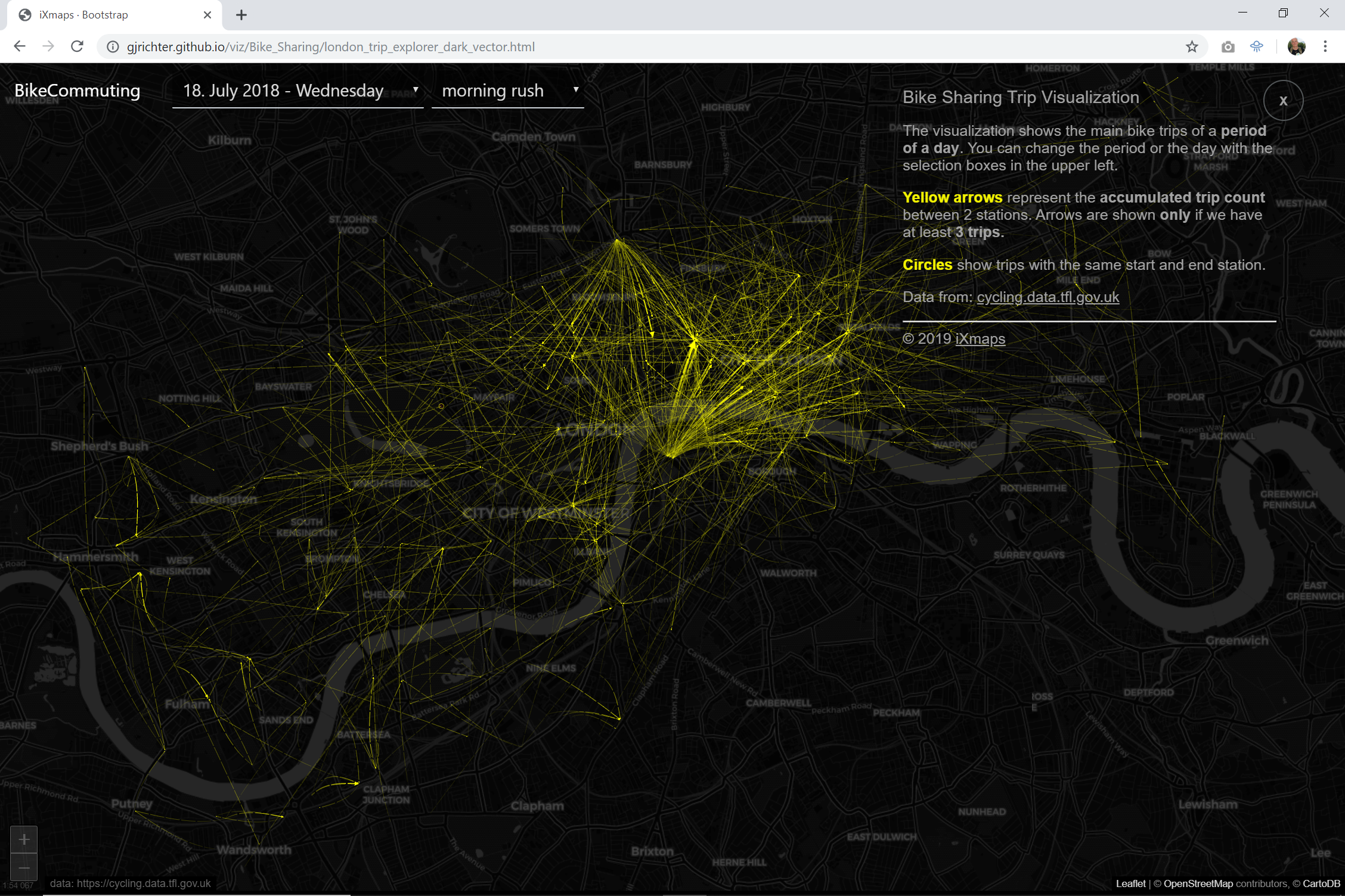
The graphic, created ad hoc from the raw data, aggregates the bike moves between the stations of the bike sharing provider within the selected period of a day.
The result is shown in a graphic composed by 4 different elements.
The start and end points are visualized by starburst charts where the rays of the chart are oriented towards the trip end or start. Start points are coloured in red, end points in green. The size of the rays represents the number of trips started towards the same end station, or being received from the same start station.
The trips are shown by yellow vectors. The line width represents the number of trips between two stations.
Trips with the same start and stop station are shown by circles.
In the interactive version, the user can select different significant moments of a day and analyse the bike usage in relation to commuting patterns or leisure movement.
The visualization includes data form 18. July 2018 to 24. July 2018 and covers the 7 days of a week.
The entrant has supplied an additional file for this project: [1]
-
CreditsGuenter Richter
-
Award
-
Categories
-
See more


