I Am As Tall As ... by South China Morning Post
This interactive project visualises publically available data and historical chronicles in the case of figureheads like William Wallace. The data visualisation by the South China Morning Post’s infographic designers, Marcelo Duhalde and Dennis Wong, is composed in the form of a bar chart to compare the heights of contemporary and historical world leaders chosen as being of interest to a Hong Kong readership. A colour key indicates which of the movers and shakers are alive or deceased.
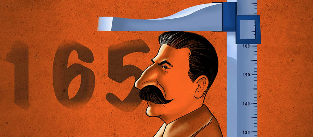
The composition is a visual reference to a police lineup. Politicians, Generals, heads of state and spiritual leaders from different epochs are arranged from shortest to tallest, left to right.
Recent studies have controversially revealed taller people tend to receive bigger pay packets. The authors were curious how these charismatic, larger than life, world leaders, stacked up in terms of height compared to their national average.
Readers are also invited to interact with the story by entering their own height and gender, metric and imperial options are provided. A gray silhouette representing the reader appears among the celebrities. By scrolling horizontally readers can go toe to toe with world leaders and compare them to their own height.
It is a playful solution with instant results and is a formula that can be transposed into many scenarios allowing users to pit themselves against others in any number of scenarios.
The portraits are simple vector drawings designed to not distract from the concept and data. A caricature of Joseph Stalin was used for the placeholder image as an example of a ruthless political leader demonstrating height doesn’t necessarily reflect a person’s power.
-
CreditsDennis Wong
-
Award
-
Categories
-
See more


