Deaths relating to drug poisoning in England and Wales. by University of the arts London, central saint martins
As someone who has seen the damage drug abuse does to people I was inspired to create this infographic with the main purpose of displaying clarity and understanding. We often hear the names of these drugs but do we often get to see what they look like? What is it that we should be cautious of?
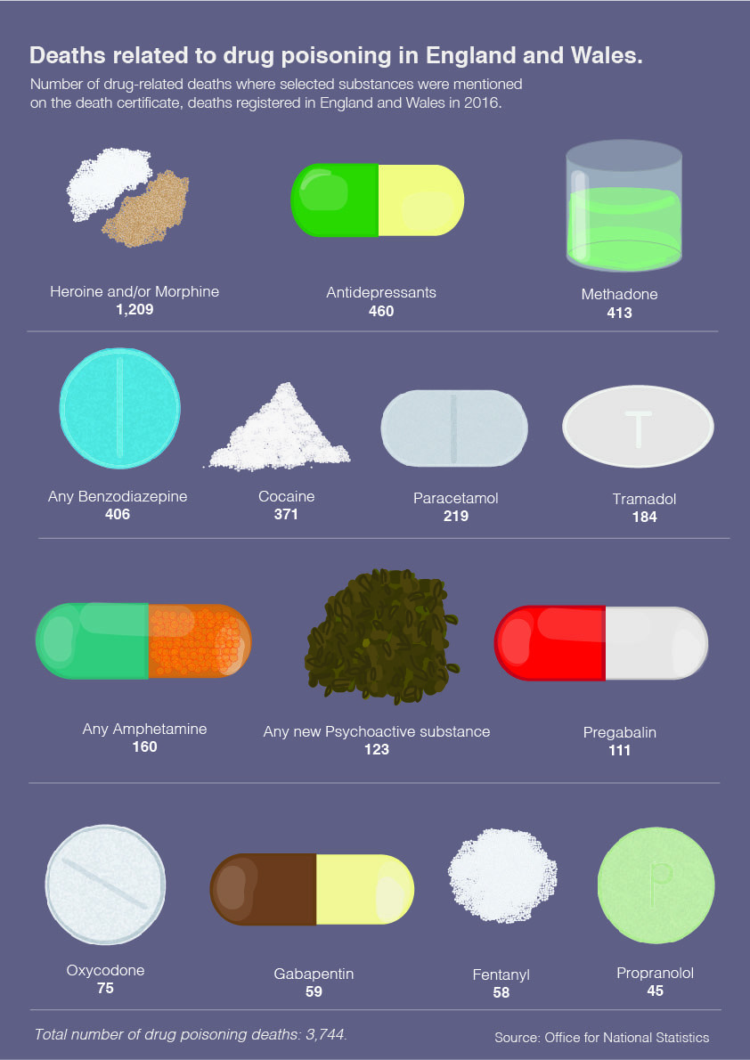
I feel like statistics regarding substance abuse are more understandable when people can see what the actual cause is. Its aim is to educate, so I believe that having a visual representation of the cause is vital. The reality is that what can be perceived as harmless elements can and has been deadly. Only a few of the drugs listed are illegal substances.
In this case it’s beneficial to the reader if they can see what it is that could be dangerous to know to look out for it, if need be.
I purposely made it clear to read by making the information direct and simple. It’s in order from the biggest amount of deaths to the least with an image, name of the drug and number of deaths. It’s designed to represent the number of drug-related deaths where selected substances were mentioned on the death certificate, from deaths registered in England and Wales in 2016. I hope the infographic has a visual and lasting impact on its readers.
-
Credits
-
Award
-
Categories
-
See more


