
The Winners: Visualization & Information Design
This category included everything your dataviz-loving heart desires: tools, resources, apps, sites or graphics for & about dataviz.
GOLD WINNER
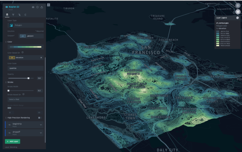
Kepler.gl by Shan He, Giuseppe Macri, Chris Chua & Abhishek Gupta
A web app for visualizing geolocation data, Kepler can render millions of points representing thousands of trips.
SILVER WINNER
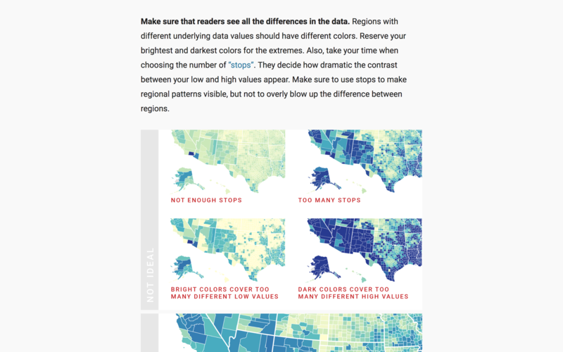
Chartable. A Blog by Datawrapper.
Chartable is a blog written by the dataviz-wizzes at Datawrapper, a charting tool for journalists.
BRONZE WINNER
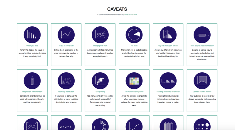
From Data to Viz by Yan Holtz & Conor Healy
A decision tree for selecting the best chart type for your data.

