
Stylized Beeswarm chart using triple encoding to display the number of people who entered Iron Viz, the number of times they've each entered the competition, and the total number of works they've...
-
 View projectTributary poster celebrating the journey from Data Visualizer to data artist. Showcasing their unique identity, style, and work and mapping his journey for past 10 years.
 -
 View projectThis visual analysis presents a comparative study of the energy transition trajectories of China and Germany from 2000 to 2023. Focusing on their heavy industries, which encompass high-emission...
 -
 View projectSouth Korea has the world's lowest birth rate and its total population started to decline in 2021 for the first time in recent history. A recent BBC article showed that the birth rate continued to...
 -
 View projectClimate change demands immediate attention, and it’s surprising to learn that 18.4% of total greenhouse gas emissions come from agriculture. This raises an important question: how might we make...
 -
 View projectDrone shows are becoming an increasingly popular way for cities to celebrate events. As an alternative to traditional fireworks, they are much safer and eco-friendly. Furthermore, they are...
 -
 View project"Try Not to Gag" is a broadsheet about Nathan’s Hot Dog eating contest, held annually on the Fourth of July in Coney Island, NY. The project highlights the trends, strategies and controversies of...
 -
 View projectThis visualization offers an engaging overview of performance statistics and key facts from the UEFA European Football Championship, focusing on its 2024 edition. It highlights notable players,...
 -
 View projectTypeNow is a student-focused initiative aiming to spread awareness of typeface design and typography – both as practice and profession. Its first issue centers in on typeface design programs across...
 -
 View projectAn unusual interactive visual exploration of self-love and small joys in everyday life, blending personal data, storytelling, and art. This project began with an Instagram account created by Ted...
 -
 View projectA personal and data-driven look at the intersection of technology and health, this visualisation explores the transformative impact of modern medical technology on managing type 1 diabetes. Seen...
 -
 View project“La Vorágine,” written by Colombian José Eustasio Rivera, portrays the brutality of exploitation in the Amazon rainforest and denounces the social injustices that afflict the most vulnerable...
 -
 View projectThis is a data-driven exploration of public art across New York City’s boroughs to visualize the various concentrations of art installations in the city’s transit system from 2000 to 2023. By...
 -
 View projectLook Back at the Paris Olympics' High Jump and Pole Vault events through animated data visualizations. https://krisztinaszucs.com/blog/20241211_highjump/
 -
 View projectIn 2024, female pop artists Sabrina Carpenter, Chappell Roan, and Charli XCX redefined the pop music landscape with critical acclaim, viral success, and a strong cultural presence. Their impact...
 -
 View project‘Things I love about my cat’ is a humorous quantified-self exploration of my relationship with my cat. I embarked on a whimsical journey to capture why I cherish her, focusing on the little joys...
 -
 View projectIn basketball, each player performs their role. Some focus more on offense, others on defense, while some support the entire team through their actions. In the "NBA Gems" visualization, the Ternary...
 -
 View project“Pathways for Girls in Africa” is a storytelling that visualizes data on adolescent girls in Sub-Saharan Africa, highlighting key indicators like education, employment, and early marriage to...
 -
 View projectOur Human World on a Breathing Planet This piece merges monthly precipitation patterns with population density, visualized spatially to reflect the interplay between nature and human life, all...
 -
 View projectReuters investigates the persistent use of flammable cladding materials in high-rise buildings, including those used on Grenfell Tower in London. The piece focuses on a devastating fire that...
 -
 View projectThe visual thesis deconstructs the process of trend forecasting in typeface design. It explores the factors driving these trends, from cultural shifts & technological advancements to artistic...
 -
 View projectI created this poster as part of the Infogr8 Future Fridays & Data Visualization Society initiative. It was themed around the United Nations Sustainable Development Goals (SDGs) and I narrowed...
 -
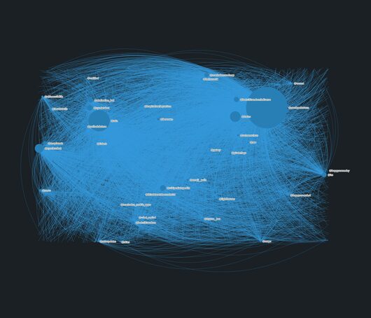 View projectI’ve been running a network of creative bots on Mastodon since August 2018. In that time I've created over 50 automated accounts, posting anything from live views of the NYC skylines and South Pole...
 -
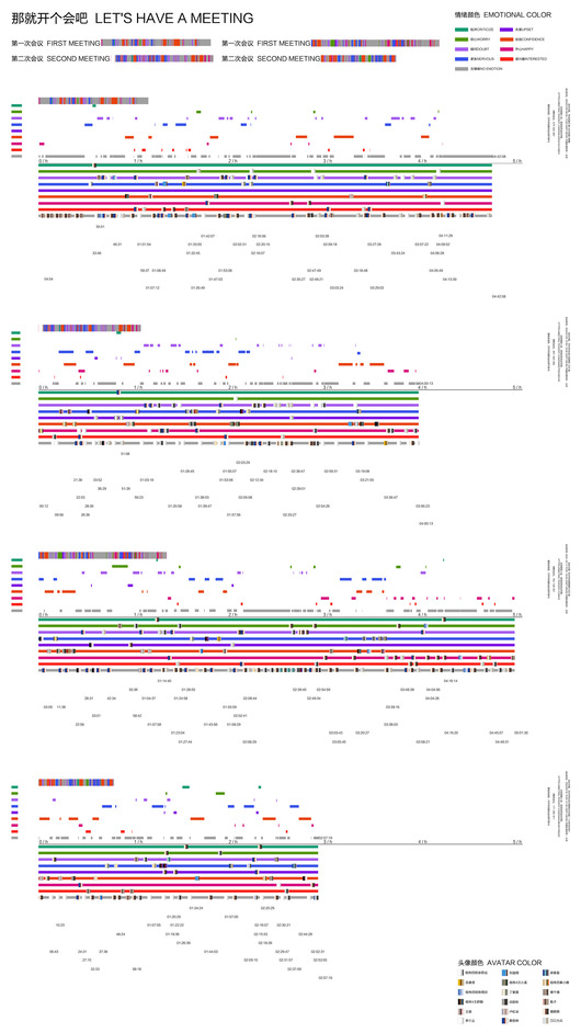 View projectAs an important online communication tool, Tencent Meeting has rapidly gained popularity and has become an indispensable part of our daily life and work. Sometimes students are nervous when giving...
 -
 View projectThis data-scrolling story delves into the evolution of same-sex marriages in the City of Buenos Aires, Argentina, since the law's approval in 2011. As one of the first countries in Latin America to...
 -
 View projectAdventure Awaits is an interactive map designed to connect you with America's national parks. Having grown up in California, where stunning parks were just a drive away, and then relocating to New...
 -
 View projectThe Climate Bracelet encodes decades of temperature changes in Arkhangelsk, Russia, using the Warming Stripes method by Ed Hawkins. Each pair of bead rows represents a year, with red for warmer...
 -
 View projectAn interactive Tableau dashboard built to support the draft process for a fantasy baseball league my close friends and I have been running for 15 years and give all league participants historical...
 -
 View projectThis is the first piece in a triptych of three titled MAD (Music-Astronomy-Drugs). There is a shared musical, celestial, and psychedelic quality to all three pieces. Here I visualize the note...
 -
 View projectUSA TODAY’s analysis began in 2022 with data from the National Renewable Energy Laboratory and Columbia University’s Sabin Center for Climate Change Law. Both track laws governing solar and wind...