What if Earth’s terrain was created by nighttime lights? This 3D web mapping experiment sheds some light on the question with a complete resculpting of our planet's surface.
Human light...
-
 View projectThe visualization is created using Tableau software and some of the design elements are created with MS PowerPoint. The viz represents the recent trends of refugees migrating to the U.S from around...
 -
 View projectCOVID Gowns is an interactive online visualization of Canadian COVID-19 cases. A common horizontal timeline or horizontal bar chart is limited by how much data can be included because the data will...
 -
 View projectHow to read this chart: Each line chart shows the rate of change since 2009 of tuition and fees in US states (counting public in-state four year institutions). Red shows values higher than the...
 -
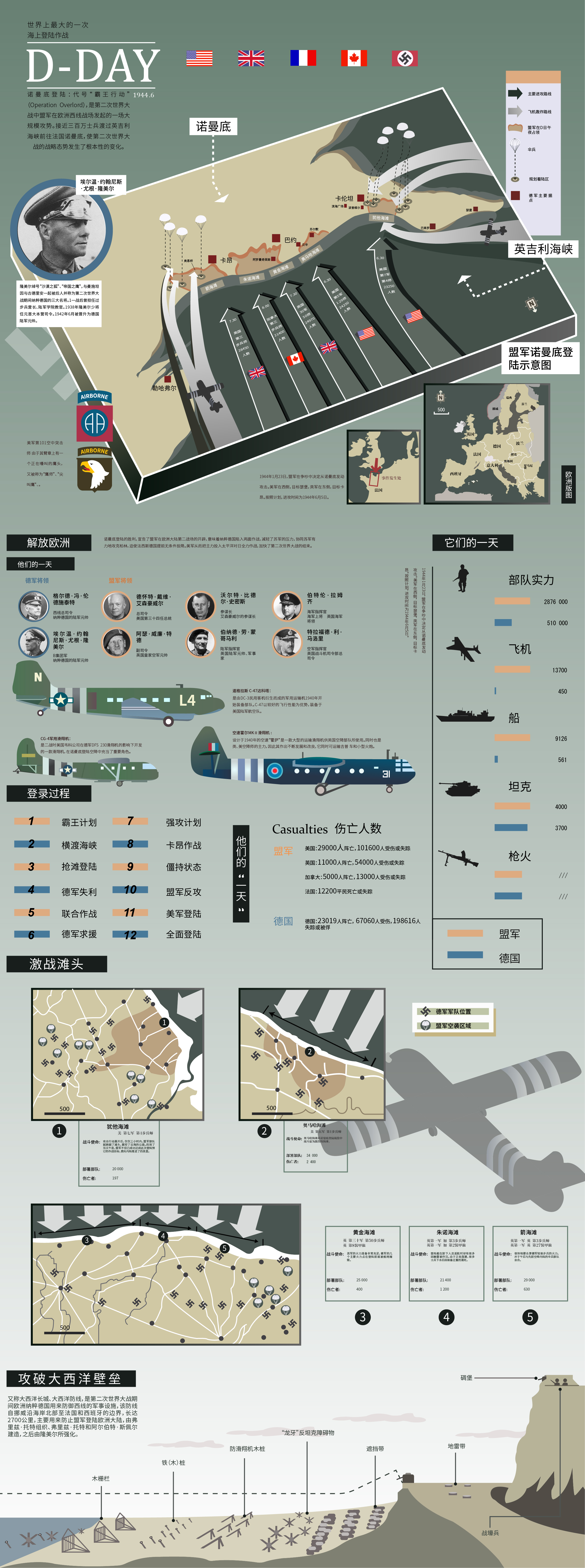
 View projectThis is my junior year's information course assignment in the last semester. At the time, I chose the historical event of Normandy landing. I learned the war and learned the greatness of this...
 -
 View projectHow would be the perfect selection of candies to give away on Halloween to make everyone happy based on a survey.
 -
 View projectAs of December 2024, more than 70,000 dead or missing human beings have been documented by the Missing Migrants Project of the International Organization for Migration (IOM) since 2014. The actual...
 -
 View projectThis work presents changes of the angle at which the Sun's rays strike the Earth's surface during the year. It is aiming to explain what causes the change of seasons. I calculated the angle of...
 -
 View projectThis visualization reimagines how we understand book genres through the lens of network science and data art. By analyzing bestseller data and user-generated book labels from Open Library's API, we...
 -
 View projectIn what Maps.com calls “an exemplary experience for public communication,” this interactive website developed by the USGS Vizlab highlights the location of beverage-bottling facilities in the...
 -
 View projectThis article, published on the anniversary of Australia’s first documented cases of COVID-19, uses a national dataset of every confirmed coronavirus case (a dataset built by our team) to tell the...
 -
 View projectAfter Amelia and Oliver have yet again topped the list of most popular baby names in England and Wales, we look at how other names are faring. While Mia and Ella were gaining fans, there were...
 -
 View projectPulse of Love and Hate is an interactive and sonified data visualization of the hourly occurrence of the words 'Love' and 'Hate' on Twitter. Many users spend time reading various online news...
 -
 View projectOnboarding is the process of introducing newly hired employees to our organization's expectations, behaviours, and culture. COVID-19 has permanently altered how we work, and consequently, it has...
 -
 View projectThe FIFA Football World Cup was held in the Arab world for the first time in history in 2022. To mark one of the world’s biggest sporting events, at the start of the tournament, Al Jazeera...
 -
 View projectClimate change has a direct impact on the intensity and frequency of heavy rainfall and heat waves. This is shown by the IPCC reports from 2021. The interactive data story “Weather Extreme”...
 -
 View projectThe Hostages: A Visual Representation of Time, Status, and Connections. This interactive visualization presents the hostages through silhouettes that reflect their gender and age. The background...
 -
 View project“What’s Really Happening” is an informational graphic poster describing a typical female college student lifestyle. The intent is to show the reasons and meanings behind different behavioral...
 -
 View projectECLIPSE is a personal project I developed from start to finish: conceptualization, data collection, visualization design, and the handcrafted production of the book-object. This book tells the...
 -
 View projectInfographics show median voting scores, representing participants tastes since 1994 till 2013. Outcome flow shows voting statistics, how one country participant voted for another, while income flow...
 -
 View projectA collaborative project with CJ Mayes - visualising Manchester United's 2020/21 English Premier League Season. Understand how their form changed throughout the season, in addition to a stark...
 -
 View projectw̶o̶n̶d̶e̶r̶ is a physical installation where a visualization is projected over a bowl of water. The visualization animates through four years of my photos, with each dot representing a photo...
 -
 View projectThe digits of Pi are assigned mass and placed uniformly around a circle. The simulation calculates the gravitational forces between all mass pairs and moves the masses accordingly. When masses...
 -
 View projectThis piece uses musical notation to visualize songs in Disney animated feature films. It depicts when songs occur, how many times they occur and who they are sung by. From this, one can see...
 -
 View projectThe Science of Jogging: How To Run Better?' is about the quality and habits of running, analyzed from an exclusively Swiss perspective, and mapping the amounts of runners and their average...
 -
 View projectThe digitalization of todays society emerges into nearly all aspects of our lives. Musicians, dj‘s and producers mainly use digital music formats nowadays. Digital music files and current dj...
 -
 View projectThe European Commission targets a tripling in the EU’s organic farmland from today’s 8.5 percent of agricultural terrain to one quarter by 2030. Cash and subsidies will be available at national and...
 -
 View projectThe Japanese government is planning to release treated wastewater currently stored at the Fukushima Daiichi nuclear power plant into the Pacific Ocean later this summer. The plant was damaged by an...
 -
 View projectNYC Covid Mortality Map is an interactive data visualization that aims to shed light on health disparities by visualizing the imbalanced death toll of Covid19 across different zipcode areas in New...