
While horses have come close in recent years, none have come close to replicating the winning form of Affirmed or Secretariat, perhaps the most famous horse of all time. Activ8Social takes a closer...
-
 View projectThis infographic reflects our evolving awareness of space, showing discovery and exploration of planets in our solar system, and the recent accelerated pace of exoplanet discoveries driven by new...
 -
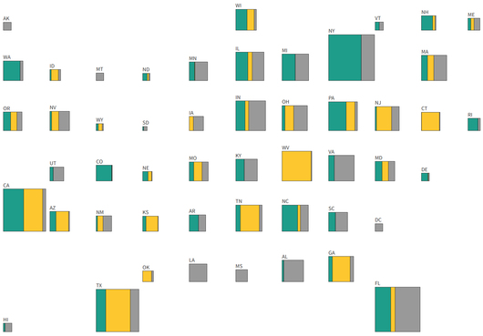 View project“Payback: Tracking the Opioid Settlement Cash” is a series that uncovers how state and local governments are using — and misusing — billions of dollars they’re receiving from companies that fueled...
 -
 View projectCrimes are a reflection of the period and society in which they occur. What happened, the objects and people involved, the location, how it was reported, all tell us something about the values,...
 -
 View projectThis project presents an in-depth, interactive exploration of Romania's socio-economic development across 16 critical categories, offering a fresh and engaging approach to data visualization and...
 -
 View projectIn this personal project, I explored my music preferences by analyzing my Yandex Music listening data from November 8 to November 14, 2024. I wanted to understand how much I listen to, which tracks...
 -
 View projectA nutritional analysis of food and drinks available at Starbucks using D3.js and employing HTML/CSS to imple- ment the visualizations. The website presents a story that uses various data...
 -
 View projectA poster designed for OCAD University's graphic design graduate exhibition in Toronto, Canada. The work in the 2014 graduate exhibition spanned a wide variety of subjects and media. This...
 -
 View projectThis visualization (interactive version here) is a musical history of one of my favorite artists: Bruce Springsteen. It focuses on his 200 songs and 17 original studio albums over a 45 year career....
 -
 View projectFor the past few months, I have spent much of my spare time trying to delve into the mindset of a dog whilst out on their walks. Where do they go on their adventures? How far do they deviate from...
 -
 View projectCapture the now with Kennedy. A new way to mark moments in time complete with surrounding context of the things happening around you. One tap and Kennedy will collect data about where you're...
 -
 View projectACE is an interactive web-based engineering course designed to increase vibroacoustic awareness. ACE consists of two modules: Module 1 – Vibroacoustic Materials – contains 11 chapters with quizzes...
 -
 View project“Roads to Rome” is a data visualization project exploring one of the biggest unsolved quests of mobility: Do all roads really lead to Rome? The project resides somewhere between data...
 -
 View projectGas prices are on the rise again—about 4.2 percent, on average, in the past three months. Behind that increase is a wide range of price swings felt differently around the world. We ranked 61...
 -
 View projectOn 1 February 2021, Myanmar's decade-long transition to democracy was upended when the military overthrew the government. This coup triggered nationwide protests by the pro-democracy public, who...
 -
 View projectOur in-depth analysis using data from IMDb and The Numbers reveals a significant increase in both the quantity and proportion of 2h+ films since 2020. Using this as a starting point, we interpret...
 -
 View projectInspired by the 'Loy Kratong' festival in Thailand, Under the Asian Moon delves into the cultural, religious, and spiritual significance behind the full moon celebrations across Asia. Under the...
 -
 View projectThe Philippines has been experiencing rapid economic growth in the past 10 years, yet there is a huge contrast between economic development and poverty incidence among the regions. Did the rural...
 -
 View projectThe project is a visual analysis of the letters written by Vincent van Gogh to his brother Theodorus ("Theo") between 1873 and 1890. For each letter an automatic linguistic extraction has...
 -
 View projectInformation Graphic Visionaries is a book series celebrating spectacular data visualization creators with original research, new writing, and beautiful visual catalogs. We launched in November 2022...
 -
 View projectWe need to communicate data in a way that it makes people stop and think. In this data video the climate stripes blend with an animated emoji showing annual global temperature anomalies. The...
 -
 View projectTo celebrate 30 years of NatCen's British Social Attitudes survey we launched a new interactive data tool letting you explore 30 years of data on attitudes to the economy, welfare, morality,...
 -
 View projectThis project was a response from a Design Council brief during our MA data visualization at LCC. We set out to reframe the story about the current and future state of the UK design economy drawing...
 -
 View projectYou traverse an American’s family tree, and eventually you find an immigrant. And most of the time, you don’t have to go back that far. So … what if everyone went back where they came...
 -
 View projectIn February 2020, South Korea announced thousands of coronavirus cases in the space of only a few days, an outbreak that initially pushed their tally of confirmed cases much higher than anywhere...
 -
 View projectA common business question is "How does the percent of total for a category change over time?" Some ways that are typically used to visualize this data include a stacked area chart, stacked bar...
 -
 View projectA timeline about the evolution of Mecha done for "Pacific Rim" released in theaters. From Mazinga Z to Gipsy Danger, without forgetting Gundam and Power Rangers.
 -
 View projectThe primary objective of this project is to visualize the projected growth and population changes in the world's largest cities in a way that communicates both the complexity and interconnectedness...
 -
 View projectPresenting the San Francisco Purchase Commodity Dashboard: Elevating Business Intelligence and Visualization for Informed Decision-Making! 🛍️💼 Dive into the realm of procurement analytics,...
