Food Poisoning Outbreaks Digested by Andrew Park
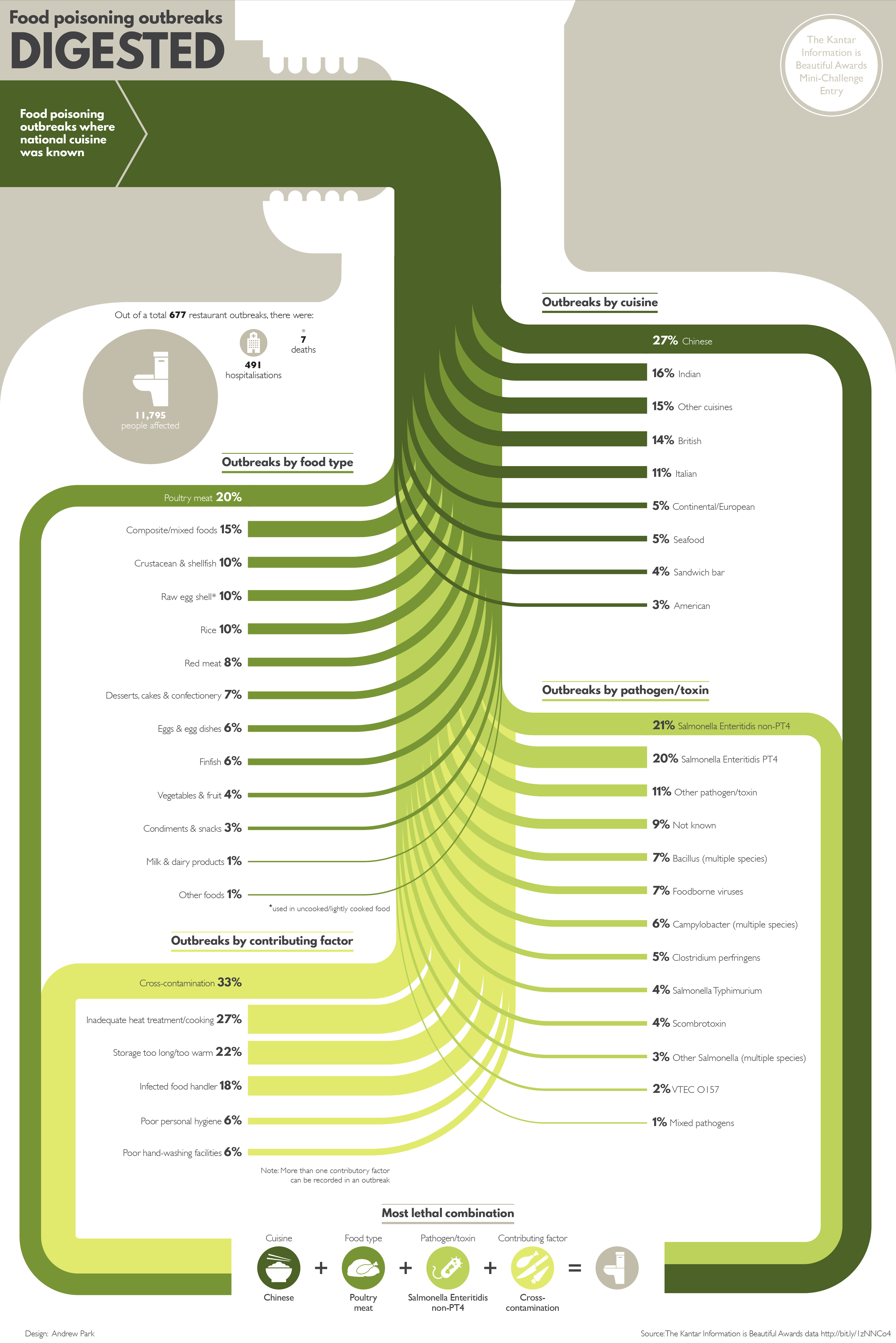
Using a Sankey diagram, the visualisation charts the percentage breakdown for food poisoning outbreaks by national cuisine, food type, pathogen/toxin and contributing factor where the cuisine type was known.
The diagram concludes with the "most lethal combination", highlighting the top factors that led to an outbreak.
I thought it would add context to frame the Sankey diagram in a human body, as though it was being eaten and spreading through the body like a disease.
-
CreditsAndrew Park
-
Challenge
-
Categories
-
See more


