An Economy Built on Slavery—A Future Build On Freedom? by Cédric Scherer Data Visualization Design
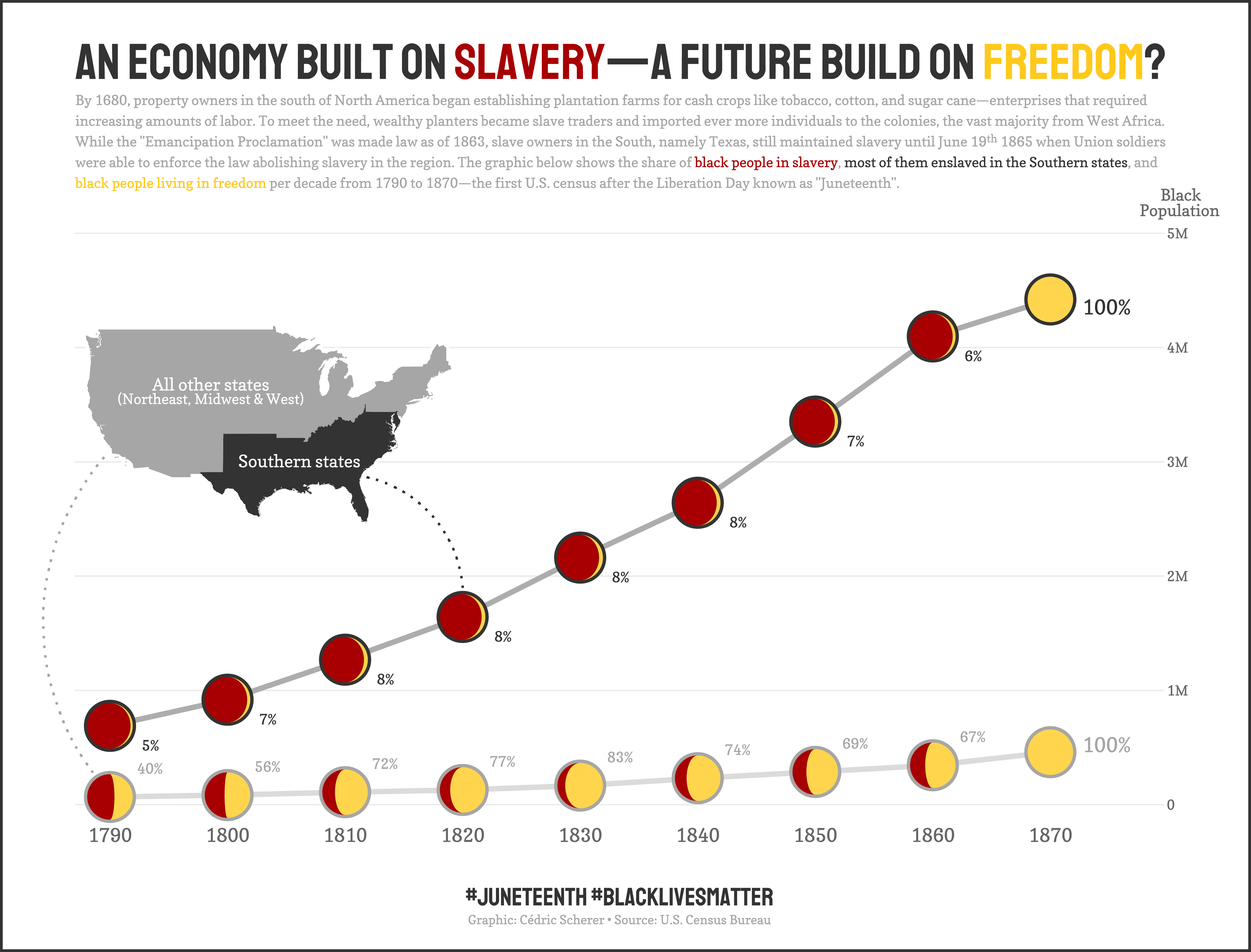
A hybrid visualization combining a line chart and moon charts to illustrate the black population and the share of black people living in freedom in the United States from 1790 to 1870.
The main aim of the visualization is to highlight the differences across the United States in the number of black people living in the different parts and the share of them living free. While in "all other states", the share of black people living in freedom was 40% in the 1790s and steadily increasing, the numbers of black people in Southern states was increasing tremendously; however, the share of the black people living in freedom stayed low—until te "Emancipation Proclamation" when numbers (officially) rised to 100% across all states.
The line chart shows the black population per decade for the Southern states of the US versus that of all other states.
The moon chart provides additionally the share of black people living in slavery (red) versus those living in freedom (yellow). An inset map illustrates which states were considered as Southern and "other" states.
(Note: I am well aware that the states where changing over time; the U.S. census data was aggregated to match the states of today.)
As property owners in the Southern states required increasing amounts of labor to run their plantation farms successfully, the title states "An economy built on slavery" with a uncertain but hopeful intonation that the future will be build on freedom.
The main visualization was created as a personal contribution to the #TidyTuesday challenge in June 2020 to raise awareness of the BLM movement and the Juneteenth celebrations.
The visualizations were completely created in R with ggplot2. The code and image are publicly available on GitHub.
-
Creditsnone
-
Award
-
Categories
-
See more


