My life with them, my life without them by Noemí Folgueira
Can data visualization help you cope with confinement?
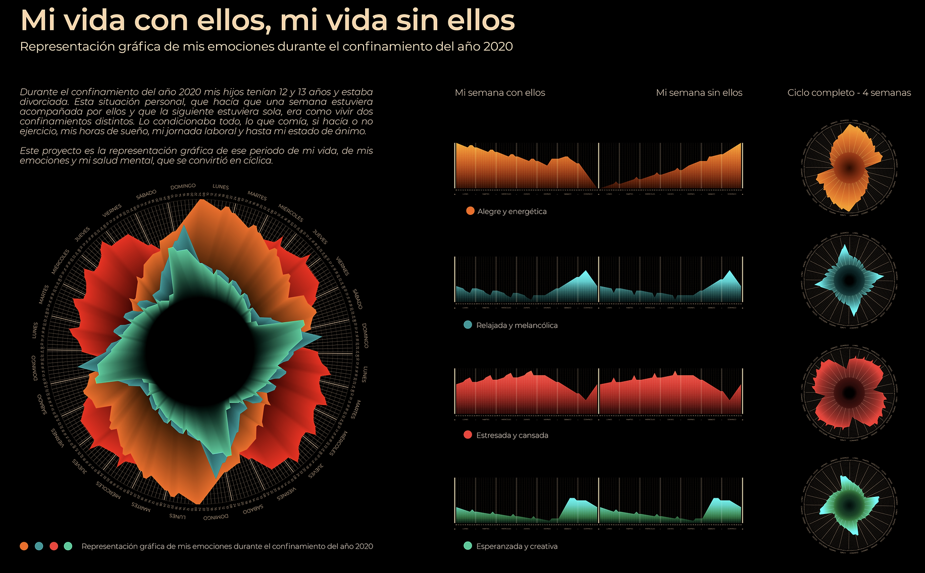
My name is Noemi, I am divorced and I am the mother of two children who, during the 2020 confinement, were 12 and 13 years old. This personal situation, which meant that one week I was with them and the next week I was alone, was like living two different confinements.
When they were with me, I did a lot of shopping, cooked their favorite dishes, ate healthy, exercised with them in front of the TV, worked fewer hours and still laughed a lot.
When they weren't around, I made do with leftovers from the fridge and potato chips, worked almost fourteen hours a day and my leisure time was a virtual vermouth with friends.
The transition from one week to the next was no less difficult. I don't remember how many times I was stopped by the police on the road taking my children to and from their father's house, with the car full of papers that I had to show every time I was stopped: divorce decree, family book, identity card of the three of them, rental contract to prove where I was living at that moment and a copy of my ex-husband's rental contract to prove where I was going or where I was coming from.
As the weeks went by all of this began to affect my emotions, differently depending on whether they were home or not.
As a designer, I have always believed that creativity is fundamental to making life simpler, easier. So I decided to take action and turn such a difficult moment into something enriching. Why not use data visualization to represent what was happening to me? It would be both good therapy and entertainment for when they were away. I started to create the data series: I defined four variables and began to write down my levels of joy, sadness, hope and stress throughout the hours of the day and days of the week that I was without my children. I then repeated the operation the following week when they returned and so on for four weeks. I transformed the data into line graphs and these in turn into pie charts, putting four weeks together in each. In this way the data became flowers of light representing my emotions and my mental health, which was cyclical at the time, in an explosion of emotions and color.
Just keeping my head busy on this project made the situation not seem so serious and gave me an incentive to get out of bed in a better mood. The graphic result told me many things about me, and about my understanding of infographics.
So the answer is yes, data representation can help you cope with confinement.
Translated with www.DeepL.com/Translator (free version)
-
Credits
-
Award
-
Categories
-
See more


