THOU SHALT SHRED by Maryland Institute College of Art
For this project, I focused on the process of developing compelling narratives using information and data, accompanied by techniques primarily associated with audience. The consideration of the audience has been central to my work, but this was my first time specifically working with and developing user personas. And so was birthed, "THOU SHALT SHRED", a guide for any cover band seeking to melt the faces of their adversaries and the hearts of their audiences.
The dataset I stumbled on that snowballed into this magnificent, metal music madness was Sean Miller’s “RS 100 Greatest Metal Albums of All Time”. Amazingly, and much to my appreciation, Sean included each of the songs within the albums AND their Spotify audio features. Alongside this dataset, I discovered that MetalSucks maintains Spotify’s ‘monthly listeners’ counts for several hundred metal bands (wowza).
The persona I ran with was — drum roll, please… Katie Kruel (She/Her). Katie is the badass lead singer of Mugshots, a grungy, metal cover band based in Cleveland, OH, home of the metalheads. During the day, Katie works as an accountant. So, she understands the importance of numbers. However, she also understands the importance of fun and thriving outside the cubicle. What’s more fun than rocking out in front of a massive crowd while they headbang alongside you? (The answer is nothing. Well, except maybe data viz.) Katie wants to know what it takes to get the head[bang]counts up and rip out the hearts of the crowd.
In my mind — and there’s a lot going on in this mind — two basic questions I would want answered as a metal cover band would be, "Who are the most popular bands?" and "Which songs are the most popular?" For the more nuanced questions, though, you just have to get your hands dirty and dig in there! And the most helpful form of achieving this is often the visual one. In this case, radar charts seemed like the best fit to display the audio features.
Some advantages of using radar charts:
1. You can compare multiple variables that connect to form a group in a less cluttered manner.
2. They allow for quick comparisons.
3. Outliers are noticeable.
4. You can use different scales of measurement.
5. They look cool.
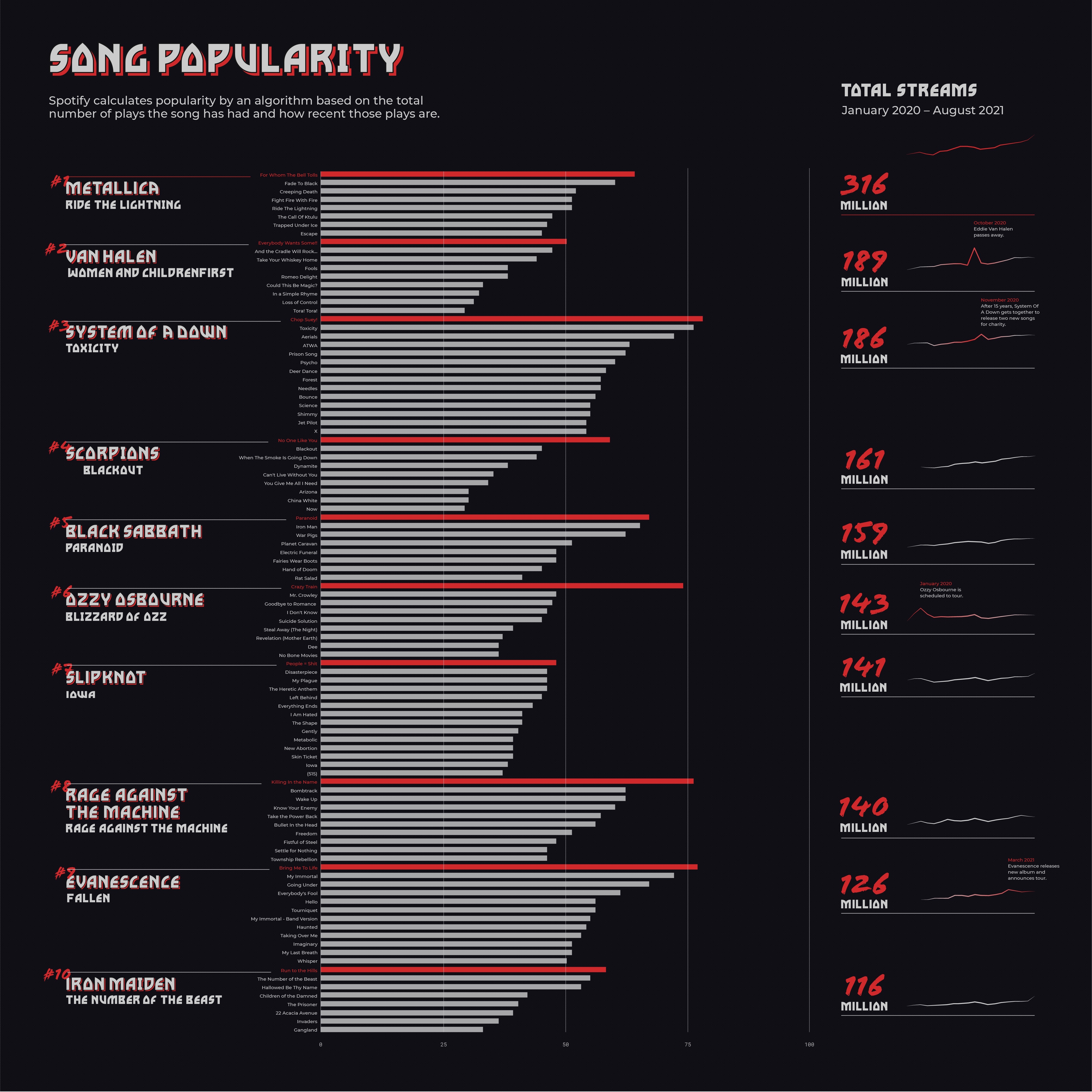
Visually representing every song from an album on a radar chart was certainly insightful, but a hot mess with no real contribution. Ultimately, I chose to stick with the most popular song (red) and the least (grey), which Spotify calculates using an algorithm based on the total number of plays a song has had and how recent those plays were. It is interesting to see that the majority of the metal bands listed do not diverge from their established audio features. (Slipknot was the biggest culprit of this, maintaining their little mountain.) Van Halen, Black Sabbath, Ozzy Osbourne, and Evanescence appear to be the bands with the most stylistic variation, particularly when it came to ‘acousticness’. These outliers felt significant because they demonstrate that a band can stray from the “standard” metal sound and still have a strong following, which is pretty darn cool. Consequently, I chose to represent them in the final visualization as outlines. (I was able to present this project to an amazing virtual audience [shoutout to my cohort], but I do recognize that I failed to provide an explanation of these in the key.)
Q: What would you say characterizes metal music?
When looking at the bar graph, which further breaks down the popularity of individual songs, Slipknot appears to have the most evenly distributed album. In theory, that would make them a solid choice for a band who wants to cover a sole artist, rather than individual songs. Another area of interest is the spikes in total streams, which generally occurs when a band announces a tour or releases a new album. This seems pretty obvious, but it was not something I had considered. Another solid choice for a cover band to take advantage of! Sadly, in some cases, the loss of a band member is another reason for these spikes.
I am not the biggest fan of dark backgrounds in my design work because they are incredibly difficult to work with — kudos to people who do — and, for lack of a better explanation, it feels heavy to me. (Fitting for this project.) Generally, when it comes to data visualization, I would only consider a dark background if the content had an ominous tone or was related to technology. So, what did I decide to do? Challenge myself and make a dark background! And what screams ‘METAL!’ more than red and black? I tried to be mindful of using the red sparingly, since it quite literally competes with the black for attention and often causes eye strain. High color contrast is useful for readability, but pure black text on a pure white background, for example, can cause eye strain because of the intense light levels that overstimulate the eyes. (Science!)
The critique I received was the lack of [visually] communicating my insights, which is absolutely fair. If there is anything I have learned over this past year, it is that personal insights are what makes pretty much anything in life more compelling, especially visual storytelling.
That’s all she wrote, folks.
-
Credits
-
Award
-
Categories
-
See more


