The key sectors of the Canadian economy that can move the country towards clean growth by Voilà:
The work we do with our client, the Canadian Climate Institute, is always an opportunity to be bold, collaborative and to gain creative confidence. In this new project, the objective was to reveal the opportunities for the Canadian economy to actively participate in the development of a low carbon world. We created visualizations and a cover for the Institute’s “Sink or swim” report, and animated visualizations for social media.
Our initial research work in data visualization led to the creation of polygonal, irregular shapes that provide the basis of a strong and original visual impact further developed in graphic design. Here are a few examples of how they are used to illustrate report’s the key messages.
Chart: “Canada’s goods exports are sensitive to transition-related market disruption”.
In this Voronoi chart, the polygons come together to represent which sectors are vulnerable to the major trends that are transforming world markets. Vulnerable sectors are now grouped under the same colour (in orange) to immediately differentiate them from sectors that are not (in blue). This chart form is more intriguing and original than a pie chart would have been, attracting the eye and remaining consistent with the look and feel of the project.
Chart: “There are workers in transition-vulnerable sectors in every province and territory”.
In this study, the Institute focuses on vulnerable workers and communities. Disadvantaged or weakened by their jobs in high-emitting sectors, also called “transition-vulnerable sectors”, these populations must be at the heart of government concerns with a view to protect against risks and opening up to new economic opportunities. We use the polygonal shape in these Voronoi charts to illustrate the vulnerable sectors.
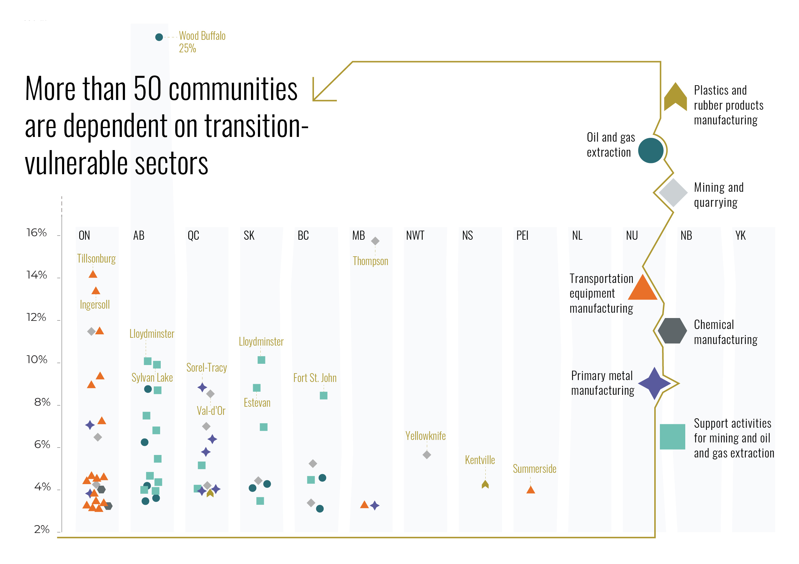
Chart: “More than 50 communities are dependent on transition-vulnerable sectors”.
Counter to the perception that some regions are immune to the ecological transition, the Institute identified over 50 communities across Canada that are economically dependent on transition vulnerable sectors. The visual shows each of the communities and what proportion of their workers are vulnerable. We played around with the layout to highlight an outlier and kept the chart clear by jittering the dots.
Chart: “Preparation for global low-carbon transition will determine whether companies sink or swim”.
The Institute also looked at the impact of international action to reduce climate change. It will impact each sector differently, and within each of them, companies will have to make choices. By adapting, they may see a positive impact on profitability and thrive. Otherwise, they may sink to the bottom and risk bankruptcy. The sectors are grouped according to the three main types of possible scenarios with subtle shading in an irregular shape.
Chart: “Three dominant drivers of profit change across sectors”.
There are three broad adaptation strategies for Canadian economic sectors based on the main drivers of profit change: demand creation, carbon costs and demand decline. This chart highlights the main type of profit change that some selected sectors will face. We used color redundancy to put the accent on the relevant type for each sector.
The irregular shapes and the golden arrow subtly guiding the reading direction are visual elements that are also found on the cover of the report, whose title is deliberately provocative. In this design, we highlight both the dilemma facing the Canadian economy and the opportunities brought by a transition to a low-carbon world. The oblique positioning of the shapes and text communicates the urgency created by the global ecological transition.
-
CreditsMarie-Blanche Rossi, Graphic Designer Celia Albano, Graphic Designer, Animator Estelle Villemin, Graphic Designer Timour Screve, Information Designer Francis Gagnon, Supervising Information Designer
-
Award
-
Categories
-
See more


