Science Trendline: Does CBD effectively reduce chronic pain? by Kayleen Schreiber
The beauty and benefit of the scientific process is its iterative nature over time. Each individual discovery fits into a body of work, and firm conclusions develop only after many years and many publications. Even then, if new information is discovered, those conclusions are updated. Unfortunately, this is not typically how science is communicated to the public. News stories highlight individual discoveries usually without enough context about how it fits into other research on the topic. And there's no effective way to update the original audience when new information is produced.
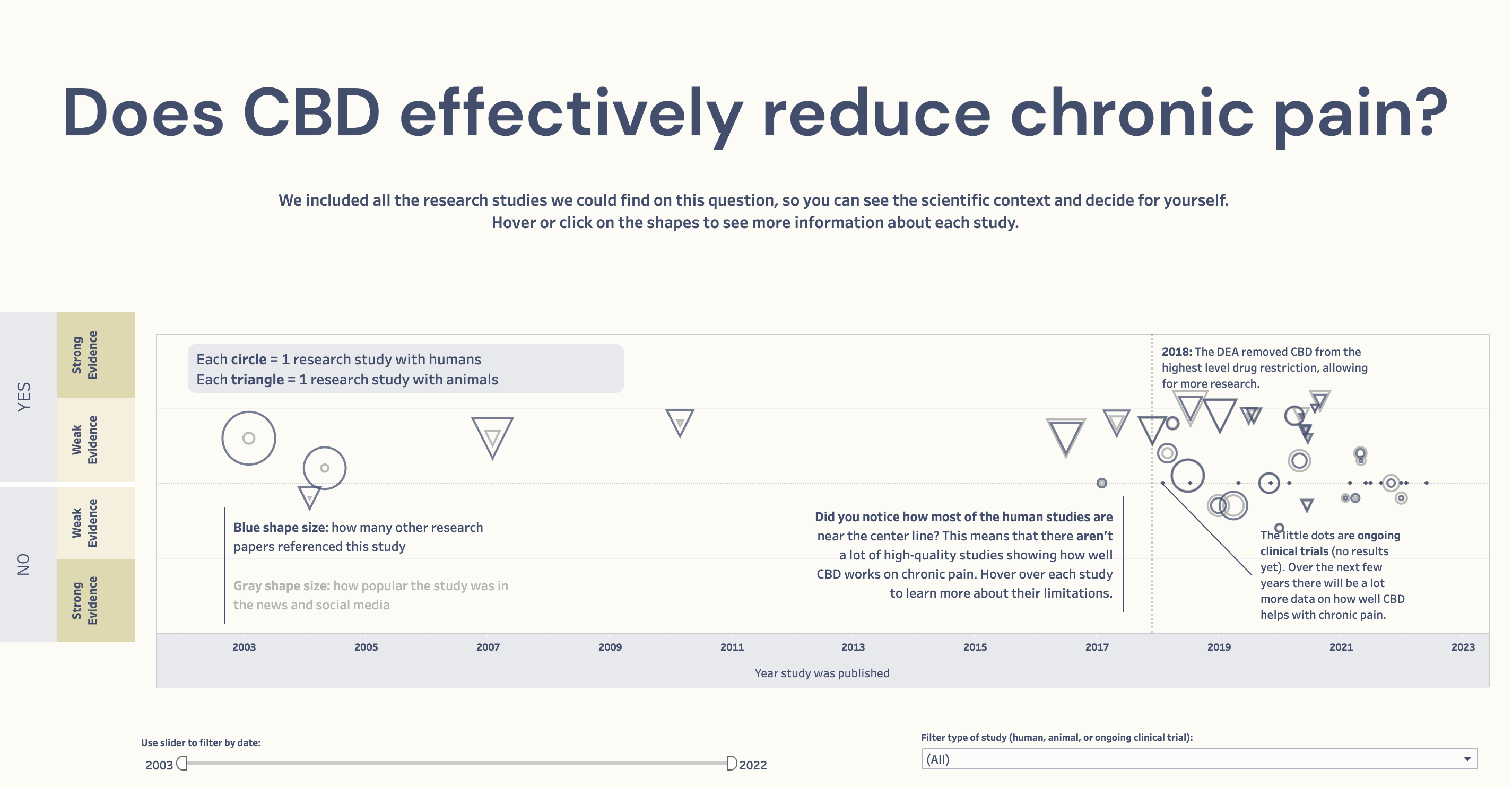
This visualization is the first topic covered by Science Trendline, an initiative to create interactive data visualizations showing every research study on a specific science or health question in one view. The visualization provides viewers much-needed context: how the science has built on itself over time and how individual discoveries or headlines fit into the larger body of work. Science Trendline is a simple approach to put all relevant data in one place so viewers can explore scientific context for themselves, and not be overwhelmed or confused by seemingly conflicting headlines. It’s one tool to help fight against misinformation and disinformation by shifting the debate from individual studies to the scientific process as a whole.
Each shape, or data point, is one published research paper on the topic. How high or low a datapoint is on the graph shows how strong the evidence from that study is. The strength of evidence calculation is a combination of 5 metrics (type of study, size of study, size of the effect, generalizability, and limitations). From the initial view, the user gets a sense of how all the research on that topic fits together. In this case where a lot of data points hover near the center line, more research needs to be done before strong conclusions can be drawn about how well CBD really helps with chronic pain. Filtering allows the viewer to have more control over what they see, especially for topics with more research.
Triangles represent animal studies and circles represent human studies. The little dots are ongoing clinical trials. There are 2 shapes for each data point. The size of the blue shape indicates how many times that study has been cited by other researchers while the size of the gray shape indicates how popular the study was in the news and social media. This is important because sometimes a study will be very popular in the media, but if the study wasn’t of high quality, scientists won’t cite it and it won’t influence their conclusions as heavily.
Instead of highlighting individual results that often change or even reverse, Science Trendline visualizations draw focus toward the true benefit of science – incremental discoveries that connect and build on each other over time. This project can be one tool to help combat the onslaught of misinformation and disinformation by refocusing on context and follow-up in science communication, instead of on isolated headlines.
-
Credits
-
Award
-
Categories
-
See more


